Cmd/Ctr-K for Controls
CSS takes a source document organized as a tree of elements… and text nodes… and renders it onto a canvas such as your screen.
- CSS Layout starts with a source document (usually HTML)
- Which is parsed and organized into a nested ‘tree’
- of Elements & Text Nodes
- That’s what we see when we open the web inspector
- With browser dev tools
- It’s based on our source HTML,
- But might not match exactly
- (DEMO)
- The DOM is what gets rendered…
The document canvas is the infinite surface over which the document is rendered.
- Onto an infinite canvas!

- That sounds daunting,
- But we interact with that canvas…
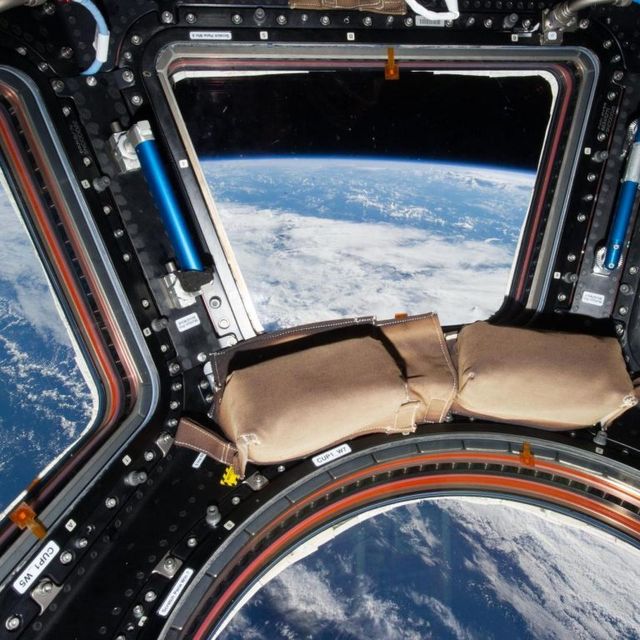
- Through a finite viewport
- Our ‘window’ for viewing a website
- The parent of the root element
- We can’t style (directly)
- Has a finite
width/height
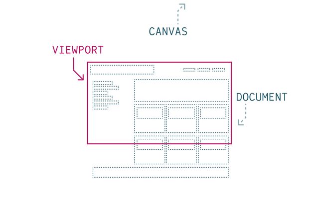
- Provides the ‘initial’ containing block
- The outermost context
- For our document tree of boxes
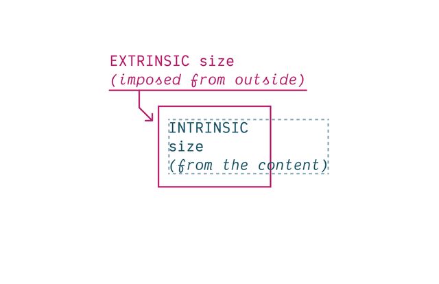
- CSS layout is defined by this back-and-forth struggle
- Smaller and smaller boxes nested inside the viewport
- Creating an extrinsic context, pushing in
- But the content inside the page is also taking up space
- Text and images can’t just keep getting smaller,
- that’s not useful,
- so our content has some intrinsic size pushing out
- I think this is an issue we’re all familiar with
- So any CSS layout mechanism
- has to solve for this negotiation
- How do we balance the intrinsic space required
- With the extrinsic space available?
Intrinsic sizes… From The Content Itself
- Intrinsic sizes come from the content itself
- The natural dimensions of an image
- Or the space that text takes to render
Extrinsic sizes… Anything Outside The Content
- Extrinsic sizes include anything else
- The viewport, the parent element, or grid track
- Properties like width and height,
- when we set them to an explicit value
- This is always a back and forth on the web
- It’s not like extrinsic sizes always win
- Sure, content has to move around
- When we change what space is available
- But boxes also get bigger when we put things inside them!
- And an extrinsic size on a child element
- Becomes an intrinsic size for the parent to deal with

- It doesn’t matter what layout system we’re using
- This is always the fundamental question in CSS:
- How do these two forces interact?
Every document Has a Flow
- All of that happening
- in the context of a document flow
- Which also applies across layout systems.
- This is the direction & orientation of documents
- In a given language or writing mode
- In English we start at the top left,
- Text creates words and lines on one axis
- Which we call the ‘inline axis’
- In english that’s horizontal,
- With lines flowing left to right
- but that depends on…
direction
[demo link]- The language
- A right-to-left language (like Arabic)
- Is still written in horizontal
- But the direction is reversed (right to left)
writing mode
[demo link]- And some languages are written in vertical lines
- We call this the writing mode
- When text reaches the end of a line,
- is fragments, creating multiple lines
- that stack together on the block axis
- For english this is vertical,
- With blocks stacking top-to-bottom.
- So in addition to our physical dimensions,
- Width and height, which are fixed in place
- We can talk about…
- The ‘flow-relative’ or ‘logical’ dimensions
- Based on the flow of text in a given writing mode
- English flows in lines from left to right
- And stacks in blocks from top to bottom
- (Horizontal, top to bottom)
- These are not fixed, but change based on the language
- That also gives us four logical sides
- Top, right, bottom, and left are fixed in place
- But block-start, block-end,
- Inline-start, and inline-end
- Orient us based on writing axis and direction
flow-relative Logical Properties
- Most design is relative to flow
- English sites put the logo top left
- Because that’s where we start reading English documents
- There are a few exceptions (eg shadows)
- As always, CSS is expressive
- Best to say what you mean
width->inline-sizeheight->block-sizetop->block-startbottom->block-endleft->inline-startright->inline-end
- We can start to replace our habits & old code
- Replacing properties like
margin-rightwithmargin-inline-end - It will help if you ever provide page translations
- But also as browsers auto-translate
- Design interfaces that re-orient efficiently
- Without making other changes in CSS
- While some of the long-hands are a bit longer
- We don’t only save time doing multi-lingual sites
- We also get handy block and inline shorthands
- e.g.
margin-block,padding-inline,border-block - I use these all the time!
css…
input {
  margin-inline-end: 1em;
  margin-left: 0;
}- Note that they cascade separately
- We don’t know until layout time if they will conflict
- Because the writing mode has to cascade as well
- If they do conflict, we compare cascade priority again
- Determine which should apply
Logical properties Convey Intent
- The goal is to provide better browser hints,
- So we want to say what we mean
- If we’re creating shadows from a light source
- The shadow direction doesn’t depend on the language,
- it depends where the light is coming from
- But if we’re trying to set a line of text
- Then we should be thinking in text-relative terms
Document Flow
- Writing-Mode (axis assignment)
- Text Direction (inside lines)
- That document flow
- Established by a writing mode & text direction
- Is the context we start with for any layout
- And we can change those two values
- for nested sections of the page
- We can have layouts inside layouts…
…A tree of elements… and text nodes…
- Defining different rules for different branches
- In our tree of elements and text nodes
Elements Generate Boxes
- Every element in the tree
- Generates it’s own box by default
display property
Box Generation Values
- We can use the
displayproperty - To manipulate box generation on elements…
- Box tree of elements and text nodes
- Four areas: content, padding, border, & margin
- Four edges: content-box, padding-box, border-box, margin-box
- Each box provides a context for nested content to flow (inside the content-box)
- HTML box is contained by Viewport
Display:none;(head/style) removes box & subtreeDisplay:contents;(figure?) removes boxDisplay:list-item;(li) generates a second::markerboxList-style-positionmoves::markerin or out of primary box
Text nodes Have an Anonymous Box
- Text nodes get anonymous boxes
- The browser knows there’s a box there,
- But the box details aren’t exposed to us
- We can’t select or style them directly
- Have to select the parent element instead
- Styles only inherit, but can’t be specified
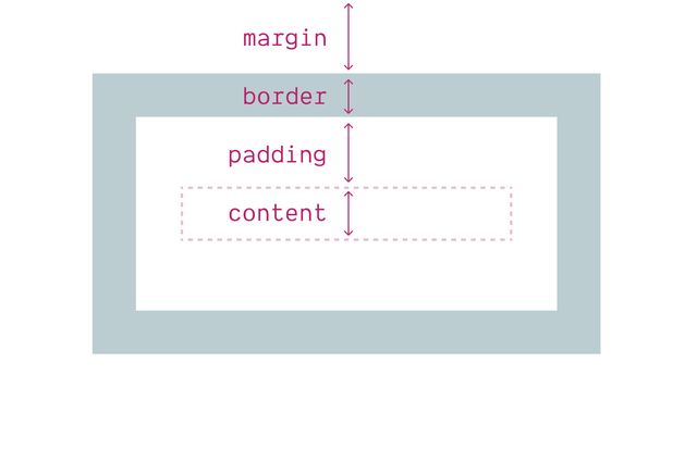
- But each element box has four areas
- (content, border, padding, and margin)
- (B/P/M have their own properties)
- But each of them…
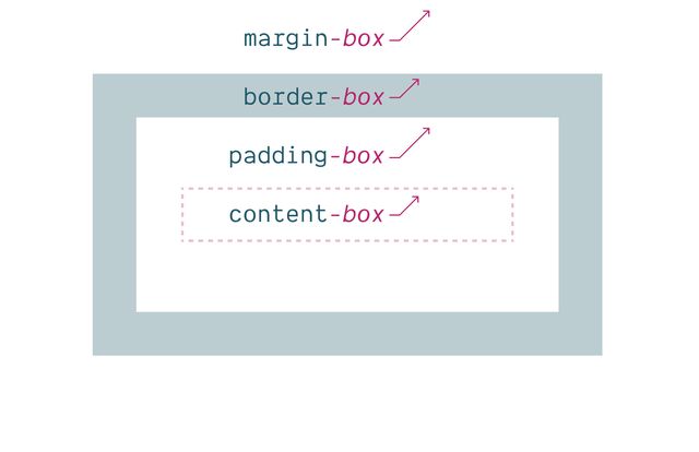
- Has an outer box edge that we can reference
- Using keywords
display: list-item
Adds Marker Box
- The
list-itemdisplay - Generates an additional
::markerbox - Which we can move in or out of the principle box
display: none
Removes Box Tree
- Display-none will remove the box
- (including everything inside)
- So neither the box or the contents are rendered.
display: contents
Removes Box
- Display-contents will remove the box
- But leave the contents in place
- This can be helpful in some situations,
- But we have to be careful…
Historically… ⚠️ Severe A11y Issues
- Can cause major accessibility issues in some browsers
- Removing the semantics of the element
- Or the elements inside, which is bad!
- Much of that has been fixed in recent releases,
- But not everyone is on the latest browsers, and…
Currently avoid… ⚠️ On Buttons & Tables
- Most browsers still have issues on HTML buttons and tables
- So never use display:contents on those elements
- And be cautious on other semantic elements
- (links, lists, etc)
- Mostly use for adding/removing
- ‘wrapper’
divs when doing layout
CSS properties Are Entangled
- I mentioned earlier that CSS properties
- are often entangled
- The value of one property
- impacts the meaning and behavior of other properties
- We can see that happening here
Layout is Modal
Mostly based on formatting contexts
- Layout is extremely modal in CSS
- Various properties (but especially
display) - Can completely change how other properties work,
- (or if they apply at all)
- Display is toggling us between different modes of layout.
Multi-Value display
primarily inside and outside modes
- So the display property is doing multiple things.
- We usually set a single value,
- but it acts like a bit like a shorthand.
- In addition to controlling what boxes to generate…
display creates
Inner Formatting Context
- ‘Normal’ Flow (block/inline)
- Multi-Column (flow)
- Grid
- Flex
- Table-*
- Control the inner layout mode…
- Which will impact how children lay out together.
- But we can also establish…
display sets
Outer Flow Behavior
- Block
- Inline
- For elements in a normal flow layout
- the outer mode of the element.
- How it behaves in the parent flow.
- This is part of…
Default layout mode Normal Flow
- Normal flow, the default layout mode for every element
- Designed to feel somewhat invisible and obvious
- It’s just the way we write documents…
- There’s a great talk by the creators of CSS
- (Håkon Lie & Bert Bos)
- “We didn’t think we needed to specify this,”
- “Everyone knows how a document works”
display:
flow | flow-root
- We didn’t even have syntax for it until recently
- Most of us never set these display values explicitly
- But we can!
block ➡️ block flow
inline ➡️ inline flow
- These are the defaults when we only define an outer value of
display - block or inline means block flow, or inline flow
- Flow is the default, if we don’t specify another layout mode…
Two Value Display
See details on the Web Features explorer- We call this new syntax multi-value display
- Or two-value display
- This has been in all browsers for a couple years
- And is very close to Baseline wide support
display property
Outer Display Values
inline or block
- Block and inline are the outer display values
- Specific to flow layout
- Some boxes flow in line with the text
- And some stack up, wrapping entire blocks
- As we saw earlier,
- The initial display value is inline,
- So all our boxes flow with the text by default
- Until the browser comes along…
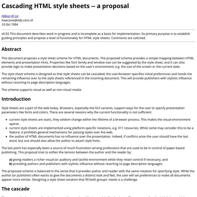
- And defines some block boxes for us
- With space between them
- To make the document more readable
These are Distinct Layout Models
- Even though these are both part of Normal Flow
- They act as somewhat distinct layout modes,
- Each with different rules
- And they don’t really mix
- They separate, like oil and water
- If we put a block box inside an inline box
- Browsers add ‘anonymous’ block boxes
- Around the inline content
In practice… Flow is Inline or Block
- So in practice any given flow layout
- Is either an inline layout
- Or a block layout, never both.
- One can be nested inside the other
- With things like
display: inline-block, - But they are never happening at the same time.
- Let’s start with inline flow
- Inline element boxes flow alongside (anonymous) text nodes
- Boxes expand (and stack together) ‘in lines’
- Their inline-size is intrinsic,
- determined by the content inside.
- When a box reaches a container edge, it will fragment
- Creating a new ‘line’ (like a new page)
- Contribute border/padding/margins on the inline axis only
- And explicit boxes sizes are ignored
- The height of the box is extrinsic
- Defined by the
line-heightproperty
Inline boxes…
Get inline-size
from Content
- Inline boxes and text nodes get their inline size
- From the text itself, the contents of the box
- Explicit sizes are ignored
Inline boxes…
Get block-size
from Line-height
- But the height of the box is extrinsic,
- It comes from the line-box we’re inside of
- Which is defined by the parent
line-height - And we’ll see this a lot,
- by default, one axis or the other
- Is defined from outside,
- while the other axis remains flexible,
- shrinking or growing with the content
- Take their inline-size from context (extrinsic)
- Always stretch by default
- Take their block-size from content (intrinsic)
- Blocks expand and stack flow on the block axis
- Contribute padding/margins on both axis
- Adjacent margins collapse
- Can be explicitly sized (intrinsic or extrinsic)
Block boxes…
Get block-size
from Content
- Take their block-size from content
Primary axis Sized By Contents
- So for both block and inline elements
- The primary axis comes from content
- This is the intrinsic size
- To find it, look inside at children
- On block elements, the block axis
- On inline elements, the inline axis
Cross axis Sized By Context
- And in both cases,
- the cross-axis is sized by context
- This is extrinsic sizing
- And we find it by looking outward
Our Styles Provide Extrinsic Sizes
- Extrinsic sizes often come from the parent
- But they can also come from our styles
- Any size that we set explicitly
- (width, height, padding, margins, whatever)
- will be extrinsic
- It doesn’t come from the natural size of the content,
- But it’s imposed from the outside
All CSS Units
Including % and other ‘relative’ units
Intrinsic Size Keywords
min-content | max-content | fit-content
- Intrinsic keywords that we can use as well
- Min-content, max-content, and fit-content
- Fit-content will flex from min to max
- Without going over the max.
Outer inline/block…
Often Ignored
Only used in normal flow!
- These outer display values are sometimes ignored
- If we move an element into a
grid - No longer
inlineorblock, just a ‘grid item’ - In a flex context, it becomes a ‘flex item’ (and so on)
- Even adding
floator absolute position overrides inline/block - In all these cases, an
inlineelement is ‘blockified’
Out-of-flow Block-ification
display, position, and float- Let’s look a bit closer at elements pulled out of flow
- With absolute positioning or floats
- These are specialized modes, with complex interactions
- Sometimes overriding the element’s outer display
- And often overriding the parent context as well
- There’s a chart in the CSS 2 spec
- For how these properties interact
- floats only in flow
- abspos overrides float
- both blockify the element
- fixed/absolute change the anchor
- fit-content ‘shrink-wrap’ sizing
Display none… Overrides Position or Floats
Floats only work… In Normal Flow
Parent context can override
Position absolute…* Overrides Floats
*Position fixed… Is Spicy-Absolute
- The spec considers fixed and absolute position
- To be variants of the same thing
- Not different ‘layout modes’
- Only different positioning anchors
Either way… Outer Display is Blockified
inline & inline-* ➡️ block & *
Out-of-flow elements… ‘ShrinkWrap’ To Contents
Inner display…
Flex, Grid, Table-*, Flow
- These are ‘inner’ display values
- We set them on the parent, and they establish context for children
- Different formatting contexts or layout modes
- Such as flex, grid, table, or even ‘flow’
block ➡️ block flow
inline ➡️ inline flow
- Flow is the default,
- If we set an outer display,
- Without defining an inner value
- But we can also set…
grid ➡️ block grid
flex ➡️ block flex
table ➡️ block table
- Flex, or grid, or some form of table display
- When we just set an inner value (like grid or flex)
- Those come with a default
blockouter value - In most cases, this single value shorthand works great
- But there are special cases…
inline-grid ➡️ inline grid
inline-flex ➡️ inline flex
inline-block ➡️ inline flow-root
- Sometimes we want to but layout boxes
- Inside the flow of text
inline-blockis the most common option,- But we can also do inline-grids and inline-flex
- Again these are shorthands,
- which can now be written as separate values
- Note that the inline version…
- … doesn’t impact line spacing
- … breaks across lines
- But we can make it a nested layout
- … Which does impact the line
- … and doesn’t fragment
Flow-Root boxes… Can have Explicit Size
- While inline boxes are always sized to content
- Block and inline-block (or block flow-root) boxes
- Can have explicit sizes
- And contribute to the layout of both dimensions
- Allows nesting other layouts inside a line box…
Display Flow-Root
See details on the Web Features explorer- Well supported since 2019
- Flow-root has some other use-cases as well
- In normal flow,
- Margins collapse to give us reasonable spacing
- And floats ‘flow’ through neighboring boxes
- Pushing inline-content to one side, continuing to wrap
- But sometimes we want to break up our flow into discrete blocks
- Historically, solved floats with a ‘clearfix’
- Or
overflow: hidden;
Display: Flow-Root
“A mini layout in your layout”…
- Now we can ask for this explicitly
- Flow-root not just creating a new flow context
- But isolating it from outside interactions
- “a mini layout in your layout”
Flow-Root Block Formatting Context
- Generates a new Block Formatting Context
- This is also what happens with
overflow: hidden - And some other ‘clearfix’ techniques
- Rachel Andrew has an excellent article
- With various demos to show what a BFC does
- Keeping floats contained
- Keeping external floats out
- The same with margins
- Don’t interact or collapse across the boundary
block»block flowflow-root»block flow-rootinline»inline flowflex»block flexgrid»block gridlist-item»block flow list-iteminline-block»inline flow-rootinline-flex»inline flexinline-grid»inline grid
- So we can often use a single value display
- But it’s helpful to understand
- How this shorthand expands
- To handle box-generation
- along with inside and outside display settings
Fine to Use Single-Values
- Don’t need to use new syntax
- But it’s there if we want it
- Flow-root is especially useful
- As a built-in clearfix
box-sizing property…
Selects Box Edge for Sizing
- Before we wrap up,
- I want to touch on a few final things.
- You’re probably familiar with box-sizing

- Which let’s us define the box-edge to use
- When we’re applying sizes
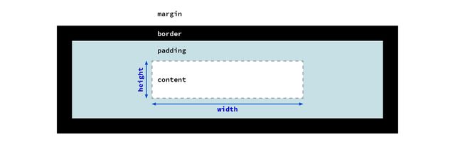
content-box model- Either the content box
- (this is the default)
- Paddings and borders will be added
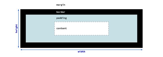
border-box model- Or the width of the entire border-box
- This is what most people like as a default
- And so we see it a lot in resets
css…
/* initial value: content-box */
* { box-sizing: border-box; }

/* optional… */
/* ::before, ::after {
  box-sizing: border-box;
} */- This is the version I would recommend
- Some people set it to inherit, but I’d avoid that
- It’s useful being able to change it for one-offs
- without impacting other elements
- You can also include before & after pseudos if you want
- But I find they don’t usually need it
content-box
Is Still Useful
- Just because we’re changing the default
- Doesn’t mean we should only use border-box sizing
- Any time we want to set the content size
- That’s what the content box is for!
- That might be true on icons
- Or overall page containers,
- Where we’re trying to establish a good line-length
css…
.container {
  inline-size: calc(34em + (var(--padding) * 2));
}content-box sizing instead…- If you ever find yourself doing math
- To add or remove padding and borders
- From the size of something,
- That’s a good sign you’re in the wrong mode
- And switching modes is simpler!
Occam’s
Miriam’s CSS Razor
- When I’m writing CSS, this is my rule
- Occam’s Razor says the simplest explanation
- Is often the correct one
- For me, in CSS, I’m looking for the simplest way of
- saying what I mean
- Not the shortest code that gets me a result
Like Poetry
Concise, but expressive
- Like poetry,
- Having a wide vocabulary
- (a big toolbox, with a variety of tools)
- Allows us to be more expressive
- Without writing out all the details
Tomorrow… CSS Grid & Alignment
- We’ll take a break
- and then come back for Q&A
- Tomorrow we’ll go into detail
- With grids and alignment
Bring this workshop to your company.