A poll…
OOCSS, ITCSS,
SMACSS, BEM, CUBE,
Utility-First, other …
What are you trying? Are you happy with it?
- ✅ Love it
- ⚠️ Could be improved
- ❌ Needs to change
- ‘Branded’ conventions
- Built up over 20 years of CSS
Branded… Conventions are Useful
(as a point of reference)
- What I call the ‘branded’ conventions
- BEM, SMACSS, etc
- These are systems that someone is marketing to us
- And they can be useful as a point of reference
- But it’s also important to remember…
Different Project Needs
- No single solution will fit every project
- Or every team
- We’re all working under different constraints…
Different Team Structures
- Different team structures
- Different budgets & priorities
- And those differences matter…
Just… 🤷🏻♀️ Conventions
Your mileage will vary
- All just conventions
- A set of guidelines someone found useful
- In their org, their team, their code
- Your mileage will vary
Just because InstaSalesFace Did It
Doesn’t mean we all need to
- Just because instaSalesFace did it
- Doesn’t mean it will help anyone else
- In fact, the tools people use at that scale
- Are often absurdly overblown for the rest of us
- They’re trying to solve problems most developers don’t have
- So there’s not a single correct approach

I think they are all pretty neat and I see the point…
— Chris Coyier
- I tend to agree with Chris Coyier
- They’re all pretty neat…

But I’m a bunch of years into this and still generally… write the selector I need and then style with that.
— Chris Coyier
There’s no Miracle Cure
Conventions won’t save us
- Important to say up-front, there’s no miracle cure
- If we refuse to weed the garden over time
- Then the garden will have weeds
- That work doesn’t go away because we switch to utility classes,
- Or move our styles into Javascript
It’s a Process
Conventions can develop over time
- Maintaining a convention, like weeding, is a process
- Not a technical problem to ‘solve’ and move on

- I’d say we do the same at OddBird
- But I’m going to flesh that out a bit more today
- And talk about the decisions we’re making
- And how we think about ‘the selector we need’
Poetic CSS @ OddBird
- Start with functional HTML
- Use the whole language
- Don’t reinvent browser features
- Follow the cascade
- Say what you mean
- Use minimal constraints
- Build the essentials, then enhance
HTML has Built-In Functionality

I decided to stop using the word semantics. Instead I talk about the UX of HTML…
— Vasilis van Gemert, The UX of HTML

Instead of explaining the meaning of a certain element, I show them what it does.
— Vasilis van Gemert, The UX of HTML
HTML also has Built-In Names
Don’t like naming things? Then Stop Naming Everything
.btn»button.btn-submit»button[type=submit].link»a:any-link.hidden»[hidden].active»[aria-current]
aria-currentWe talk about CSS Cascading & Inheritance
- Filtering
- Cascading (includes specificity)
- Defaulting (includes inheritance)
- Resolving
- Formatting
- Constraining
- Both are steps in a larger process called value resolution
- Or value processing…
Value resolution is The Foundation of CSS
this-slide {
  $my-color: red;
  $my-color: yellow; /* winner! */

  background-color: $my-color;

  $my-color: green;
  $my-color: powderBlue;
}this-slide {
--my-color: red;
--my-color: yellow;
background-color: var(--my-color);
--my-color: green;
--my-color: powderBlue; /* winner! */
}
CSS code…
A Series of Commands
A Bucket of Properties
Every HTML Element,
Must Have a Single Value
For Every CSS Property
- Before a browser can render the page
- Every CSS property
- on every HTML element
- must have a single value
- Filtering (
0+declared values) - Cascading (
0-1cascaded value) - Defaulting (
1specified value) - Resolving (
1computed value) - Formatting (
1used value) - Constraining (
1actual value)
- Each step here gets us closer
- to that actual rendered style on the page
- Filtering to get all the relevant declarations
- for a specific property on a specific element,
- Cascading to resolve any conflicts between those declarations
- Defaulting to fill in anything that wasn’t declared explicitly
- And then several steps that help us resolve contextual & automatic values
These are all Internal Browser Algorithms
- On the one hand,
- This is all internal logic, right?
- Just an algorithm that browsers use…
- to thunder-dome our declarations
- Whenever a property is set more than once
- We need to find a winner

- Almost like the laws of physics…
- A way of describing the universe around us,
- The way the world works.
- That’s all true, but also…

- tools provided to us, intentionally
- part of the language,
- designed for us to communicate…
Express… Purpose & Priority
- At each step we get tools
- to help us express purpose and priority
- Of our hints and suggestions.
Filtering Finds Relevant Declarations
color: blue;Could be called Declaration Gathering
Building a list of declarations requires filtering our CSS to only the relevant declarations.
A Relevant Declaration…
(determined one element at a time)
- In a stylesheet that applies (see
mediaattr) - Not in a false conditional rule (see at-rules)
- In a selector that matches the HTML Element
- Is syntactically valid
CSS valid syntax Depends on Type Safety
<integer>/<number>/<dimension>etc…<length>/<angle>/<time>etc…<calc-sum><color>/<hue>/<alpha-value><image>/<position><string><url><custom-ident>/<dashed-ident>- etc.
html { color: 3em; }3em is a <length>, not a <color>html { color: teal; }teal is a <named-color>, a <color> sub-typehtml {
color: teal;
color: 3em;
}html {
color: teal;
/* color: 3em; */
}
only one color
We’re Done! 🎉
Value Resolution
- Filtering (“parse time validation”)
- Cascading
- Defaulting
- Resolving
html {
  color: var(--my-color);
  --my-color: teal;
  --my-color: 3em;
}.ಠ_ಠ {
--(╯°□°)╯: ︵┻━┻;
}Value Resolution
- Filtering (“parse time validation”)
- Cascading
- Defaulting
- Resolving 👀👀👀👀
Declarations containing
The var() function
Are not evaluated at parse time
Value Resolution
- Filtering (“parse time”)
- Cascading
- Defaulting
- Resolving (“computed value time”)
Might become… Invalid At Computed Value Time
Declarations containing
The var() function
or if() function
or any --custom() function
Are not evaluated at parse time
Value Resolution
- Filtering
- Cascading (resolve conflicts)
- Defaulting
- Resolving
button          { background: gray; }
.action         { background: darkblue; }
[type=“submit”] { background: darkgreen;
                  background: var(--submit); }
#send { background: maroon; }- The cascade itself has a 7 steps to it
- 7 Questions we can ask to compare and discard declarations
- Until we have a single winner
- Starting with origins & importance, which we’ve discussed
- Who requested it, and how much do they care?

- We can think of each layer here as a coin sorter
- Instead of measuring the size of a coin
- Measuring the priority of each declaration
- See which ones make it farthest

- All we care about is the coins that made it the furthest
- We can ignore any empty columns
- And discard coins that didn’t make it quite as far
- Those are gone from memory now!
- But we still don’t have a single winner

- So we find another coin sorter, and we do it again
- Over and over, until we have a single coin
- Each time comparing different features
- Not just size, but shape, width, metal, whatever
- Ok, but not coins -
Working backwards… Order of Appearance
- Order of appearance
- Guarantees a single answer
html {
  background: red;
  background: teal;
}- If we set the same property multiple times
- Only one can apply,
html {
  /* background: red; */
  background: teal;
}- And ‘last one wins’ will always give us
- that single answer
html {
  color: teal;
  color: oklch(55% 0.09 195); /* discarded?? */
}html {
color: teal;
/* color: oklch(55% 0.09 195); */
}html {
color: teal;
color: oklch(55% 0.09 195);
}html {
/* color: teal; */
color: oklch(55% 0.09 195);
}You can use it and not use it at the same time, because it works and it doesn’t work at the same time. It’s Quantum CSS! It’s Magic!
Order styles… From General to Specific
- Since later styles override earlier styles
- We want to start with our broad brush strokes
The Cascade exists for Building Systems
/* broad defaults */
button { background: rebeccapurple; }

/* narrower patterns */
button.danger { background: maroon; }

/* one-off overrides */
button[type=submit] { background: forrestGreen; }
Harry Roberts Inverted Triangle CSS
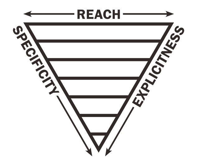
Narrow » Broad Reach How Many Elements?
Low » High Specificity What Selector Weight?
Generic » Explicit What Desired Impact?
From p {} through .text-center {}
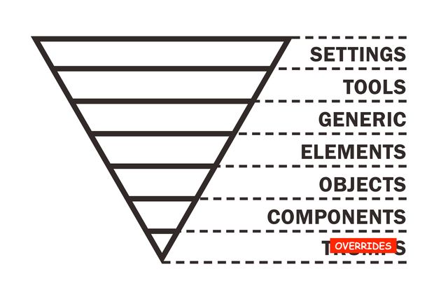
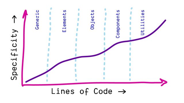

Andy Bell CUBE CSS
- Something they all share
- Working from the macro to the micro
- Broad strokes, before minute details
- Composition
- Utilities
- Blocks
- Exceptions

Natalie Downe CSS Systems
A CSS System Overall Structure & Individual Components
- Overall structure & individual components
- These are distinct, and separate
- General Styles (resets, type, colors)
- Helper Styles (forms, errors, alerts)
- Page Structure
- Page Components
- Overrides (avoid when possible)

Nicole Sullivan OOCSS
- Nicole Sullivan’s OOCSS
- (came out around the same time)
- Highlights similar ideas
Beyond Reusable Components
- Objects are not just components, because
- Not just components are reusable…
Components Share Patterns
Avoid even unique component styles
- But the patterns that we use
- across components
- Which leads us into selectors and specificity
- Maybe the most feared and hated part of the cascade…
h2:has(> button[aria-expanded="false"]) + div {
  display: none;
}- to express fairly complex ideas
- Read from right to left in phrases…
- This selects a
divthat comes after anh2 - (which has a
buttonchild, that is not expanded) - Look at all that information we’re communicating to the browser!
/* expressive browser-ux */
form:has(:invalid) [type="submit"] { … }

/* we do all the work??? */
.form__btn--submit--invalid { … }- We can reference els & attrs in selectors
- Also have access to pseudo-classes & pseudo-elements
- Extended with ARIA attributes as needed
- Selectors help enforce/encourage semantic HTML patterns
- When we reduce this to a class-name string,
- We lose all the meaningful built-in associations
a[href*="://"] { /* external links */ }
a[href^="https:"] { /* secure links */ }
a[href$=".pdf"] { /* pdf links */ }

button[aria-pressed=true] { /* pressed buttons */ }
img:not([alt]) { /* images without alt text */ }- There’s so much we can do
- Without ever coming up with our own names
.flow > * + * {
  margin-block-start: var(--flow-space, 1em);
}- Selector combinators let us expand on that
- Defining relationships
“Intelligent” Selectors
No “intervention by the author”
But we get lost… In Specificity Battles
Specificity is a “Heuristic”
- But what we’re worried about now
- Is the specificity of a selector in the cascade
- And for this step the browser uses a heuristic
- a practical assumption
More Explicit Selectors
are Likely
More Important
- That narrowly targeted selectors like IDs
- are likely more important than broad selectors like element types.
- That makes some sense, right?
- One-offs override reusable patterns,
- which override element defaults,
- which override global initial values?
* { /* universal */ }
p { /* type */ }
.summary { /* attribute */ }
#call-to-action { /* id */ }- So simple selectors…
- (the bits that we build into complex and compound selectors)
- …fall into four ‘categories’
- Each with increasing priority in cascade…
* { /* universal */ }- The universal (star) selector
- Alone in its category…
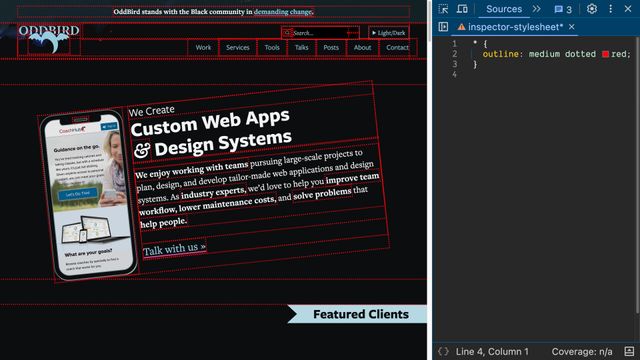
- Selects all HTML elements
- (but not pseudo-elements like before or after)
- We can use this for extremely generic settings
- Across every element on the page
button, div, span {
  /* 'type' (element) */ }
::before, ::after, ::part() {
/* 'pseudo-element' */ }- Element & pseudo-elements
- Are called ‘type’ selectors

- They are much more targeted, but still fairly broad
- And (until recently) not something we could control
- HTML defines what elements we have available to use
- But still, these selectors can us establish
- More customized defaults,
- Similar to user agent styles
.action, .summary {
  /* 'class' */ }
:hover, :user-invalid {
  /* 'pseudo-class' */ }
[type=“submit”] {
/* 'attribute' */ }- Attribute selectors
- (which include classes and pseudo-classes)
- Select elements based on any attributes or exposed state
- This is where we have the most control & flexibility
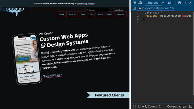
- Great for defining reusable patterns
- So they become the backbone of our design systems
#send { /* 'id' */ }- Finally ID selectors
- Valid ID’s are required to be unique on a page

- Should only ever select one element per page
- Extremely targeted/specific styles
/* 1 IDs, 2 attributes, 2 element type */
/* specificity: 1,2,2 */
form#contact button[type='submit']:active {
  border-color: seaGreen;
}- To compare, we count up how many terms we used in each selector,
- And which category those terms belong to
- Here the
border-colordeclaration has a selector - With 1 ID
- 2 Attributes
- 2 Element types
- A specificity of
1, 2, 2

- The total isn’t what matters
- We again compare the columns one at a time
Like Versioning…
[1,0,2] vs [0,3,2] vs [0,2,3]
vs [0,3,2] vs [0,2,3]- Like software versions
- We can look at the first number
- That might give us a winner already
Move on when tied
[0,3,2] vs [0,2,3]
vs [0,2,3]- We only have to look at the next column (attributes)
- If there’s a tie in the first
Again… Generic to Explicit
Again… Macro to Micro


- Elements grouped by Type
- Classes grouped by Effect
- IDs grouped by Component
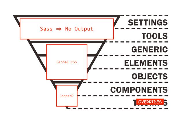
- General Styles (resets, type, colors)
- Helper Styles (forms, errors, alerts)
- Page Structure
- Page Components
- Overrides (avoid when possible)
Modern selectors can ‘Hack’ Specificity
#example { /* [1,0,0] */ }
[id="example"] { /* [0,1,0] */ }- ID’s are often used in forms, aria-roles, etc
- But sometimes ID specificity is too much for what we’re trying to do
- Remember that IDs are attributes!
- We can use an attribute selector instead,
- Selecting the same element, with lower specificity
.example { /* [0,1,0] */ }
.example.example.example { /* [0,3,0] */ }- We can also increase the specificity
- Of a class, attribute, or ID by repeating it
- In a compound selectors (all strung together)
- This changes specificity, without changing what we select
CSS Nesting
See details on the Web Features explorera {
&:any-link { color: blue; }
&:focus, &:hover, &:active {
color: deepPink;
}
}.card {
@media (width > 20em) {
display: flex;
}
}article {
h2 { … }
.thumbnail { … }
}@scopeol, ul {
> p { /* :is(ol, ul) > p */ }
.sidebar & { /* .sidebar :is(ol, ul) */ }
}:is() under the hood/* :is(button, .btn, #my-btn) */
button, .btn, #my-btn {
&:focus,
&:hover,
&:active { /* 1,1,0 */ }
}The :is() Selector
See details on the Web Features explorer
The :where() Selector
See details on the Web Features explorer
<nav>
  <a href="#">not selected</a>
  <a href="#" class="active">selected!</a>
</nav>nav a:is(.active)
nav a:where(.active):is() & :where() work the same- The
:is()and:where()selectors - Can also be used to manipulate specificity
- They always select the same things
:where()
Removes Specificity
/* nav a.active { 0,1,2 } */
nav a:where(.active) { /* 0,0,2 */ }
a:where(nav .active) { /* 0,0,1 */ }
*:where(nav a.active) { /* 0,0,0 */ }
:is() takes
Highest Specificity
:is(a, .b, #c .d) { /* 1,1,0 */ }
a:is(.b, #c .d) { /* 1,1,1 */ }a:where(#logo, .sponsor .logo) {
/* specificity: 0,0,1 */
}
a:is(#logo, .sponsor .logo) {
/* specificity: 1,0,1 */
}It doesn’t matter Which Selector Matches!
<a class="sponsor logo">Still 1,0,1</a>a:is(#fakeID, .sponsor .logo) { /* … */ }🌶️ Hot Take Specificity is Brilliant
(but)
Our teams & projects Grew Faster Than Our Controls
1. Avoid Naming Conflicts
(across large teams & projects)
2. By Expressing Membership
(through lower boundaries & proximity)
.title { /* global */ }
.post .title { /* nested */ }

.post__title { /* BEM */ }
@scope (<root>) { … }
Different from CSS Nesting
Scope has… Defined Relationship
Always child or descendant
Scope… Doesn’t Add Specificity
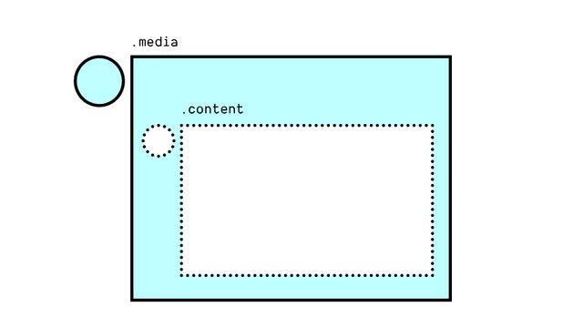
Scope has… Lower Boundaries
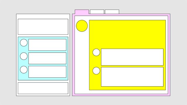
Build-tools Provide Scoped Styles
BEM, CSS Modules, Vue, JSX, Stylable, etc
.post__title { /* BEM */ }
.title[data-JKGHJ] { /* Vue */ }@scope (<root>) to (<boundary>) {…}
@scope (.media) to (.content) {
  img { /* only images that are "in scope" */ }
}Nested <style> Scopes
<article>
  <style scoped>
    p { color: green; }
  </style>
  <p>This paragraph will be green.</p>
</article>

<p>This paragraph won't!</p><article>
<style>
@scope { p { color: green; } }
</style>
<p>This paragraph will be green.</p>
</article>
<p>This paragraph won't!</p>Different from Shadow-DOM Encapsulation
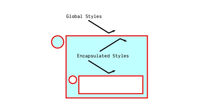
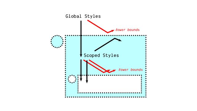
@scope (.block-name) to (.block-content) {
  .title { /* only inside the block! */ }
}button {
&:hover { background: hotPink; }
&[aria-pressed=true] { border: thick solid teal; }
@media (width > 30em) { padding-inline: 1em; }
& + & { border-inline-start: 1ch; }
}In the cascade… Scope Proximity
.light-theme a { color: purple; }
.dark-theme a { color: plum; }@scope (.light-theme) {
a { /* similar to simple nesting… */ }
}
@scope (.dark-theme) {
a { /* but the _closer_ scope root wins… */ }
}- Remember, each of these steps is resolved
- Before we move on to the next step
- So if a single declaration wins after comparing
- Origin, importance, context, or element attachment,
- Then we never bother with layers or specificity and so on.
Cascade Layers
See details on the Web Features explorer- Cascade Layers are relatively new, but
- Well supported across browsers,
- For almost 3 years now


@layer settings { … }
@layer tools { … }
@layer generic { … }
@layer elements { … }
@layer objects { … }
@layer components { … }
@layer overrides { … }- They give us a way to organize our code
- And help us manage the cascade
- Or maybe more to the point…
Layers of Specificity
- They can help us manage specificity
- Because they come before specificity in the cascade
- So the declaration in the highest layer wins
- Before we bother to compare specificity
- Inside the winning layer
demo:
- Source order is fragile, layers are explicit
- Specificity only matters inside a layer
- Un-layered styles win by default
- Layers stack in order
- Define the order up front
/* establish layer order */
@layer one, two, three;

/* add code to layers as needed */
@import url(two.css) layer(two);
@layer three { … }
@layer one { … }
@layer two { … }- So define the order up front
- Generally, imports have to come first
- Layer lists are allowed before imports
- Order matters!
@layer components {
  @layer state { … }
}

/* access nested layers */
@layer components.state { … }/* system.css */
@layer theme { … }
@layer components { … }@import url(system.css) layer(system);
@layer system.theme { … }
@layer system.components { … }@import url(system.css) layer(system);
@layer system.theme { … }
@layer system.components { … }
@layer system.custom { … }- Add your own sub-layer to an imported layer!
@import url(bootstrap.css) layer(bootstrap.theirs);

@layer bootstrap.ours {
  /* anything here will override bootstrap */
}@layer components {
@layer defaults, themes, state;
}Not Escalating ❗️importance
Managing Priorities
More Cascade Control
Fewer Specificity Hacks
Getting Started
my recommendations
Define a A Layer Order
/* add as the first styles */
@layer reset, framework, components, utilities;<style>/* keep this before linked styles */
@layer reset, framework, components, utilities;
</style>
<link rel="stylesheet" href="…">
<link rel="stylesheet" href="…">If Possible Layer Overall Architecture
<style>
@layer reset, framework, components, utilities;
@import url(…) layer(reset);
@import url(…) layer(framework);
</style>Prioritize Dependencies
*Including inter-org dependencies
- Like resets, design systems, component libraries
- Anything not project-specific
Clearly define… Each Tool’s Priority
Clearly define… Tool-Specific Overrides
@import url(bootstrap.css) layer(bootstrap.vendor);

@layer bootstrap.overrides {
  /* anything here will override bootstrap */
}As you go, Update Layer Order
Working from Lowest to Highest

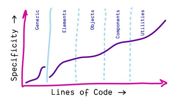
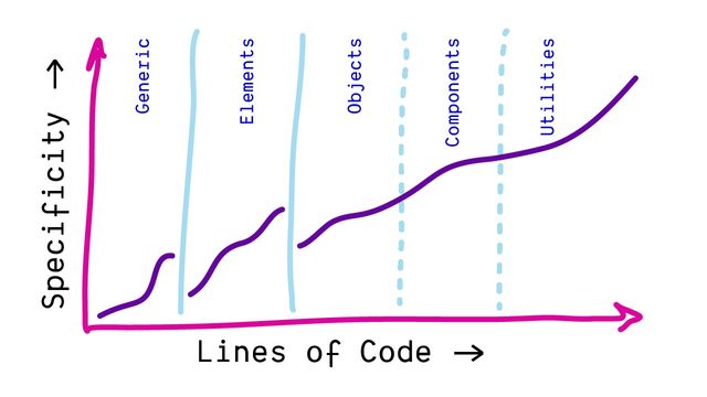
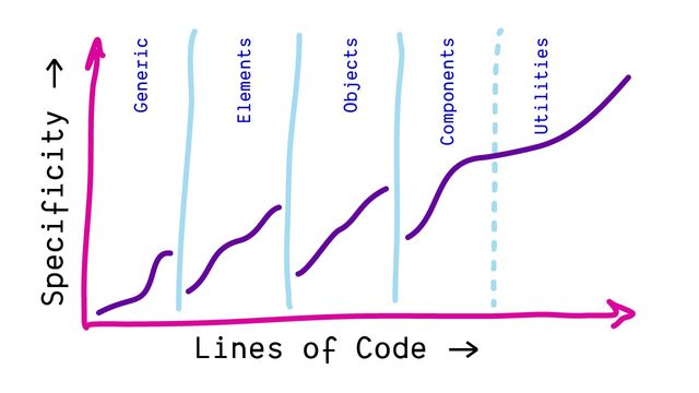
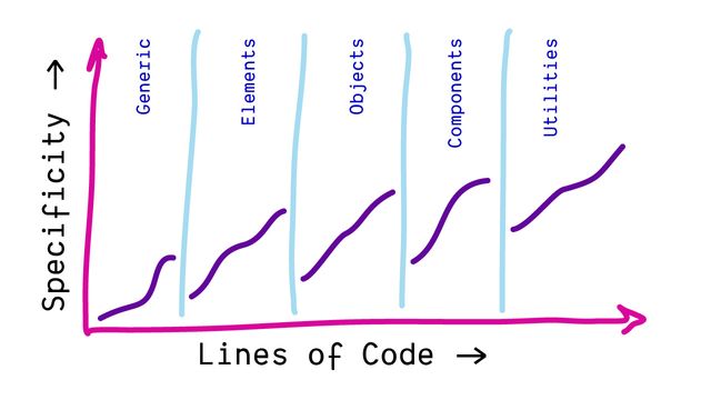
<template>…</template>
<style>
@layer components {
  /* … */
}
</style>Don’t (Usually) Need Layers Per-Component
As useful, Layer Inside Components
Once We Start Layering
*the styles will be hidden from older browsers
There’s No Harm Layering More
Encourages Nuanced & Explicit Priorities
For flexibility… Layer Everything
Use un-layered for Prototyping & DeBugging
Like Origins, ❗️important Layers Reverse
- Like origins and context
- Important layers are reversed
- Resets (weakest)
- Themes
- Components
- un-layered (strongest)
- So if we have three layers
- Each one overriding the previous
!important
- And then we add important styles
- Inside each layer
- Resets
- Themes
- Components
- un-layered
- ❗important un-layered
- ❗important Components
- ❗important Themes
- ❗important Resets
- We now have six layer
- With the important layers reversed

- Again, the goal is balance
Protect Styles From Future Layers
Prioritize -> Layers
Protect -> Importance
- If we just want to override
- Or manage priorities
- That’s what layers are for
- Importance only when essential
@layer reset {
  [hidden] { display: none !important; }
}- So when I set the hidden attribute to display none
- And add importance,
- I can put that in my lowest layer,
- I’ll call it the reset layer
- And future, more powerful layers
- won’t be able to override this declaration
- It’s important, and so it’s protected.
- Element attached (or inline) styles are next
- They’re an exception to our importance reversal
- They work the same on both tracks…
- Important styles can be used to override inline styles
- But when both styles are normal, or both important
- Then inline styles always win
- Resets
- Themes
- Components
- un-layered
- Inline Styles
- ❗important un-layered
- ❗important Components
- ❗important Themes
- ❗important Resets
- ❗important Inline Styles
- While we’ve already covered inline styles,
- And they aren’t technically ‘layers’ in the same way
- It can be useful to understand how these two features of the cascade
- Weave together somewhat,
- With inline styles at the top of both
- The normal and important layer order
CSS Variables… Are Excellent Inline
- With context, we’re mostly talking about shadow DOM
- And like origins & layers,
- We’re back to importance reversing things
🌗 (Shadow) Context
styling web components
- Which is called
Contextin the cascade - It’s like a sub-‘origin’, but for shadow DOM styles
- Styles that come from the shadow DOM
/* shadow DOM styles */
:host(my-element) { outline: thin solid red; }
[part=title] { outline: thin dashed red; }
::slotted(span) { outline: thin dotted red; }

/* light DOM styles */
my-element { outline: thick solid green; }
my-element::part(title) { outline: thick dashed green; }
my-element > span { outline: thick dotted green; }- Since we generally can’t select Shadow DOM elements
- From outside the shadow DOM,
- There are only a few places where these conflicts can happen
- Primarily light-DOM host element, exposed parts, and slotted elements
- I’m not an expert with web components so I might have missed something
- But those are the primary cases I know about
Shadow Styles Are Custom Defaults
similar to user agent origin
- We can think of shadow DOM styles
- As similar to browser defaults, from the user agent origin
- We’re defining ‘custom elements’ and we can give them ‘custom defaults’
- Normal author styles from the page
- will override those default shadow DOM styles
- Unless we add
!importantto protect essential styles, - and then (again) the priority is reversed
- Shadow styles can ‘take back’ priority when necessary
Again… Importance is Defensive
and reverses priority
- Again, importance is defensive
- Allowing component authors to protect essential styles
- We’ll see this importance-reversal behavior again
- in other steps of the cascade
(demo if needed)
- So let’s keep going through them
- We talked a bit about origins
- But you can see there are a few we left out
For Intermediate Styles
in transitions and animations
- For ‘intermediate’ or interpolated styles
- Generated by animations & transitions
hotPink
»
teal
- Take two colors (HotPink to Teal)
- If we want to move between them,
- The browser has to go through other colors…
hotPink
rgb(93 138 220)
?!
teal
- (Depending on the color space we use)
- Maybe we go through this bluish color
- Along the way, that has to _override_both
hotPinkandteal
button {
  background: teal;
  transition: background 1s;
}
button:hover { background: hotPink !important; }- For transitions,
- The start and end values might come from any origin,
- With any importance
- The transition isn’t applied until after the cascade
- So we’ve all had our say
- We agree on the end points,
- And we agree on transitioning between them
- 🖥 User Agent Defaults
- 👥 User Preferences
- 🎨 Author Styles
- ❗🎨 Author Important
- ❗👥 User Important
- ❗🖥 User Agent Important
- ➡️ Transitions
- So the intermediate values have to override everything
- Transitions are the most powerful ‘cascade origin’
:target { animation: bg-change 3s ease-in both; }
@keyframes bg-change {
  from { background: pink; }
  to { background: cyan; }
}- Animations are a little different
- Only the
animationproperty is in the cascade - But keyframe declarations live outside the cascade
- 🖥 User Agent Defaults
- 👥 User Preferences
- 🎨 Author Styles
- 🏇🏽 Animations
- ❗🎨 Author Important
- ❗👥 User Important
- ❗🖥 User Agent Important
- ➡️ Transitions
- So we still need a way to override specific parts of an animation
- By slotting animated values just above the normal origins
- Important styles become immune animation
Transition
override ❗Important
override Animation
Just to restate:
- We can transition between important styles
- And those transitional values will override everything else
- But we cannot use keyframe animations to change important styles
- 🖥 User Agent Defaults
- 👥 User Preferences
- 💭 Non-CSS Presentational Hints
- 🎨 Author Styles
- 🏇🏽 Animations
- ❗🎨 Author Important
- ❗👥 User Important
- ❗🖥 User Agent Important
- ➡️ Transitions
- And then there’s one… pseudo-origin?
- For non-CSS presentational hints
<img src="..." width="160px" height="90px" hidden>
<s>strikethrough</s>- This includes presentational HTML attributes like
width, orheight, orhidden- Or the default styles of the strikethrough element
- Since it’s a presentational element, not a semantic one
- They’re a little weird, and in-between,
- so spec doesn’t list them as their own origin,
- But it does treat them like one, usually
Cascade output…
Single (possibly empty)
Cascaded Value
for each property of each element
- The input to the cascade
- Was a list of declared values
- (for each property on each element)
- The output now
- Is a single (possibly empty) cascaded value
There are Still Missing Values
- Since some values are potentially empty
- We need a process to fill them in!
- That will mean inheritance for some properties
- And the initial value for others
The Cascade is Our Most Powerful Feature
- Hopefully (today) a better understanding of cascade…
- What it is, how it works

- Why it exists (to bring balance)
- Where we fit into the larger process

- And ways we can use it
- To write more expressive style rules

- As part of our style collaboration
- With browsers, users,
- and (hopefully) aliens
- The cascade is what makes all of this possible.