Cmd/Ctr-K for Controls
Poll… Do You Use Flexbox?
- ✨ all layout
- ✅ regularly
- ⚠️ sometimes
- ❌ rarely
display: flex Content Sharing Space
- I mentioned that Grids are ‘block-like’ by default
- But the container has more control
- Flex is much more like inline layout by default
- The container doesn’t create a grid,
- Items just stack up in lines,
- and wrap to a new line if we let them
scss…
.grid-span {
  width: percentage( /* 23.7288136% */
    ((3 * 4em) + (2 * 1em)) / ((12 * 4em) + (11 * 1em))
  );
  margin-right: percentage( /* 01.6949153% */
    1em / ((12 * 4em) + (11 * 1em))
  );
  padding-left: percentage( /* 08.4745763% */
    ((1 * 4em) + (1 * 1em)) / ((12 * 4em) + (11 * 1em))
  );
}- If you were around for the old days of floated grids
- Flexbox is a more direct 1-to-1
css…
.parent {
  display: flex;
  gap: 1em;
}

.child { flex: 1; }- But without all the math involved
- Instead of the container defining the whole layout
- Children define their own spacing
Not intrinsic or extrinsic, but… Flexible Sizing
- And we get what it says on the tin:
- more flexible boxes
- We’re not just working with intrinsic and extrinsic sizes
- But boxes that shrink & grow in different ways
- based on the available space!
- This is similar to grid fractions,
- But works a bit differently under the hood
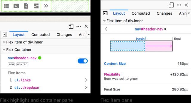
- We’ll be using the Firefox flex inspector for this
- I don’t know why it’s only in Firefox
- It’s such a useful tool!
- Other browsers provide an overlay on the parent
- Firefox also shows us how each item is being sized
- In many ways, Flexbox is inline-ish layout
- Items flow along a primary axis, forming ‘flex lines’
- That optionally wrapping at the edge of the container
- We often use it on inline elements, like navigation links
- Control
-directionand-wrap(or-flow) - Add gutters with
gapon container
- Now we also have more box alignment options
- Items can still align themselves
- But we can
align-itemson the flexbox container - And it will apply as default on all items (until we override)
- We can still use
place-oralign- - Individual items have no space to
justify-in relation to - But the entire layout does! It is not the container.
- We can move the entire layout around with
place-content - Distribute:
space-between|-around|-evenly
css…
.defaults {
  flex-basis: auto; /* starting width */
  flex-shrink: 1; /* distribution factor */
  flex-grow: 0; /* distribution factor */
}- We also control how the item boxes flex
- When there is extra space,
- or not enough space
- There are three underlying controls: basis, shrink, and grow
- By default, starting from their
autocontent size - All items shrink equally (factor of 1)
- Don’t grow at all (factor of 0)
Four flex
Shorthand Values
initial | auto | none | <grow>
- Often don’t need that level of detail
- Four shorthands to cover most common cases
Initial
Shrink, If Necessary
Same as 0 1 auto
- Initial, the default
- Same as basis auto, no growth, shrink as needed
- Great for distribution around/between elements
Auto
Shrink or Grow
Same as 1 1 auto
- Auto, to distribute space into elements
- Adds the ability for them to grow into extra space
None
Don’t Flex
Same as 0 0 auto
- None, still auto-sizing
- But no flexibility
<number>
Share Space Equally
Same as <number> 1 0
- A single number, setting growth
- Fully flexible, with no content basis
- initial
- auto
- none
<grow>
Generally… I Avoid Flex-Basis
Not a strict rule, just a hint!
- Generally I avoid explicit flex-basis
- Not because it’s bad to use, go for it!
- But if I want more control over explicit sizes…
I probably Want Grid Instead
- I probably want grid instead
- Probably! Not always.
- This is not a strict rule,
- There’s nothing wrong with flex-basis
- Andy Bell makes a case for automatic layouts
- Using flex-basis as a sort of container-query
- Built into the item sizing algorithm
- I think that’s pretty clever
- But if we’re adjusting these based on overall layout
- Rather than something specific to the flex items
- We’re missing the point
flexbox is For Sharing Space
grid is For Imposing Structure
flex & grid… Better Together
- And they go great together
- We can nest either inside the other
- To get powerful results!
- These were always meant to be a pair
- Flexbox alignment works much like grid
- But we don’t have tracks on the flex axis
- So there’s nothing to justify items inside of
- We can still
justify/place-contentoralign-items/self - And we can still use the shorthand
align-content- is now supported on block elements in normal flow
- Note it’s only on the block axis
- And we can’t use the distribution values
- (already ways to do inline with margins)
Align-Content in Block Layouts
See details on the Web Features explorer- This is fairly new,
- But supported in all major browsers
- We can also start to use this
- on absolute or fixed-position elements
- (the only difference is the positioning anchor)
- requires
insetvalues
Can I use… AbsPos Alignment
- Currently available in Chrome/Edge and Firefox
Handling change… Container Queries
- What I want to keep coming back to
- Is that all of these tools
- are designed to handle change and uncertainty
- in various ways
- Responding to different conditions,
- Like the size of the viewport…
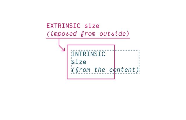
- Or any other extrinsic constraints
- But also the intrinsic sizes of things
- This constant push and pull negotiation

- Web layout is like filling a balloon with water.
- The contents have to change shape to fit inside,
- But the container is also changing shape,
- and if we’re not careful…
- Things can go wrong

- When coining the term Responsive Web Design
- Ethan mentions several tools for responsiveness…
- Percentage-based image and layout sizes are cental
- But then media queries to handle bigger shifts
- What we call breakpoints,
- (At the point where something breaks, we apply a query)
- This is the same year that media queries became available!
- And that’s extremely handy!
- But there’s a small issue
- What if we have nested components?
- It’s not the viewport size that matters,
- But the size of the container
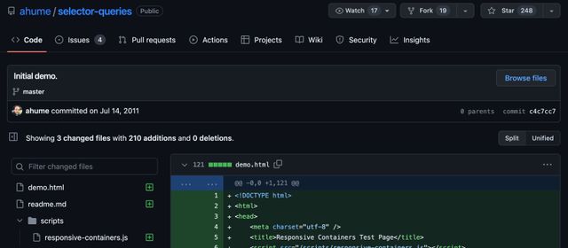
- People pointed that out right away
- And started asking for better option
- selector queries, element queries, container queries
- Whatever we call them,
- we need some way to know about nested context

- We need some way to query containers - And the browsers heard us asking - And responded together
NO.
— The Browsers
Not Ever.
— The Browsers
Stop Asking.
— The Browsers

Container queries will never be possible on the web. They would cause infinite layout loops.
— The Browsers

- How are we supposed to measure a water balloon?

- If we tell you the size of the container
- And you use that to change the size of the content
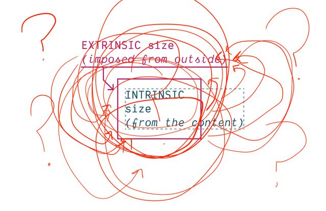
- That could change the size of the container
- And we’re stuck in a loop!
- But recently some folks pointed out…
- We’re not dealing with fluid dynamics here…
- We know that inline elements
- are more flexible on the inline axis
- And block elements are more flexible
- on the block axis
- Mostly we define layouts by establishing
- the width externally,
- and allowing the height to grow and shrink
- with the content
- maybe we can measure one axis, and change the other?
Container Size Queries
See details on the Web Features explorer
- So how do we make sure there’s no loops?
*Some Restrictions Apply
We can’t affect The Container That We Query
We Need to Turn Off Intrinsic Sizing
- We can’t rely on the fact
- That we’re mostly measuring an extrinsic axis
- We have to be clear about it
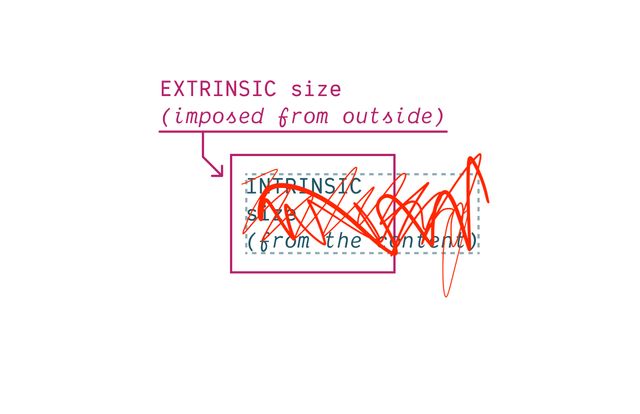
- And turn off any ability
- For an element to be resized by content
CSS Containment
contain: size | layout | style | paint;
- First we got the containment features
- Which are useful on their own for handling extreme
- performance optimizations
- but…
- Maybe a bit too dangerous
- For us to use in container queries
We can only Measure The Axis We Contain
Contain inline-size
For Most Containers
Also need to Contain Layout* & Style
- Containers should no longer apply layout containment!
- Still create ‘formatting context’
- Still contain counters
👍🏼 Inline-Only Containment
👎🏼 Block-Only Containment
Contain size
For Scroll Containers
Since… Containment is Invasive
We create Explicit Containers
css…
container-type: inline-size;contain: inline-size layout style;Recommended… Name Your Containers
css…
main {
  container: layout main / inline-size;
}
container-name [/ container-type]?css…
@container layout (min-width: 40em) {
  .conditional { /* … */ }
}

@container main (min-width: 40em) {
  .conditional { /* … */ }
}Finding Containers
- For each matched element…
- Find the nearest ancestor that has…
- Any required container name
- Any required container types
Containers Can’t Self-Query
(That would introduce loops!)
Always Measuring an Ancestor
(can’t change what you measure!)
Always Measuring an Element
Bonus! Container Queries Measure Actual Styles
Grid Tracks & Flex Sizing?
No element to measure…

For legacy reasons… No Default Containers
css…
body > :is(header, main, footer, aside) {
  container: layout / inline-size;
}also… Container Query Units
cqw | cqh | cqi | cqb | cqmin | cqmax
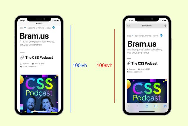
Default unit container The Small Viewport

css…
@container style(--colors: invert) { … }Always Queries Direct Parent
Unless you query a specific container-name
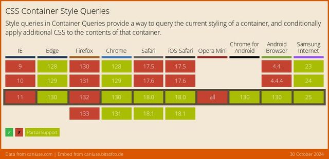
Style Queries… Only Custom Properties*
* for now **
** but maybe forever?
State Queries (???)
css…
@container state(stuck) { … }
@container state(snapped) { … }
@container state(overflowing) { … }
- We’ll see what else comes out of this!
- I imagine there are a lot more questions worth asking

- But for now,
- Please do query the containers actually, thanks!
Bring this workshop to your company.