Cmd/Ctr-K for Controls
CSS takes a source document organized as a tree of elements… and text nodes… and renders it onto a canvas such as your screen.
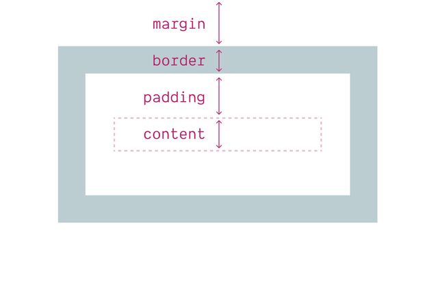
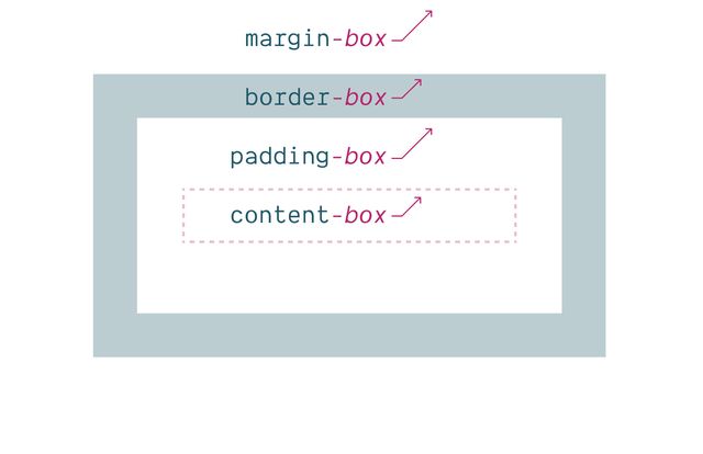
Elements Generate Boxes
display is a Shorthand
primarily inside and outside modes
Inner display creates
Formatting Context
- Flow (can be multi-column)
- Grid
- Flex
- Table
Outer display creates
Normal Flow Behavior
- Inline
- Block
Inline boxes…
Get inline-size from Content
Block boxes…
Get block-size from Content
display property
Box Generation Values
- None
- Contents
- List-Item
display: contents
⚠️ Potentially Severe A11y Issues
Especially avoid… ❌ On Buttons & Tables
These boxes Have a Flow
writing mode
[demo link]direction
[demo link]flow-relative Logical Properties
width->inline-sizeheight->block-sizetop->block-startbottom->block-endleft->inline-startright->inline-end
margin-right -> margin-inline-endcss…
input {
  margin-inline-end: 1em;
  margin-left: 0;
}Place Self
Block axis comes first
Shorthand for… Align-Self & Justify-Self
Which axis are we manipulating?
Fill space
With stretch
Set position
start | center | end
Set position
self-* | flex-*
- Rarely, we might have nested writing modes
- (Different on container and items)
- We can change which one we’re aligning based on
- With self-start & self-end (for items own writing mode)
- Or flex-start & flex-end (for the flex direction)
Details differ Across Layout Contexts
Layout modes… Flow, Flex, Grid, Table-*…
block ➡️ block flow
inline ➡️ inline flow \
grid ➡️ block grid
flex ➡️ block flex
table ➡️ block table
Display: Flow-Root
Create a Block Formatting Context
Display Flow-Root
See details on the Web Features explorerdisplay: flex Content Sharing Space
Beyond intrinsic & extrinsic… Flexible Sizing
css…
.defaults {
  flex-basis: auto; /* starting width */
  flex-shrink: 1; /* distribution factor */
  flex-grow: 0; /* distribution factor */
}
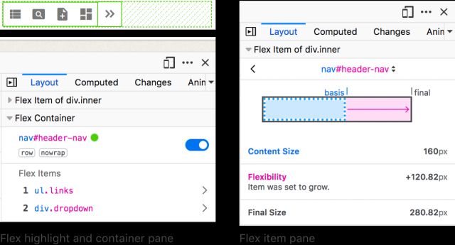
Four flex
Shorthand Values
initial | auto | none | <grow>
Initial
Shrink, If Necessary
Same as 0 1 auto
Auto
Shrink or Grow
Same as 1 1 auto
None
Don’t Flex
Same as 0 0 auto
<number>
Share Space Equally
Same as <number> 1 0
- initial
- auto
- none
<grow>
- Flex values can add up to less than one!
place-self to
Move Individual Items
Explicit on each element
place-items to
Move All Items
A default from the container
place-content to
Move Entire Layout
Content distribution
space-between | -around | -evenly
Generally… I Avoid Flex-Basis
Not a strict rule, just a hint!
You probably Want Grid Instead
Poll… Do You Use CSS Grid?
IM(H)O… The Best of CSS 🏆
display: grid
Container Defined Layout
Implicit grids
Generate columns & rows as needed
Sizing implicit tracks…
grid-auto-columns
grid-auto-rows
Explicit item placement… grid-column & grid-row
grid-<axis>-start & grid-<axis>-end
Defining Templates
grid-template-columns
grid-template-rows
Defining Templates
grid-template: <rows> / <columns>;
- grid-template often the right shorthand
Defining Templates
grid-template: <rows> / <columns>;
Fluid & Fixed 20em 25% 200px
Fluid Until Fixed
minmax(min-content, 1fr)
Fitted…
fit-content(<limit>)
clamp(auto, max-content, <limit>)
Repeating…
repeat(<count>, <tracks>)
Essential Use Cases
- Auto-fit for cards & galleries
- Named areas for layout
- Named lines for prose
- Overlapping layouts
Auto-fit for cards & galleries-
Named areas for layout
- Named lines for prose
- Overlapping layouts
Auto-fit for cards & galleriesNamed areas for layout-
Named lines for prose
- Overlapping layouts
Names ↔ Areas
with matching *-start & *-end names
Auto-fit for cards & galleriesNamed areas for layoutNamed lines for prose-
Overlapping layouts
- We can use the interaction between named lines and named areas
- To create more interesting and overlapped layouts
Subgrid
as column or row template
🤔 Nested Contexts ??
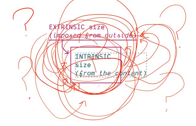
Content Expands & Contracts ??

Container queries will never be possible on the web. They would cause infinite layout loops.
— Browsers, a paraphrase (circa 2020)
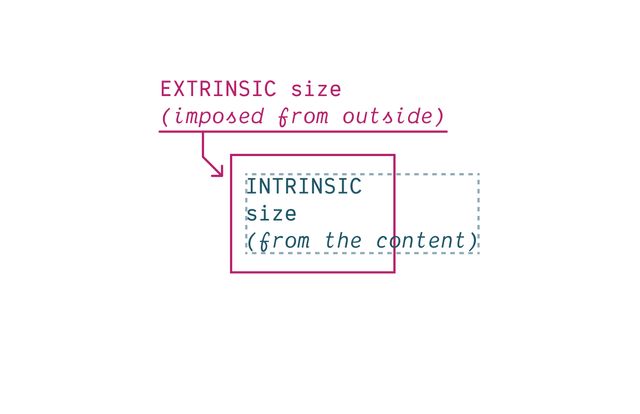
Container Queries
See details on the Web Features explorerBring this workshop to your company.