Introductions…
- Name & pronouns & location
- Brief relationship to CSS
Three Weeks Together
- CSS Mental Model
cascading, declarative, and contextual - CSS Layout
flexbox, grid, and alignment - CSS Architecture
naming conventions & progressive enhancement
It’s a lot We’ll be Moving Quickly
- It’s a lot to cover,
- And we’ll move pretty quickly sometimes
- Skimming past some demos that you can come back to,
- But then really digging in where it makes sense
Takeaway A CSS Mindset
- Don’t need to memorize everything
- Understand the mental model, what’s possible
- And I want to leave you with resources
- You can come back to on your own time
While we’re together Let’s Discuss
- Feel free to stop me if you have questions
- Q&A at end of each day
- I can’t see all of you, so you’ll need to interrupt me
- (I don’t mind)
Cascading Styles
Let’s do this…
- Any questions before we start?
ok, here we go…
- We’re talking about the origins of the web,
- But especially design on the web, using
CHSS
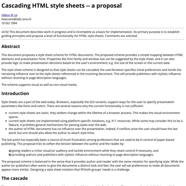
- Håkon Lie, 1994
- email, still archived online
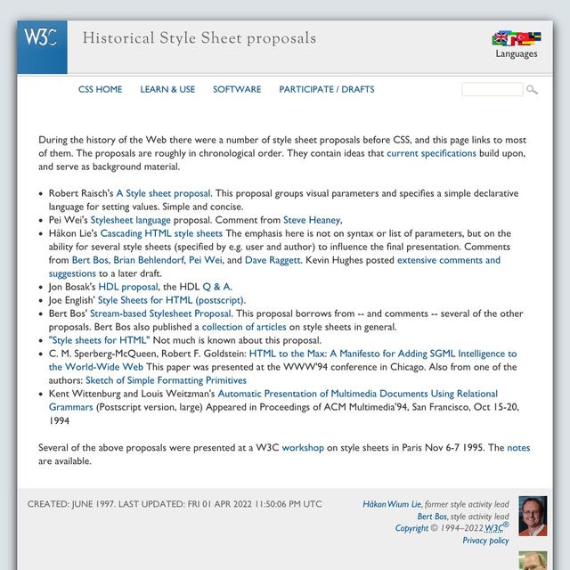
- not the only proposal for styles on the web
- not the first
- solves a major problem for the new platform
Technology Is Political
- not technical
- but philosophical
- political, like all decisions we make
- designing a new platform or interface
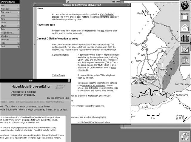
- first web browser
- Hypermedia WWW Browser and Editor
- CERN
- NeXt machine
- graphic interface

You can’t make a web that’s world-wide, by saying it works on my machine, and everyone else is an edge-case.

- Nicola Pellow
- Line Mode browser
- text-only
- no install
- any device with an internet connection
Web for all. Web on everything.
— W3C Mission Statement
- Mission statement of W3C


- includes devices without screen
- or screen readers
- read the screen (a combination)
Web for all. Web on everything.
— W3C Mission Statement
- If we really want this to work
- Everywhere for everyone
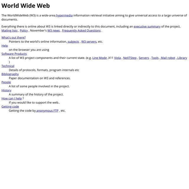
- leads to some interesting constraints
- documented on the original website
- (still online)
- browsers ignore code they don’t understand
[DEMO]
- individual attributes
- entire HTML tags
Protect the Content
across devices, and over time
- the code is optional
- the content is essential
- whatever else happens
- browsers should protect the content
- that’s why…

- we can still see
- first website on modern browsers
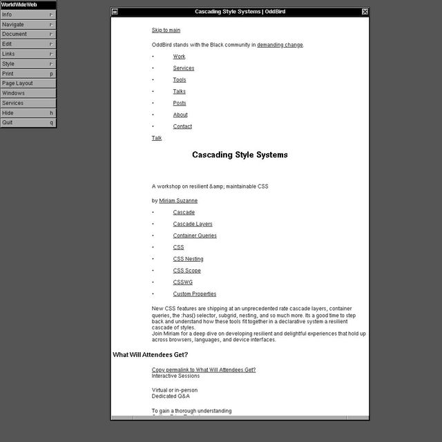
- modern website, on the first browser
- (this is an emulator you can play with)
- No css
- No images
- all the text is there
It is required that HTML be a common language between all platforms…
- limitation is more dramatic
- for graphic design
- to be a common language anywhere…
…This implies no device-specific markup, or anything which requires control over fonts or colors.
Web Design Will Never Happen
(at least in a graphic sense)
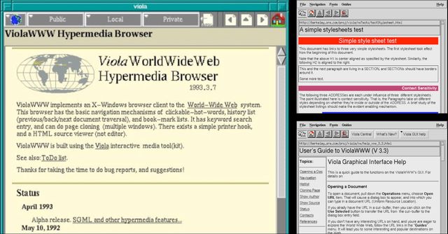
- The problem isn’t styles
- Early browsers all had built-in stylesheets,
- We think of these as browser defaults to override
- but they used to be the only styles available.
- They’re sometimes different from one browser to the next
- but they’re the same for any website we visit

- Even the text-only browser
- uppercase headings, space between paragraphs, etc

- This is not the way print works
- If we’re designing a book, we don’t get defaults from our printer
- We control everything…
- page size (static, forever)
- down to the inks used, and the paper to print on


- It just sits there
- The same was true for other digital formats at the time…
PostScript, 1982 Page Description Language
- PostScript around almost a decade
- page description language
- Like print
- describes a static page
- how big is it? where does each thing go?
- We set fonts, colors, etc.
- We have complete control, but…
The fact we can control a paper page is really a limitation of that medium.
— John Allsopp, A Dao of Web Design
- That control comes at a cost
- The page, print or PDF, is a static medium
- can’t adapt to context or preferences
- a limitation of the medium
Web Styles Must Be Contextual
- web is different
- even static sites aren’t static
- what we ship is not always what our audience sees
- styles must adapt to situations…
- the web is responsive to context
@media
min-width
- Not just the width of the viewport
@media
prefers-reduced-motion
- user needs & preferences
@media
hover
- device interfaces
@supports
container-type: inline-size
- changing capabilities over time
- And often unpredictable content
- Changing all the time
- All of these variables, because…

- We’re not alone here
- We’re part of an ecosystem
- Our decisions impact other people
- And on the web, we don’t get final say

- We’re collaborating with browsers
- (instructed to ignore us)

- Also the people who interact with our sites
- (super cute in their handy tool belts)
- On their chosen devices
- (with varying capabilities)
- And we’re also collaborating with…

- aliens 👽
- Maybe, who knows?

- They’re probably just trying to get home.
Graphic design of unknown content with unknown collaborators, on an infinite and unknowable canvas, across operating systems, interfaces, languages, and writing modes…
— me
- So we’re here, supposed to do…
- (slide)
- It’s absurd
Web Design Seems Impossible
- Under those constraints,
- design seemed impossible, but…
HTML totally eliminates any visual creativity that a document’s designer might have.
— Roy Smith, www-talk “Re: Adobe’s PDF”
- No one was happy with that outcome
- When every site looks the same
- That’s boring for both authors and users
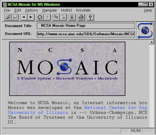
- Turning point, 1993
- Mosaic added image tag to HTML
- Before web standards
- web styles suddenly possible
- put everything in an image, and it never changes
- Just like print design!

- or it doesn’t show up at all
- and we lose everything that makes HTML special
- Can’t protect structured content in an image…
- If it doesn’t load, it’s lost
The web would have become a giant fax machine where pictures of text would be passed along.
— Håkon Lie, 2014 interview
- A real risk to the platform
- (slide)

- And so we get a rush of proposals
- around 1993 and 1994
- trying to save the web from images!
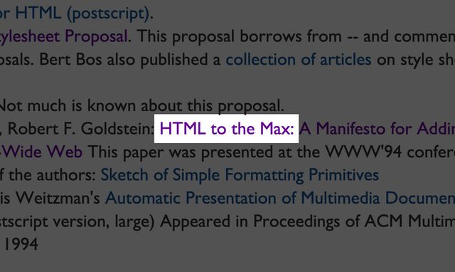
- It’s time to take HTML to the max!
(HEAD,BODY fontSize=normal
           BGColor=white
           FGColor=black
  (H1 fontSize=largest
      BGColor=red
      FGColor=white)
  (H2 fontSize=large)
  (A FGColor=red)
  (CMD,KBD,SCREEN,LISTING,EXAMPLE fontFamily=fixed)
  (BOLD,EMPH,STRONG fontWeight=bold)
)- Pei Wei’s Viola browser
- Was the first to allow custom style sheets for a page
- About a year before CSS was proposed
- It has familiar selectors, nesting, property-value pairs,
- And even inheritance
- They all have inheritance…
“an easily parsable format”
@DEFAULT fo(fa=ti,sp=pr,si=14,we=me,sl=ro,fo=in,bo=in,li=no,nu=1,fn='')
ju(st=le,hy=0,ke=0) co(nu=1,wi=80) br(lo=af,ob=it)
li(lo=in,ma=no,li=un,nu=1,be=no,af=no,hi=0)

@UL in(le=5)
@LI ma(pr=ro,be=4) in(le=10,ri=10)
- Robert Raisch’s ‘easily parsable format’
- Was proposed even a few months earlier
- I assume he means parsable by machines?
- Because I can’t parse it, I had to memorize the first few lines.
- You can see the default selector there,
- We’re setting our default fonts in the
fofunction - Family=times, spacing is proportional, size 14,
- and then ‘we’ is ‘me’, which…
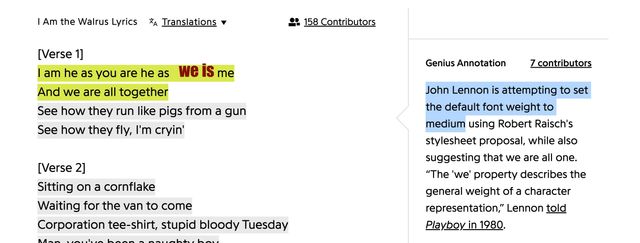
- I don’t know,
- Sounds like a Beatles song?
- John Lennon had a lot to say about web typography
[Times] is not meant as a font name, per se. Rather it is a suggestion of a particular style of character representation.
— Robert Raisch, Request for comments: STYLESHEETS
times (serif), helvetica (sans-serif), system (from the OS), and typewriter (monospace)- But Robert is clear that these styles are only suggestions!
- Even the
timesfont-family - doesn’t mean we get the ‘times’ font specifically,
- it just means we want something like times,
- a serif font!
- And he repeats this phrasing…
Styles are suggestions or hints about behavior, not rules…
— Robert Raisch, Request for comments: STYLESHEETS
- Over and over,
- We’re not writing rules,
- but suggestions or hints about behavior.
A set of HINTS or SUGGESTIONS to the renderer which might be used…
— Robert Raisch, Request for comments: STYLESHEETS
- Sometimes all-caps
- hints and suggestions which might not be used.
- And the other proposals pick this up…
Specified attributes are taken as “hints” that will degrade in a controlled way depending on the level of support… in the operating environment.
— Jon Bosak, Proposal for a language optimized for WWW delivery
- Jon Bosak’s
- Hints that will degrade in a controlled way
- Or, with CHSS…
- We can allow the author to attach style hints
- Hints that the browser may or may not use

Provide authors and publishers with stylistic influence without resorting to page description languages.
— Håkon Lie, CSS proposal
- Authors should have stylistic influence,
- without resorting to page description languages
- without giving us full control
- Use the same resilient logic as HTML…
- browsers ignore css that they don’t understand
- We don’t get a blank page with an error message,
- We get the content with default styles.
- Always protect the content!
Content should be viewable and accessible by default.
— W3C, Platform Design Principles
- This becomes another design principle of the w3c
- content should be viewable and accessible by default
- Which is why…
- The default
overflowisvisible - if we get so cocky
- that we try to shove large text in a small box
- The browser will try to bail us out
- Not because it’s the best-looking solution
- but because the web is unpredictable
- and browsers prioritize content over style
- That’s a good thing!
- What’s the alternative?
![InDesign is [+]](/img/rhqYG1iQfc-640.jpeg)
- InDesign doesn’t even worry about accidental overflow
- The whole word just disappears!
- But that’s fine, because we can fix it
- before we hit print,
- and it will stay fixed forever

- Unchanging
- Unaware of context
- Unable to adapt
- By giving up some deign control

- We allow the web to carry our designs
- Farther than we could ever go alone

- Because we’re not alone,
- While CHSS wasn’t the first stylesheet proposal,
- It didn’t invent selectors, or properties, or even inheritance
- It was the first to suggest an equal collaboration

This proposal tries to soften the tension between the author and the reader.
— Håkon Lie, CSS proposal
- Designed to soften the tension
- Between the author and the reader

While the author (or publisher) often wants to give the documents a distinct look and feel, the user will set preferences to make all documents appear more similar.
— Håkon Lie, CSS proposal
- Authors want to show their creativity and branding,
- with a distinct look and feel,
- make their document visually interesting.
- But users will have preferences,
- styles that they like better (or even require)
- like larger text or dark mode,
- and sites to respect those preferences!

The proposed scheme is balanced in the sense that it provides author and reader with the same notation for specifying style.
— Håkon Lie, CSS proposal
- We do that by allowing everyone to contribute styles
- Written in the same language
/* a 'declaration' */
property: value;
color: blue;- Each of us providing
- our style hints as declarations,
- a property and a value
/* a selector, with attached declarations… */
/* a 'style rule' (or 'rule set') */
p {
  background: white;
  color: mediumVioletRed;
}- We can group those together,
- and add selectors
- forming rule-sets…
<!-- a 'style sheet' -->
<link rel="stylesheet" href="styles.css">/* another 'style sheet' */
@import url('styles.css');- Which can be attached to an HTML document,
- Giving us…
- An ordered list (or ‘cascade’) of stylesheets
- all applied to the same web site,
- But not coordinated…

- Remember, anyone can add styles to the page
- So, of course, this leads to conflicts!…
<button type="submit" id="send" class="action">button { background: gray; }
.action { background: darkBlue; }
[type=“submit”] { background: darkGreen;
background: var(--submit, black); }
#send { background: maroon; }- We have any number of declarations
- coming from different sources
- likely applying different values
- to the same properties, on the same elements!
- So what now? What background should we apply the the button?
- The last one? Who gets to go last?
- Should we…

- Some way to thunder-dome our declarations
- And choose a single winner
- Two styles enter, one style leaves
/* button { background: gray; } */
/* .action { background: darkBlue; } */
[type=“submit”] {
  /* background: darkGreen; */
  /* background: var(--submit, black); */
}
#send { background: maroon; }- The simplest way to choose a winner,
- We can let each declaration override the previous one
- Until there’s only one left
- Last takes precedence
- We’ll start there, but…

- But someone has to go first,
- so we’ll start with…
First… 🖥 User Agent Styles
- The browser, or user agent
- providing legible defaults
- That’s essential!

- This email archive doesn’t add any document styles,
- But the browser is providing some!
- Let’s see what happens when we remove those.
- [demo]
* { all: initial; }

- You can’t render text without styling it somehow!
- So CSS provides…
/* initial values */
display: inline;
background: transparent;
color: CanvasText;
font-style: normal;
flex-basis: auto;
/* etc. */- Several layers of ‘default’
- The specification defines
- An initial value for each property
- Display inline, background transparent, and so on
body { display: initial; } /* inline */
section { display: initial; } /* inline */
div { display: initial; } /* inline */
span { display: initial; } /* inline */
head { display: initial; } /* inline */
title { display: initial; } /* inline */- The
initialvalue fordisplay - is always
inline! - Doesn’t matter what element we’re talking about
- Body, section, div, span…
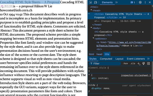
- Even something hidden like the
headortitleelement - Would get
display:inlineby default - If the browser didn’t come along and set…
html, body, p, div, article, aside, header,
hgroup, footer, main, nav, section /* etc */ {
  display: block;
}

base, basefont, datalist, head, link, meta,
script, style, template, title /* etc */ {
  display: none;
}display:blockanddisplay:none- everywhere we expect it
body { margin: 8px; }
a:link {
  color: blue;
  text-decoration: underline; }
h1, h2, h3, h4 /* etc */ {
  font-weight: bold;
font-size: something big I dunno; }- They also add things like
8pxmargin on thebody- Link colors and underlines
- Heading styles, large bold text
- Space around paragraphs and lists, etc
User Agent Styles
- Firefox/Gecko
resource://gre-resources/ - Safari/WebKit
- Chrome/Blink
- These are the user agent styles
- And they apply to every site on the web
- With only minor differences between browsers
Second… 👥 User Styles
- After browser defaults
- Users apply their preferences
- Originally using CSS syntax as well
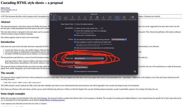
- Safari still supports this option
- In the settings panel, upload a stylesheet
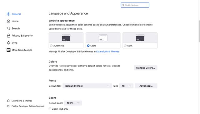
- Other browsers have mostly switched
- To limited preference settings in a graphic interface
User Styles
- Safari/WebKit:
Settings / Advanced / Style sheet… - Firefox/Gecko:
about:preferences - Chrome/Blink:
chrome://settings/appearance
- The details are different
- But the results are the same
- Users get to set some default preferences
- That are applied to every site they visit

- And to be clear,
- When we talk about ‘users’ or ‘readers’
- on the web…
We All Use The Web
More than we author it
- We’re talking about all of us
- We all use the web
- And I think it’s safe to say
- We spend more time using the web
- Than we spend building it
We can all Have Preferences
- And we’re all allowed to have preferences!
- Not just light mode or dark mode,
- But fonts, font sizes, all of it.
- I used to worry as a dev
- “but I’ll see something different than the user”
- That’s the point! People might see something different!
- Having a unique setting is a great way to remember that
Finally… 🎨 Author Styles
from the author origin
- Finally, ‘document’ or ‘author’ styles
- (also us, making stuff for the web)
- We come last
🗺 Cascade Origins
- 🖥 User Agent Defaults (first, lowest priority)
- 👥 User Preferences
- 🎨 Author Styles (last, too powerful)
- And so we get the highest priority,
- Last takes precedence, remember!
- These are called the ‘cascade origins’
- We override the user preferences
- Which override the browser defaults

- Which is a lot of power for us to have!
- Sometimes we’re not even paying attention
- Or we throw a fit…

- And stomp around force-choking everyone in our way
- But Håkon was clear…
- That user should have the last word
- When it really matters!
If a trade-off needs to be made, always put user needs above all.
- This has also become a W3C principle
- Always put user needs above all
color: blue 64%;- So the original proposal included
- A percentage next to each declaration
- Expressing how important that style is
/* user styles */
html { background: blue 64%; }

/* site styles */
html { background: red 100%; } /* only 36% */- And if the user requests 64% control,
- It doesn’t matter how much we want,
- This isn’t winner-takes-all,
- It’s first-come-first-served
- And there’s only
36%remaining influence for us…
color-mix(in srgb, blue 64%, red)
- And the result is a weighted average of our styles!
- I wanted blue, but you asked for red,
- So here’s the purple no one asked for!
- People immediately pointed out how this could go wrong
- And how hard it would be to average other values like fonts

- Although I wish we had tried harder on that one
:      User            Author
Font   o-----x--------------o 64%
Color  o-x------------------o 90%
Margin o-------------x------o 37%
Volume o---------x----------o 50%- I honestly love this final diagram that Håkon provides
- ASCII art of a graphic interface with range sliders
- So users can fine-tune their design
- Live-mixing the relative weights of every declaration
html { background: blue; }            /* 0%   */
html { background: red !important; } /* 100% */- It was simplified into a binary option
- 0% by default, or 100% with the
importantflag…
- 🖥 User Agent Defaults
- 👥 User Preferences
- 🎨 Author Styles
- ❗🎨 Author Important
- ❗👥 User Important
- ❗🖥 User Agent Important
- Important styles generate three new origins!
- They always win over normal styles,
- But now we go in reverse order –
- Authors first, but then user preferences
- And the browser plays cleanup

!important mirror universe- It’s a mirror universe where
- All our evil twins have goatees
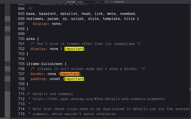
- Yes, browsers defaults are often important
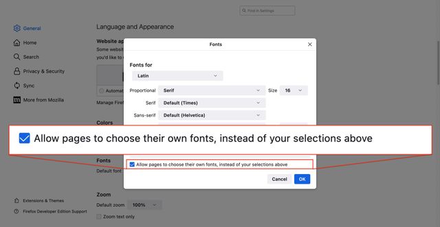
!important behavior- And users can set important styles
- Using CSS in Safari
- Or a checkbox in the Firefox settings
The purpose of… ❗Importance
- Importance doesn’t change specificity
- It changes the origins
- And the priority of origins
- The purpose…
Authors 👎🏼 Specificity Wars
With our own colleagues and libraries
- Is not for fighting each other
- In big teams who can’t agree
- Or angrily trying to override
- Styles we wrote last year
Browsers/Users 👍🏼 Protect Styles
From higher origins breaking important things
- The purpose is for users and browsers
- To protect style from future origins
- Someone that might come along later…

- That’s us
- Importance exists to
- protect our users from what we might do!
Often Isolated
- …
- …
- 🎨 Author Styles
- ❗🎨 Author Important
- ❗…
- ❗…
- But the way our origins (normal and important)
- Are isolated together…

- We start to think
- We’re the center of the universe

- When we’re really just one pale blue dot
- In the solar system of the cascade
- Which rotates around user needs!
- Fair, it’s what we deal with every day
- But we need to have perspective

A Jedi uses the [Cascade] for knowledge and defense, never for attack.
— Yoda (maybe)
Graphic design of unknown content with unknown collaborators, on an infinite and unknowable canvas, across operating systems, interfaces, languages, and writing modes…
— me
- So now we’re not just dealing with
- some extreme unknowns

- Infinite diversity in infinite combinations
There are too many variables to consider. The point of CSS is to make it so you don’t have to worry about them all.
— Keith J Grant, Resilient, Declarative, Contextual
- But the browser is allowed to ignore us
- And the user can override anything we say
- There are two many variables,
- and everything we say is a suggestion…
The point of CSS is to make it so you don’t have to worry about them all.
— Keith J Grant, Resilient, Declarative, Contextual
- But everything we say is also a hint
- Telling the browser something about our intent
CSS is A Declarative Language
- CSS is a declarative language
width: 500px;
- Some declarations seem simple,
- the width of a box
text-wrap: pretty;
- While some are more abstract,
- wrapping text so it looks ‘pretty’
- (whatever that means)
width: 500px;
- But even ‘simple’ declarations contain subtext
- What do we mean by a pixel?
- Should this box get smaller on a screen with higher resolution?
- How should it respond to zooming in and out?

content-box model- Are we setting the width of the content box?
- (so padding and border are added to our width)

border-box model- Or the width of the entire box,
- so padding and border are subtracted to get the content size?
inline-size: 500px;
- Maybe it’s not the
widthwe care about exactly, - that’s just the direction text flows.
- Are we trying to set the length of a line of text?
inline-size: 45em;
- Should it be based on the size of the font?
width: min-content;
width: max-content;
- Or maybe the box should re-size based on the contents inside?
- Their minimum or maximum size?
width: 100%;
width: 90vw;
width: 80cqi;
- Or based on context
- a parent element, viewport, or container
width: min(45em, 100%);
- Or some combination
- Like the minimum, of two values
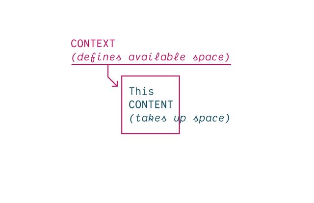
- Everything in CSS based on
- constant back-and-forth
- context pushing in,
- (defining available space)
- content pushing out
- (taking up space)

- How do we ensure
- Our content will fit
- any container we put it in?
width: auto;
- We don’t have all the information, but the browser does
- So the most useful tools in CSS
- express this kind of abstract behavior
- let the browser work out details

A and B are both #787878- Like all design choices
- Our styles are contextual
- Properties often behave differently
- or not at all, depending on other properties
CSS properties Are Never Pure Functions
- As a result, CSS features tend to be intertwined
- Behavior is never isolated,
- And everything has side-effects
- We’re not doing functional programming,
Expressive Like Poetry
- What we do is more expressive, like poetry
- Not describing the page in step-by-step detail
- but communicating high-level ideas through subtext
- Not just the result we want
- But the intent behind each choice
Subtext…
16px != 1em
- Units are great at this
- (it’s why CSS has so many of them)
- On the surface
1emis sometimes16px - But they carry different implications
- And adapt differently in context
In CSS…
flex != grid
- Similar with layout methods
- We can sometimes get the same result
- using either flexbox or grid
- But they move differently at the edges,

- And our job, the entire reason we’re here
- Is not to make things look good on one device,
- Or in a single browser
- But to design for change
- And the only way we get there…
The fact we can control a paper page is really a limitation of that medium.
— John Allsopp, A Dao of Web Design
- Is by letting go of control…
- While expressing ourselves clearly
- Providing hints and suggestions
- Which the browser can adapt…

- to handle new and unexpected situations
To me, this meme perfectly captures what is actually awesome about CSS – and how we can go wrong by taking too much control without considering the consequences. So how can we lighten our grip here?
[demo] change to use intrinsic sizes
It takes craft to set up the circumstances that are simple and yet contain the ambiguities and the incongruity of human experience.
— Anne Bogart
- This is our job as designers, design engineers
- Not forcing everyone into a singular experience
- But setting up the circumstances for communication
- In an unpredictable world,
- adapting to the incongruities of human experience

- We’re not alone on this platform
- and everything about CSS
- is built around that political vision
Always put user needs above all.
- Respect the user
Content should be viewable and accessible by default.
— W3C, Platform Design Principles
- Protect the content
First Do No Harm
- Do no harm