Cmd/Ctr-K for Controls
Poll… Do You Use CSS Grid?
- ✅ regularly
- ⚠️ sometimes
- ❌ rarely
IM(H)O… The Best of CSS 🏆
- Flexbox and grid are both excellent
- I use them all the time, for different things
- But grid may be my favorite tool in CSS

- Ethan Marcotte coined the term RWD in 2010
- He didn’t invent the idea, but he named it
- And documented the approach,
scss…
.grid-span {
  width: percentage( /* 23.7288136% */
    ((3 * 4em) + (2 * 1em)) / ((12 * 4em) + (11 * 1em))
  );
  margin-right: percentage( /* 01.6949153% */
    1em / ((12 * 4em) + (11 * 1em))
  );
  padding-left: percentage( /* 08.4745763% */
    ((1 * 4em) + (1 * 1em)) / ((12 * 4em) + (11 * 1em))
  );
}- Which is a lot of work to get right,
- We have to remove all intrinsic sizing
- And then careful math to replace all lengths with percentages
- Everything is explicit, and fluid, and heavy on the math
- Watch out for sub-pixel rounding!
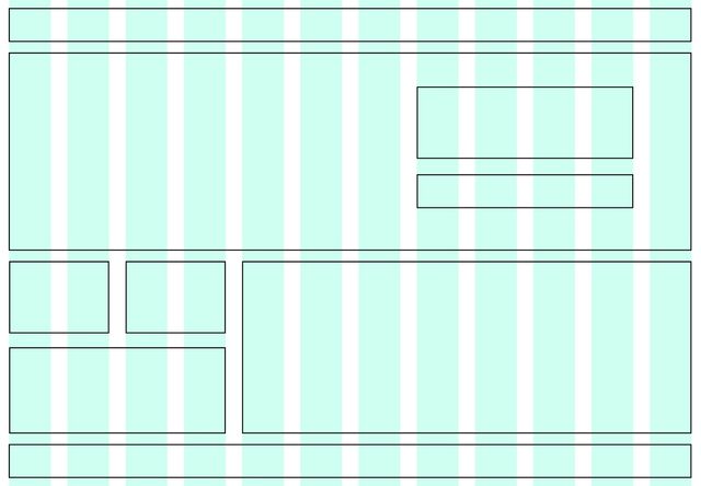
- After all that work
- We get something like 12 equal columns
- with alignment on a single axis
- explicit breakpoints,
- and no intrinsic sizing.
2017… CSS Grid
- But then CSS Grid lands in 2017
- Flexbox has already been available for several years
- And it’s time to rethink
- Not the goals of Responsive Design
- But a modern approach…

Intrinsic Web Design
- Truly Two-Dimensional Layouts
- Nested Contexts
- Combine Fluid & Fixed
- Various Stages of Squishiness
- Content Expands & Contracts
- Media (and container) Queries, As Needed
- With truly two-dimensional layouts
- In nested contexts
- (we don’t have to choose between flow, flex, and grid)
- (we can mix and match as needed)
- Combining fluid and fixed and flexible units
- That expand and contract at different stages
- (rather than explicit breakpoints)
- And the whole system can use intrinsic sizing,
- Not always relying on explicit percentages and media queries
- This is really a new era of web layout
- With so much potential!
- Jen Simmons coins a new term for this evolution
- Intrinsic Web Design

- Can we still make static grids,
- With equal-width columns?
- Yes…
css…
display: grid;
grid-template-columns: repeat(12, 1fr);
gap: 1em;- With a couple lines of code, and no math.
- But…
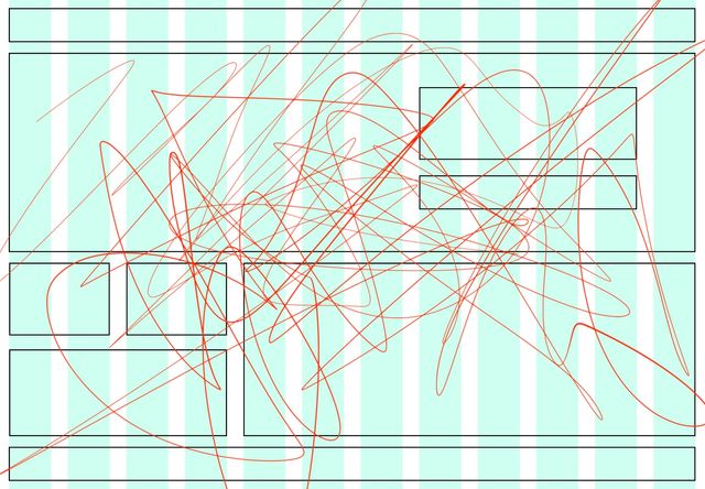
- We can do so much more than that
- But first, let’s understand what a grid is
- Note that ‘the grid’ lives between the container & the items
- A grid can overflow the container
- Items can overflow their grid areas
- We get full flexibility with alignment of content/items on either axis
- In the same way that flexbox is inline-like
- Relying on elements to find their own size
- Grid has a block-like default (
display: grid) - Again, container controls the
gap - By default we get an implicit grid
- Each item takes one cell by default
- New rows are auto-generated as needed
- We get new columns if we start placing things in them
- Everything is ‘auto’ sized, based on content
Implicit grids Generate Tracks As Needed
Explicit item placement… grid-column & grid-row
grid-<axis>-start & grid-<axis>-end
Sizing implicit tracks…
grid-auto-columns
grid-auto-rows
- We can start using implicit grids immediately
- For use-cases like overlapping content (demo)
- But most often we want explicit tracks on at least one axis
- (demo repeating gallery)
Defining Templates
grid-template-columns
grid-template-rows
- We can define a grid template on either axis,
- Column or row tracks…
Defining Templates
grid-template: <rows> / <columns>;
- Or on both at the same time,
- But that template is just the starting point
- Browsers will still add implicit column & row tracks as needed
Implicit & explicit Are Not Exclusive
- These concepts are not exclusive,
- Implicit and explicit tracks can be combined…
- So we can take the same HTML from earlier
- And let’s add some explicit track sizes
- With grid, can coordinate it all from the container
- (Even when using intrinsic sizes)
- That helps us change the layout in one place
Fluid & Fixed 20em 25% 200px
Fluid Until Fixed
minmax(min-content, 1fr)
Fitted…
fit-content(<limit>)
clamp(auto, max-content, <limit>)
Repeating…
repeat(<count>, <tracks>)
Don’t get Lost in Syntax
- Those are the basic concepts
- But there’s so much we can do
- People sometimes get lost in the all the options
- Don’t let that happen!
Essential Use Cases
- Auto-fit for cards & galleries
- Named areas for layout
- Named lines for prose
- Overlapping layouts
- We’ll focus on several essential use-cases
- Which demonstrate different ways of using grids
- If you feel overwhelmed with all the syntax,
- I’d recommend picking one one these that you need,
- And just working that into your projects
auto_-fit_ or -fill, Replacing Media Queries
- We already saw a basic repeating grid
- By making it repeat a specific number of times
- But CSS can do some of that work for us,
- So that we don’t need media queries as often
demo:
- replace media with auto fit & fill
- fixed width vs
minmax(<min>, 1fr) - more flexible small-screen
<min>to avoid overflow - jump from 1 to 3 columns
- Stacy has a great demo taking this even farther
- To create a masonry-like image gallery
Auto-fit for cards & galleries-
Named areas for layout
- Named lines for prose
- Overlapping layouts
- We also created a basic four-part layout
- When we were talking about explicit grids
- But we can improve on that with named grid areas!
demo:
- name the areas
- assign items to areas
- change columns at breakpoint
- We can also adjust the template on the fly
- Using selectors or variables
Auto-fit for cards & galleriesNamed areas for layout-
Named lines for prose
- Overlapping layouts
- It’s not just areas,
- We can also name individual grid lines
Names ↔ Areas
with matching *-start & *-end names
Auto-fit for cards & galleriesNamed areas for layoutNamed lines for prose-
Overlapping layouts
- We can use the interaction between named lines and named areas
- To create more interesting and overlapped layouts
Subgrid
as column or row template
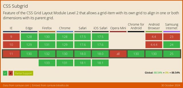
🤔 Nested Contexts ??
Content Expands & Contracts ??

Container queries will never be possible on the web. They would cause infinite layout loops.
— Browsers, a paraphrase (circa 2020)
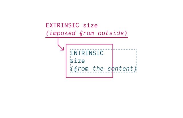
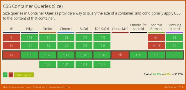

*Some Restrictions Apply
We can’t affect The Container That We Query
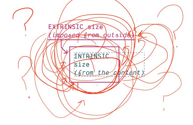
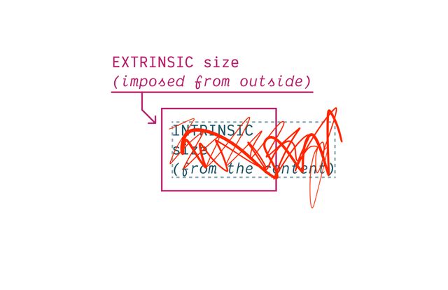
We Need to Turn Off Intrinsic Sizing
CSS Containment
contain: size | layout | style | paint;
Block boxes get their
inline-sizefrom Context (extrinsic).
— me
Block boxes get their
block-sizefrom Content (intrinsic).
— me
👍🏼 Inline-Only Containment
👎🏼 Block-Only Containment
We can only Measure The Axis We Contain
Also need to Contain Layout* & Style
- Containers should no longer apply layout containment!
- Still create ‘formatting context’
- Still contain counters
Contain inline-size
For Most Containers
Contain size
For Scroll Containers
Since… Containment is Invasive
We create Explicit Containers
css…
container-type: inline-size;contain: inline-size layout style;Recommended… Name Your Containers
css…
main {
  container: layout main / inline-size;
}
container-name [/ container-type]?css…
@container layout (min-width: 40em) {
  .conditional { /* … */ }
}

@container main (min-width: 40em) {
  .conditional { /* … */ }
}Finding Containers
- For each matched element…
- Find the nearest ancestor that has…
- Any required container name
- Any required container types
Containers Can’t Self-Query
(That would introduce loops!)
Always Measuring an Ancestor
(can’t change what you measure!)
Always Measuring an Element
Bonus! Container Queries Measure Actual Styles
Grid Tracks & Flex Sizing?
No element to measure…

For legacy reasons… No Default Containers
css…
body > :is(header, main, footer, aside) {
  container: layout / inline-size;
}also… Container Query Units
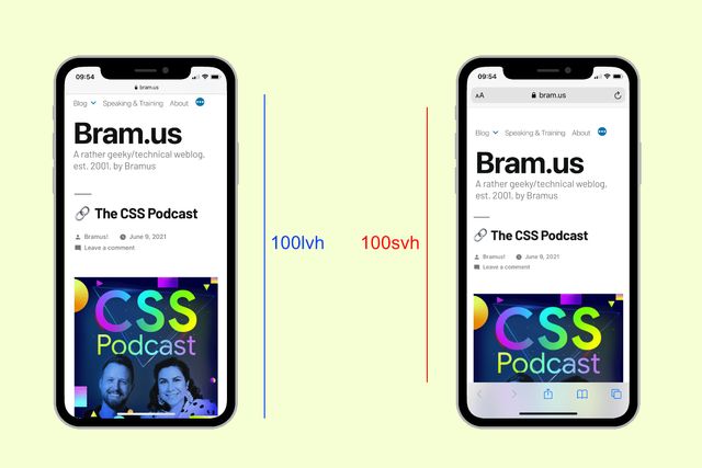
cqw | cqh | cqi | cqb | cqmin | cqmax
Default unit container The Small Viewport

css…
@container style(--colors: invert) { … }Always Queries Direct Parent
Unless you query a specific container-name
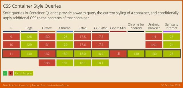
Style Queries… Only Custom Properties*
* for now **
** but maybe forever?
State Queries (???)
css…
@container state(stuck) { … }
@container state(snapped) { … }
@container state(overflowing) { … }Bring this workshop to your company.