Cmd/Ctr-K for Controls
- This week:
- Starting to look at web layout
- How things fit on a page
Design
Unknown Content
On An Unknown Canvas
- And since we often don’t know
- Details about the final page
- Or the exact content inside it
- We have to develop layout systems
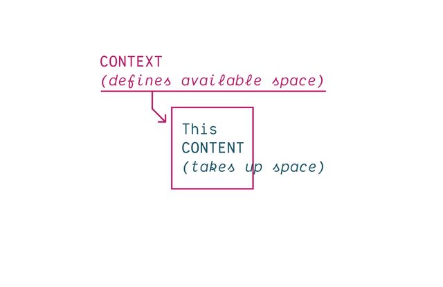
- That can manage this back and forth negotiation
- Between context and content
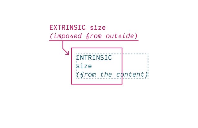
- One pushing in,
- Imposing extrinsic constraints (context)
- The other pushing out,
- An intrinsic size determined by content
- How the two forces ‘flow’ by default
- And how we can manipulate that flow
CSS takes a source document organized as a tree of elements… and text nodes… and renders it onto a canvas such as your screen.
- Starting from a source document (html)
- Organized into a nested ‘tree’
- of Elements & Text Nodes
- Rendered onto…
The document canvas is the infinite surface over which the document is rendered.
- An infinite canvas!

- So… that’s daunting
- But there are some constraints…
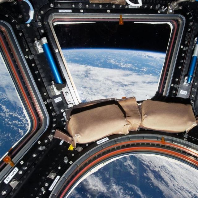
- Browser provides a finite viewport
- The window we look through to see…
- Our document rendered on this 2-dimensional canvas
- Gives us a finite
width/heightto start from - Viewport is kinda like a div, outside our document
- Parent of the root element
- We can’t style (directly)
- Establishes a flow
Elements Generate Boxes
- Every element generates a box by default
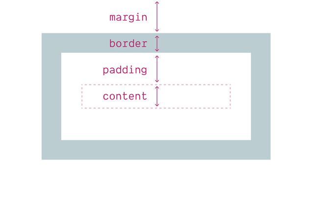
- With four box areas
- (content, border, padding, and margin)
- (B/P/M have their own properties)
- But each of them…
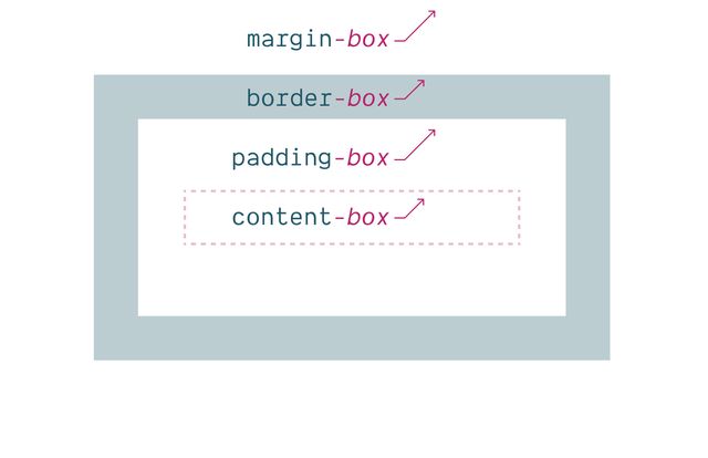
- Has an outer box edge that we can reference
- Using keywords
- In addition to the box properties & keywords…
display property
Box Generation Values
- We can use the
displayproperty - To manipulate box generation…
- Box tree of elements and text nodes
- Each box has four areas: content, padding, border, & margin
- Four edges: content-box, padding-box, border-box, margin-box
- Each box provides a context for nested content to flow
- HTML box is contained by Viewport
Display:none;(head/style) removes box & subtreeDisplay:contents;(figure?) removes boxDisplay:list-item;(li) generates a second::markerboxList-style-positionmoves::markerin or out of primary box
display: none
Removes Box Tree
- Display-none will remove the box
- (and its entire subtree)
- So neither the box or anything inside is rendered.
display: contents
Removes Box (Only)
- Display-contents will remove the box
- But leave the contents in place
- We’ll use this in flex/grid later,
- But there have been some browser bugs…
Historically… ⚠️ Severe A11y Issues
- Originally causing major accessibility issues
- On a range of elements
- Some of that has been fixed in recent releases, but…
Currently avoid… ❌ On Buttons & Tables
- Most browsers still have issues
- If you use this on buttons or tables
- So don’t.
- And moving forward, test
- I find this most useful for adding/removing
- ‘wrapper’
divs when doing layout
display: list-item
Adds Marker Box
- In addition to removing element boxes
- We can add them!
- The
list-itemkeyword - Generates an additional
::markerbox - Which we can move in or out of the principle box
From there… Display Gets Weird
- I don’t know if you’ve noticed,
- As developers, we use display so often it might seem normal
- But display is doing a lot
Inner display context…
Flow, Flex, Grid, Table-*…
Set on the container for a layout
- Some
displayvalues are set on a container element - To describe the ‘inner’ layout they establish for children
- By default, boxes have an inner display of flow
- But we can override that by setting display to
- Flex, or grid, or some form of table display
Outer display behavior
Inline or Block
Set on the elements of a (flow) layout
- But our oldest and most used display values
- Are applied to elements inside a flow container
- And describe how each box should behave in that flow
- we refer to this as the outer display role
- (
inlineorblock) - How does the box participate in the parent flow context around it?
- These values are only relevant inside a flow container
- And completely ignored in every other layout mode
- This is just one way in which
- CSS is modal
demo:
- add content to editable div
- add
widthto editable - add
height - add
display: block - not just
displayof the element itself… - add
body { display: flex; }
Layout modes… Flow, Flex, Grid, Table-*…
- So we have these various layout modes…
By default… Inner Display Flow
- Or inner values of display
- But
flowis the default…
display: block
display: block flow;
inline » inline flow- When we set outer value of display to
blockorinline - That implicitly creates an inner flow context
- There’s no reason we need to be more explicit here
- But we can now.
- We could write
display: block flowin modern browsers.
Inner display…
Flow or Flow-Root
- We can also use these values on their own now
- If we want to be more explicit about
- setting display to
floworflow-root - We’ll see the difference in a bit
display: flow
display: block flow;
flex » block flex- These also expand into two values, going the other way
- When we only set an inner display
- like
floworflexorgrid - The implied outer value is
block - Display
gridis the same asdisplay: block grid
Can I use… Multi-Value Display
- You can click through for browser support details
- But this way of writing multi-value display
- Has been available in all browsers since last summer
Fine to Use Single-Values
- It will come up again
- Because it helps clarify what
displayactually does - But there’s no reason you need to start using it in production
Let’s Talk Flow
- So let’s talk about flow layout
- We might not even think of this as a layout method
- Because it’s just… the default.
- This is just the way text documents work…
- In flow layout,
- Words and phrase expand and stack to create lines
- We call that the inline axis
- When lines of text wrap, we get blocks of content
- The direction that lines expand is the inline axis
- For languages like English, that’s the horizontal axis (or width)
- The direction lines stack up is the block axis
- For English, that’s the vertical axis (or height)
- These are the ‘flow-relative’ or ‘logical’ dimensions
- Similar to the physical dimensions (width and height)
- But depending on…
writing mode
[demo link]- …The writing mode and language
- Some languages are written in vertical lines
- So then the
inline-sizeis the height - And the
block-sizeis the width - Text also has…
direction
[demo link]- …a direction of flow,
- A right-to-left language (like Arabic)
- Is horizontal, top to bottom, like English
- But the direction is reversed, right to left
- So we get two logical axis, with logical dimensions
- And also four logical sides
- Instead of
top,right,bottom, andleft(fixed in place) - We can refer to
block-start,block-end,inline-start,inline-end - Based on writing mode and direction
Logical Properties…
(in English, for example…)
width->inline-sizeheight->block-sizetop->block-startbottom->block-endleft->inline-startright->inline-end
- We can start to replace our old habits & code
- Replacing properties like
margin-rightwithmargin-inline-end - Or the equivalent, depending on our context
- This allows us to…
- Design interfaces that re-orient efficiently
- When we provide page translations, or the browser does it for us!
- I’d argue that most design decisions are flow-based
- With only a few exceptions (like shadows)
- As always, CSS is expressive
- Best to say what you mean
- While some of the logical props have longer names
- We also get handy
blockandinlineshorthands for some - e.g.
margin-block,padding-inline,border-block, etc - I use these all the time!
css…
input {
  margin-inline-end: 1em;
  margin-right: 0;
}0px if they are the same side- Note that these properties cascade separately
- We don’t know until if they will conflict
- Until we resolve the writing mode and direction
- If they do conflict (apply to the same side)
- We compare cascade priority again
- Compute both to the same value
- If we tried inheriting
margin-inline-endhere - We would get
0, the margin-right value - (because it was defined second)
Outer (flow) display… Inline or Block
- While some of those logical properties are new - The terms
inlineandblockgo all the way back to the start
- Inline elements expand & stack on the inline axis
- Forming lines of content
- A combination of text and inline boxes
- Box length intrinsic from contents (intrinsic)
- Box height determined by
emsize - (doesn’t change adding more content)
- Explicit box sizes don’t apply
- Border/padding/margins applied, but
- Contribute to inline layout only
- Line length limited by parent (extrinsic)
- Content fragments across new lines at container edge
- Blocks expand and stack on the block axis
- Block-size from content (intrinsic)
- Inline-size from external context (extrinsic)
- Contribute padding/margins on both axis
- Adjacent margins collapse
- Can be explicitly sized (intrinsic or extrinsic)
The name tells us… Which Axis Expands
- So the name of each (inline or block)
- tells us which way it expands when adding new content
- And while both part of the same flow layout system,
- These two flow types don’t ever flow together as siblings
- If we try to mix them, side by side, they separate,
- Like oil and water
- The inline elements get wrapped in anonymous block boxes
- Meaning boxes we cant see or select
Flow includes…
- Inline Boxes doing Inline Layout
- Block Boxes doing Block Layout
Everywhere else… Elements are Block-ified
- Elements in any other layout are blockified
- The details are different
- between flexbox, grid, tables, or absolute positioning
- (even floated elements are blockified)
- But generally anything in one of those layouts
- Will generate a new formatting context (like flow-root does)
- And act like a block of content…
css…
.flex > span {
  inline-size: 50%;
}% and other ‘relative’ units)Intrinsic Size Keywords
min-content |max-content | fit-content
- Have access to intrinsic sizing keywords
- Min-content, max-content, and fit-content
Flow Is ‘Normal’
- Flow is so ‘default’ we don’t see it as ‘layout’
- This is just ‘how text works’
- And the underlying boxes tend to disappear
- Margins collapse to give us reasonable spacing
- And floats ‘flow’ through neighboring boxes
- Pushing inline-content to one side
- But sometimes we want to break our flow…
Now… Display: Flow-Root
“A mini layout in your layout”…
- Into discrete sections with margins and floats contained
- Historically, we solved this with a ‘clearfix’ to ‘clear floats’
- Or
overflow: hidden;to trigger a…
Flow-Root Block Formatting Context
- Block formatting context
- (maybe some of you remember hacks to trigger
hasLayoutin IE) - Now we can be more explicit
- Establishing not just a new flow
- But a new flow-root, an isolated flow!
display: flow-root
display: block flow-root;
grid » block grid- We mentioned that setting an inner display
- (Like
flow-rootorgrid) - Will have a default outer display of
block
Inline Layout Variants
inline-flex, inline-grid, inline-block
- That’s why we also inline variants for many of them
- They act like inline elements
- But they contain tiny layouts inside
- And now we’re allowed to set their size if we want to
- But that last one is weird, right?
- Inline and block are both
inline-flex➡️inline flexinline-grid➡️inline gridinline-block➡️inline flow-root
- We can set any of these using the two-value display
- (Or keep using the older combined keywords
- There’s no particular reason to switch)
- If we could rename
inline-blocknow - That should really be called
inline flow-root - To match the two-value version
Inline element Block Formatting Context
- We can also think of it as an inline element
- That generates a block formatting context
Flow Is ‘Normal’
- While flow is so ‘normal’ we don’t see it as ‘layout’…
Flex and Grid Designed For Layout
- Flexbox and grid are explicitly designed
- To help us move content around on the page
- And provide visual structure
- They have very different approaches to that,
- But both rely on a third concept…
Box Alignment
distributing extra space
- Box alignment
- Proposed/implemented along side flexbox, also works in grid
- Often considered ‘part of’ these layout methods
- But that was never the intent
- The spec also describes how it should work in
- ‘block’ and ‘absolute positioned’ layouts
- And now browsers are starting to add that support!
- Absolute position maybe the simplest to see
- Just moving one element around in the positioning context
- Alignment helps us place an element in relation to extra space
Place Self
Block axis comes first
- Place self is the shorthand
- An item setting it’s own alignment
- Block axis comes first (always for logical props)
Shorthand for… Align-Self & Justify-Self
Which axis are we manipulating?
- We can target each axis individually
justify-*props apply to the ‘inline’ axis- (Think about justifying paragraphs)
align-*props apply to the ‘block’ axis- (Think about aligning text and icons)
- (This assignment changes based on flex-direction)
Fill space
With stretch
Set position
start | center | end
- We can position boxes on either axis
- To the start, center, or end
- Based on the writing mode of the container
- That way they always match, even if…
Set position
self-* | flex-*
- Rarely, we might have nested writing modes
- (Different on container and items)
- We can change which one we’re aligning based on
- With self-start & self-end (for items own writing mode)
- Or flex-start & flex-end (for the flex direction)
- Sometimes alignment can move overflow to scroll start
- Dangerous, because we can’t scroll before the start
safe‘clamps’ alignment at the start- Don’t want to lose content
Details differ Across Layout Contexts
- From here, details differ a bit
- Depending on the layout mode
- Which we’ll see as we dig in,
- Starting with flexbox…
display: flex Content Sharing Space
- Similar to ‘normal flow’ layout
- Flexbox is highly content-driven approach
- But with more options for alignment
Not intrinsic or extrinsic, but… Flexible Sizing
- And more flexible boxes
- We’re not just working with intrinsic and extrinsic sizes
- But boxes that shrink & grow in different ways
- based on the size of their siblings!
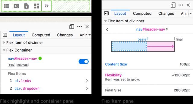
- We’ll be using the Firefox flex inspector for this
- I don’t know why it’s only in Firefox
- It’s such a useful tool!
- In many ways, Flexbox is inline-ish layout
- Items flow along a primary axis, forming ‘flex lines’
- That optionally wrapping at the edge of the container
- We often use it on inline elements, like navigation links
- Control
-directionand-wrap(or-flow) - Add gutters with
gapon container
- Now we also have more box alignment options
- Items can still align themselves
- But we can
align-itemson the flexbox container - And it will apply as default on all items (until we override)
- We can still use
place-oralign- - Individual items have no space to
justify-in relation to - But the entire layout does! It is not the container.
- We can move the entire layout around with
place-content - Distribute:
space-between|-around|-evenly
place-self to
Move Individual Items
Explicit on each element
place-items to
Move All Items
A default from the container
place-content to
Move Entire Layout
Content distribution
space-between | -around | -evenly
- It’s worth noting that
align-content - Is now supported on block elements in normal flow
- But only on the block axis (inline possible other ways)
- And not the distribution values
Default align-self…
From Container Align-Items
(each item can still align-self to override)
css…
.defaults {
  flex-basis: auto; /* starting width */
  flex-shrink: 1; /* distribution factor */
  flex-grow: 0; /* distribution factor */
}- We also control how the item boxes flex
- When there is extra space,
- or not enough space
- There are three underlying controls: basis, shrink, and grow
- By default, starting from their
autocontent size - All items shrink equally (factor of 1)
- Don’t grow at all (factor of 0)
Four flex
Shorthand Values
initial | auto | none | <grow>
- Often don’t need that level of detail
- Four shorthands to cover most common cases
Initial
Shrink, If Necessary
Same as 0 1 auto
- Initial, the default
- Same as basis auto, no growth, shrink as needed
- Great for distribution around/between elements
Auto
Shrink or Grow
Same as 1 1 auto
- Auto, to distribute space into elements
- Adds the ability for them to grow into extra space
None
Don’t Flex
Same as 0 0 auto
- None, still auto-sizing
- But no flexibility
<number>
Share Space Equally
Same as <number> 1 0
- A single number, setting growth
- Fully flexible, with no content basis
- initial
- auto
- none
<grow>
Generally… I Avoid Flex-Basis
Not a strict rule, just a hint!
- Generally I avoid explicit flex-basis
- Not because it’s bad to use, go for it!
- But if I want more control over explicit sizes…
I probably Want Grid Instead
- I probably want grid instead
- Probably! Not always.
- This is not a strict rule,
- There’s nothing wrong with flex-basis
flexbox is For Sharing Space
grid is For Imposing Structure
flex & grid… Better Together
- And they go great together
- We can nest either inside the other
- To get powerful results!
- These were always meant to be a pair
- We’ll look at grids tomorrow
Bring this workshop to your company.