Cmd/Ctr-K for Controls
- We’ve talked about the ordered list
- or cascade of style sheets
- And the way this…
css…
button          { background: gray; }
.action         { background: darkBlue; }
[type=“submit”] { background: darkGreen;
                  background: var(--submit, black); }
#send { background: maroon; }- Inevitably leads to conflicts
- And often, as developers,
- We might think of those as being selector conflicts
- But from the browser perspective,
- It’s the individual declarations that we’re looking at
- The selector is a bit of metadata attached to that declaration
For Browsers…
Every CSS Property
On Every HTML Element,
Must Have a Single Value
- Before a browser can render the page
- Every CSS property
- on every HTML element
- must have a single value
596 Distinct Property Names
* including Editor’s Draft proposals
- There’s 500-some properties
- And every one of them needs a value
- In order to render the element
Every <button> Needs
One Background-Color
& One Text Color
& One Border-Top-Left-Radius
& …
- Every button needs
- one text
color, - one
border-top-left-radius, - and so on
The Cascade (Process) Resolves Conflicts
removes extra values
- What we call ‘the cascade’ now
- is a browser process, an algorithm
- merging our list of stylesheets
- (‘cascading’ them together)
- and resolving any conflicts between declarations
- That process ensures we don’t have extra values
Inheritance… Provides Dynamic Defaults
fills in missing values
- And then inheritance helps
- Fill in some of the missing values
- We’re not going to set all 500-some properties on every element!
- So good defaults are essential,
- (we’ve already seen some of that)
- But there’s a whole separate step for it…
- Filtering
- Cascading (includes specificity)
- Defaulting (includes inheritance)
- Resolving
- Formatting
- Constraining
- After the cascade has finished.
- Both are steps in a larger process called value resolution
- Or value processing…
- Filtering (
0+declared values) - Cascading (
0|1cascaded value) - Defaulting (
1specified value) - Resolving (
1computed value) - Formatting (
1used value) - Constraining (
1actual value)
- Where each step gets us closer
- to that actual rendered style on the page
- Filtering to get all the relevant declarations
- for a specific property on a specific element,
- Cascading to resolve any conflicts between those declarations
- Defaulting to fill in anything that wasn’t declared explicitly
- And then several steps that help us resolve contextual & automatic values
Cascade & Inheritance Internal Browser Algorithms
- On the one hand,
- This is all internal logic, right?
- Just an algorithm that browsers use…
- to thunder-dome our declarations
- And find a winner

- Almost like the laws of physics…
- A way of describing the universe around us,
- The way the world works.
- That’s all true, but also…

- tools provided to us, intentionally
- part of the language,
- designed for us to communicate…
Express… Purpose & Priority
- At each step we get tools
- to help us express purpose and priority
- Of our hints and suggestions.
-
Filtering
- Cascading
- Defaulting
- Resolving
- Formatting
- Constraining
- That starts with filtering our stylesheets
- To get all the relevant declarations
- for a given property on a specific element
A Relevant Declaration…
(Read it from the specification)
- In a stylesheet that applies to this document
- (media attr)
- Not in a false conditional rule
- (at-rules - media, supports, preferences, etc)
- In a selector that matches the HTML Element
- Is syntactically valid
- Invalid CSS (like HTML) is discarded/ignored
- Called ‘parse time’ validation
- Not everything can be validated at this point
- Useful, because we catch issues early
- Before we discard other declarations
css…
.short { border: thin double; }
.long {
  border-top: thin double;
  border-left: thin double;
  border-bottom: thin double;
  border-right: thin double;
  border-image: none;
}- This is also when we expand shorthand properties
- Elements don’t have a border property
- They have four border properties, and a
border-image Borderis shorthand for setting all of them
css…
.short { border: thin double; }
.long {
  /* declared */
  border-top-width: thin;
  border-top-style: double;

  /* reset to 'initial' value */
  border-top-color: currentColor;
  border-image: none;
}- Four sides are also shorthand, including
- The
width,style, andcolorof each - Shorthands also reset the un-specified values
- Initial value of border-color is
currentColor - (We’ve set that implicitly)
- Also
border-imagewhich is reset-only here
To start over Use Shorthand Properties
- Shorthands are great for starting over
- Reset everything
- Build from the ground up
- But they’re risky if…
To adjust details Use Longhand Properties
- You just want to make small adjustments
- Long-hand properties are more precise
- And leave everything else intact
Filtering(list of declared values)-
Cascading
- Defaulting
- Resolving
- Formatting
- Constraining
- Once we have our list of declared values for a property
- We know what conflicts exists
- And we can use the cascade to resolve those conflicts

- Cascade works like a coin sorter
- Instead of measuring the size of a coin
- Measuring the priority of each declaration
- See which ones make it farthest
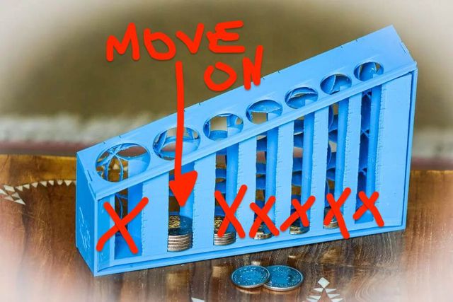
- All we care about is the coins that made it the furthest
- We can ignore any empty columns
- And discard coins that didn’t make it quite as far
- Those are gone from memory now!
- But we still don’t have a single winner

- So we find another coin sorter, and we do it again
- Over and over, until we have a single coin
- Each time comparing different features
- Not just size, but shape, width, metal, whatever
- Ok, but not coins -
css…
property: value;- We’re talking about declarations here…
- And there are seven ‘coin sorters’ that we’ll use
- 7 Questions we can ask to compare and discard declarations
- Until we have a single winner
- Starting with origins & importance, which we’ve discussed
- Who requested it, and how much do they care?
- And we’ve talked about the final step,
- Order of appearance, which was declared ‘last’ in the code?
- Along the way, we also ask:
- Does it come from the shadow DOM? (context)
- Is it an inline style? (element attached)
- What layer is it in? (cascade layers)
- How specific is the selector? (specificity!)
- (maybe) How close is the scope root? (proximity, new)
❗Important Styles Always Win
- Importance could be split out at the top
- Important styles always win
- Over normal, non-important styles

- But that would miss the point
- This is about collaboration
- And importance is here to help us…

- Balance the power of the various origins…
- 🖥 User Agent Defaults
- 👥 User Preferences
- 🎨 Author Styles
- ❗🎨 Author Important
- ❗👥 User Important
- ❗🖥 User Agent Important
- So we can override user defaults
- But users can also protect the defaults
- That are most important to them
- We’ll see this importance-reversal behavior again
- in other steps of the cascade
- But technically there are several other origins…
For Intermediate Styles
in transitions and animations
- Officially two
- For ‘intermediate’ or interpolated styles
- Generated by animations & transitions
hotPink
»
teal
- Take two colors (HotPink to Teal)
- If we want to move between them,
- The browser has to go through other colors…
hotPink
rgb(93 138 220)
?!
teal
- (Depending on the color space we use)
- Maybe we go through this bluish color
- Along the way, that has to _override_both
hotPinkandteal
css…
button {
  background: teal;
  transition: background 1s;
}
button:hover { background: hotPink !important; }- For transitions,
- The start and end values might come from any origin,
- With any importance
- The transition isn’t applied until after the cascade
- So we’ve all had our say
- We agree on the end points,
- And we agree on transitioning between them
- 🖥 User Agent Defaults
- 👥 User Preferences
- 🎨 Author Styles
- ❗🎨 Author Important
- ❗👥 User Important
- ❗🖥 User Agent Important
- ➡️ Transitions
- So the intermediate values have to override everything
- Transitions are the most powerful ‘cascade origin’
css…
:target { animation: bg-change 3s ease-in both; }
@keyframes bg-change {
  from { background: pink; }
  to { background: cyan; }
}- Animations are a little different
- Only the
animationproperty is in the cascade - But keyframe declarations live outside the cascade
!important keyframes [present, debug]- Importance isn’t allowed in keyframes
- will cause the declaration to be ignored
- 🖥 User Agent Defaults
- 👥 User Preferences
- 🎨 Author Styles
- 🏇🏽 Animations
- ❗🎨 Author Important
- ❗👥 User Important
- ❗🖥 User Agent Important
- ➡️ Transitions
- So we still need a way to override specific parts of an animation
- By slotting animated values just above the normal origins
- Important styles become immune animation
👍🏼 Transition ❗Important Styles
👎🏼 Animate ❗Important Styles
Just to restate:
- We can transition between important styles
- And those transitional values will override everything else
- But we cannot use keyframe animations to change important styles
- 🖥 User Agent Defaults
- 👥 User Preferences
- 💭 Non-CSS Presentational Hints
- 🎨 Author Styles
- 🏇🏽 Animations
- ❗🎨 Author Important
- ❗👥 User Important
- ❗🖥 User Agent Important
- ➡️ Transitions
- And then there’s one… pseudo-origin?
- For non-CSS presentational hints
html…
<img src="..." width="160px" height="90px" hidden>
<s>strikethrough</s>- This includes presentational HTML attributes like
width, orheight, orhidden- Or the default styles of the strikethrough element
- Since it’s a presentational element, not a semantic one
- They’re a little weird, and in-between,
- so spec doesn’t list them as their own origin,
- But it does treat them like one
- 🖥 User Agent Defaults
- 👥 User Preferences
- 💭 Non-CSS Presentational Hints
- 🎨 Author Styles
- 🏇🏽 Animations
- ❗🎨 Author Important
- ❗👥 User Important
- ❗🖥 User Agent Important
- ➡️ Transitions
- Those non-CSS styles slot in between
- User and authors styles
- There are no ‘important’ presentational hints.
- Although sometimes…
css…
[hidden] { display: none !important; }- There should be one
- Hidden deserves to be important
- And we can make it important in our CSS
- I include this as part of a modern reset in my projects

- Important styles always win,
- But they also split us into two paths
- An important mirror universe…
- We’ve seen that impact origins, reversing their priority
- But they have a similar effect on several other steps as well
- Including the next one,’
🌗 (Shadow) Context
styling web components
- Which is called
Contextin the cascade - It’s like a sub-‘origin’, but for shadow DOM styles
- Styles that come from the shadow DOM
css…
/* shadow DOM styles */
:host(my-element) { outline: thin solid red; }
[part=title] { outline: thin dashed red; }
::slotted(span) { outline: thin dotted red; }

/* light DOM styles */
my-element { outline: thick solid green; }
my-element::part(title) { outline: thick dashed green; }
my-element > span { outline: thick dotted green; }- Since we generally can’t select Shadow DOM elements
- From outside the shadow DOM,
- There are only a few places where these conflicts can happen
- Primarily light-DOM host element, exposed parts, and slotted elements
- I’m not an expert with web components so I might have missed something
- But those are the primary cases I know about
Shadow Styles Are Custom Defaults
similar to user agent origin
- We can think of shadow DOM styles
- As similar to browser defaults, from the user agent origin
- We’re defining ‘custom elements’ and we can give them ‘custom defaults’
- Normal author styles from the page
- will override those default shadow DOM styles
- Unless we add
!importantto protect essential styles, - and then (again) the priority is reversed
- Shadow styles can ‘take back’ priority when necessary
Again… Importance is Defensive
and reverses priority
- Again, importance is defensive
- Allowing component authors to protect essential styles
(demo if needed)
- Element attached (or inline) styles are next
- They’re an exception to our importance reversal
- They work the same on both tracks…
html…
<button style="
  background: mediumVioletRed; /* winner! */
  color: white !important; /* winner! */
  border: thin solid;
">…</button>
css…
button {
  background: white;
  color: teal !important;
  border: thick dashed !important; /* winner! */
}- Important styles can be used to override inline styles
- But when both styles are normal, or both important
- Then inline styles always win
- Remember, each of these steps is resolved
- Before we move on to the next step
- So if a single declaration wins after comparing
- Origin, importance, context, or element attachment,
- Then we never bother with layers or specificity and so on.
Cascade Layers
- Cascade Layers are both new
- Proposed at the end of 2019, but also…
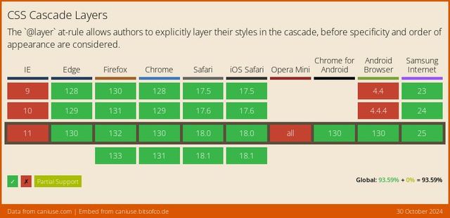
- Well supported across browsers, for almost 3 years now
css…
@layer settings { … }
@layer tools { … }
@layer generic { … }
@layer elements { … }
@layer objects { … }
@layer components { … }
@layer overrides { … }- They give us a way to organize our code
- And help us manage the cascade
- Or maybe more to the point…
Layers of Specificity
- They can help us manage specificity
- Because they come before specificity in the cascade
- So the declaration in the highest layer wins
- Before we bother to compare specificity
- Inside the winning layer
demo:
- Source order is fragile, layers are explicit
- Specificity only matters inside a layer
- Un-layered styles win by default
- Layers stack in order
- Define the order up front
@layer { … }
- A layer rule starts with at-layer
- And then brackets
- We can put any CSS inside those brackets…
@layer <name> { … }
initial, inherit, unset, revert, revert-layer, etc- And we can optionally give our layers a name
- Almost any name we want
- Avoiding a few reserved names
css…
@layer reset {
  audio[controls] { display: block; }
  [hidden] { display: none !important; }
}- And we can put almost anything
- inside each layer block
@import url(…) layer;
@import url(…) layer(<name>);
- We can also import entire stylesheets into a layer,
- Using the keyword (for an anonymous layer)
- Or the layer function if we want to add a name
css…
@layer reset { /* least powerful */ }
@layer default { /* … */ }
@layer theme { /* … */ }
@layer components { /* more powerful */ }
/* unlayered styles: most powerful */- Layers stack in the order they are introduced
- The first layer has the lowest priority,
- Building up to the last layer,
- And then un-layered get highest priority
css…
@layer reset { /* least powerful */ }
@layer components { /* more powerful */ }
@layer reset { /* still least powerful */ }- The great thing about naming layers
- Is that we can reference them again
- And add more styles to them, from anywhere in our document
- The ordering is based on when each layer was first introduced
- So it’s also useful…
@layer <name>, <name>, <etc>;
- To define an explicit layer order up-front
- There’s a shorthand syntax for that
- We can provide a list of names
- Right at the top of our CSS file
html…
<style>/* keep this before linked styles */
@layer reset, framework, components, utilities;
</style>
<link rel="stylesheet" href="…">
<link rel="stylesheet" href="…">- Or even in our HTML,
- Before we import other stylesheets
- There’s a lot more we can do here,
- but we’ll come back to it when we talk about CSS architecture
- and organizing conventions
- The key for today is that…
Like Origins, ❗️important Layers Reverse
- Like origins and context
- Important layers are reversed
- Resets (weakest)
- Themes
- Components
- un-layered (strongest)
- So if we have three layers
- Each one overriding the previous
!important
- And then we add important styles
- Inside each layer
- Resets
- Themes
- Components
- un-layered
- ❗important un-layered
- ❗important Components
- ❗important Themes
- ❗important Resets
- We now have six layer
- With the important layers reversed

- Again, the goal is balance
Protect Styles From Future Layers
Prioritize -> Layers
Protect -> Importance
- If we just want to override
- Or manage priorities
- That’s what layers are for
- Importance only when essential
css…
@layer reset {
  [hidden] { display: none !important; }
}- So when I set the hidden attribute to display none
- And add importance,
- I can put that in my lowest layer,
- I’ll call it the reset layer
- And future, more powerful layers
- won’t be able to override this declaration
- It’s important, and so it’s protected.
- Resets
- Themes
- Components
- un-layered
- Inline Styles
- ❗important un-layered
- ❗important Components
- ❗important Themes
- ❗important Resets
- ❗important Inline Styles
- While we’ve already covered inline styles,
- And they aren’t technically ‘layers’ in the same way
- It can be useful to understand how these two features of the cascade
- Weave together somewhat,
- With inline styles at the top of both
- The normal and important layer order
- Which brings us to the most discussed
- Maybe the most feared and hated part of the cascade…
🎯 Selector Specificity
- Selector specificity
- This is where we compare
- the selectors used for each declaration
css…
* { /* universal */ }
p { /* type */ }
.summary { /* attribute */ }
#call-to-action { /* id */ }- All simple selectors fall into four ‘categories’
- Each with increasing priority in cascade…
css…
* { /* universal */ }- The universal (star) selector
- Alone in its category…
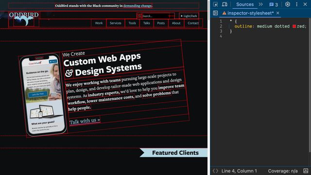
- Selects all HTML elements
- (but not pseudo-elements like before or after)
- We can use this for extremely generic settings
- Across every element on the page
css…
button, div, span {
  /* 'type' (element) */ }
::before, ::after, ::part() {
/* 'pseudo-element' */ }- Element & pseudo-elements
- Are called ‘type’ selectors

- They are much more targeted, but still fairly broad
- And (until recently) not something we could control
- HTML defines what elements we have available to use
- But still, these selectors can us establish
- More customized defaults,
- Similar to user agent styles
css…
.action, .summary {
  /* 'class' */ }
:hover, :user-invalid {
  /* 'pseudo-class' */ }
[type=“submit”] {
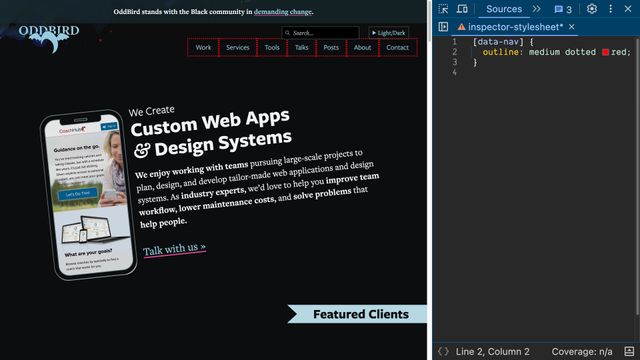
/* 'attribute' */ }- Attribute selectors
- (which include classes and pseudo-classes)
- Select elements based on any attributes or exposed state
- This is where we have the most control & flexibility
- Great for defining reusable patterns
- So they become the backbone of our design systems
css…
#send { /* 'id' */ }- Finally ID selectors
- Valid ID’s are required to be unique on a page

- Should only ever select one element per page
- Extremely targeted/specific styles
css…
h1#page-title { /* … */ }- We can combine these simple parts
- Into compound selectors…
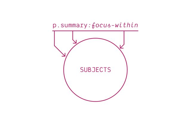
- Where every part referring to the same subject
- Or describe relationships with combinators…
css…
p.summary a:hover { /* descendant */ }
p.summary > a:hover { /* child */ }
p.summary + a:hover { /* next */ }
p.summary ~ a:hover { /* future */ }- To form complex selectors
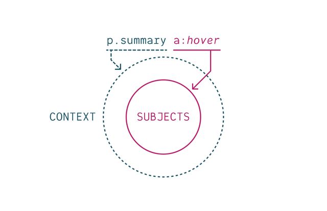
- Where there’s still only one subject (the far right compound)
- But now different parts refer to different elements,
- Providing context.
- This is extremely powerful!
- We can use selectors…
css…
h2:has(> button[aria-expanded="false"]) + div {
  display: none;
}- to express fairly complex ideas
- Read from right to left…
- This selects a
divthat comes after anh2 - (which has a
buttonchild, that is not expanded) - Look at all that information we’re communicating to the browser!
Specificity is a “Heuristic”
- But what we’re worried about now
- Is the specificity of a selector in the cascade
- And for this step the browser uses a heuristic
- a practical assumption
More Explicit Selectors
are Likely
More Important
- That narrowly targeted selectors like IDs
- are likely more important than broad selectors like element types.
- That makes some sense, right?
- One-offs override reusable patterns,
- which override element defaults,
- which override global initial values?
css…
/* 1 IDs, 2 attributes, 2 element type */
/* specificity: 1,2,2 */
form#contact button[type='submit']:active {
  border-color: seaGreen;
}- To compare, we count up how many terms we used in each selector,
- And which category those terms belong to
- Here the
border-colordeclaration has a selector - With 1 ID
- 2 Attributes
- 2 Element types
- A specificity of
1, 2, 2

- The total isn’t what matters
- We again compare the columns one at a time
Like Versioning…
[1,0,2] vs [0,3,2] vs [0,2,3]
vs [0,3,2] vs [0,2,3]- Like software versions
- We can look at the first number
- That might give us a winner already
Move on when tied
[0,3,2] vs [0,2,3]
vs [0,2,3]- We only have to look at the next column (attributes)
- If there’s a tie in the first
Heuristics Are Assumptions
- It’s a good heuristic
- Most of the time
- But heuristics are assumptions, and…
Assumptions Often Fail
Especially “At Scale”
- Assumptions always fail at some point
- So the more code we write,
- (The larger our code base)
- The more likely we are to find those exceptions
When specificity falls short We Need an Escape Hatch
(still meaningful and expressive)
- When that happens, when specificity isn’t enough
- We need an escape hatch
- that’s still meaningful and expressive
- That’s why layers were added to the cascade
- We shouldn’t be afraid of specificity
- We should have tools to manage it
Some Selectors Help Manage Specificity
- There are also some new selectors
- (and old selector tricks)
- That we can use to manage specificity
- Selector-by-selector
css…
#example { /* [1,0,0] */ }
[id="example"] { /* [0,1,0] */ }- ID’s are often used in forms, aria-roles, etc
- But sometimes ID specificity is too much for what we’re trying to do
- Remember that IDs are attributes!
- We can use an attribute selector instead,
- Selecting the same element, with lower specificity
css…
.example { /* [0,1,0] */ }
.example.example.example { /* [0,3,0] */ }- We can also increase the specificity
- Of a class, attribute, or ID by repeating it
- In a compound selectors (all strung together)
- This changes specificity, without changing what we select
:is() and :where()
Select The Same Things
- The
:is()and:where()selectors - Can also be used to manipulate specificity
- They always select the same things
css…
/* (a) AND ALSO (nav .active) */
a:where(nav .active) { color: black; }
a:is(nav .active) { color: black; }- The overlap between what’s outside
- (in this case an anchor tag)
- and what’s inside
- (in this case the
activeclass inside anavelement) - Both parts have to match the same element
css…
/* (h1 a) AND ALSO (main > *) */
h1 a:where(main > *) { color: black; }
h1 a:is(main > *) { color: black; }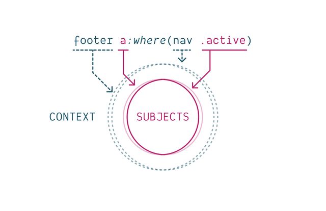
- Both contexts have to be present
- Both subjects have to match
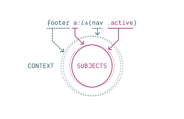
- They select the same elements
:is() and :where()
Can Group Selectors
css…
h1 a:hover, h1 a:focus,
h2 a:hover, h2 a:focus,
h3 a:hover, h3 a:focus,
h4 a:hover, h4 a:focus,
h5 a:hover, h5 a:focus {
  text-decoration: underline;
}css…
:is(h1, h2, h3, h4, h5) a:where(:hover, :focus) {
  text-decoration: underline;
}
:is() and :where()
Also Impact Specificity
:where()
Removes Specificity
css…
/* nav a.active { 0,1,2 } */
nav a:where(.active) { /* 0,0,2 */ }
a:where(nav .active) { /* 0,0,1 */ }
*:where(nav a.active) { /* 0,0,0 */ }
:is() takes
Highest Specificity
css…
:is(a, .b, #c .d) { /* 1,1,0 */ }
a:is(.b, #c .d) { /* 1,1,1 */ }css…
a:where(#logo, .sponsor .logo) {
  /* specificity: 0,0,1 */
}

a:is(#logo, .sponsor .logo) {
  /* specificity: 1,0,1 */
}It doesn’t matter Which Selector Matches!
html…
<a class="sponsor logo">Still 1,0,1</a>css…
a:is(#fakeID, .sponsor .logo) { /* … */ }CSS Nesting
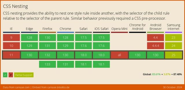
Also relies on :is() selector
css…
header {
  h1 { /* header h1 */ }
  > .title  { /* header > .title */ }
  + p { /* header + p */ }
}css…
header {
  h1 { /* header h1 */ }
  > .title  { /* header > .title */ }
  + p { /* header + p */ }
  body & { /* body header */ }
}css…
.card {
  @media (width > 20em) {
    display: flex;
  }
}css…
ol, ul {
  > p { /* :is(ol, ul) > p */ }
  .sidebar & { /* .sidebar :is(ol, ul) */ }
}:is() under the hoodcss…
/* :is(button, .btn, #my-btn) */
button, .btn, #my-btn {
  &:focus,
  &:hover,
  &:active { /* 1,1,0 */ }
}
While we’re here…
:not() and :has()
:is() & :not() & :has()
Use Same Specificity
Use :not()
For Excluding Elements
(inside matches are removed from outside matches)
css…
/* (p) UNLESS (.warning)  */
p:not(.warning) { /* … */ }
Use :has()
For Selecting Context
(we can move the subject!)
css…
form:has(:focus) { /* form with focus */ }
button:has(svg) { /* button with icon */ }:has() Selectorcss…
form:focus-within { /* form with focus */ }css…
.card:has(> figure:first-child) { /* image card */ }
.card:not(:has(img)) { /* card without image */ }
input:has(+ .error) { /* input followed by error */ }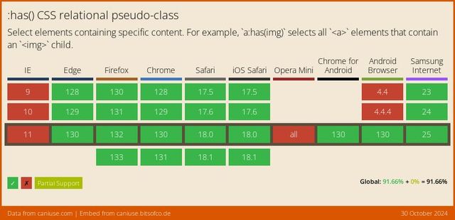
css…
article:has(h1, .title) a {
  color: red;
}

article h1 a {
  color: green;
}- After specificity,
- Another new feature in the cascade
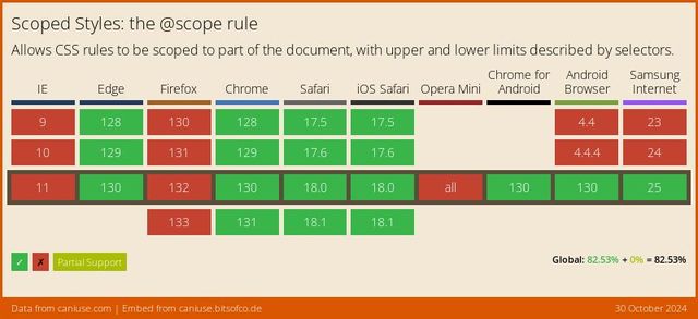
Scope Is New
Rolling out this year!
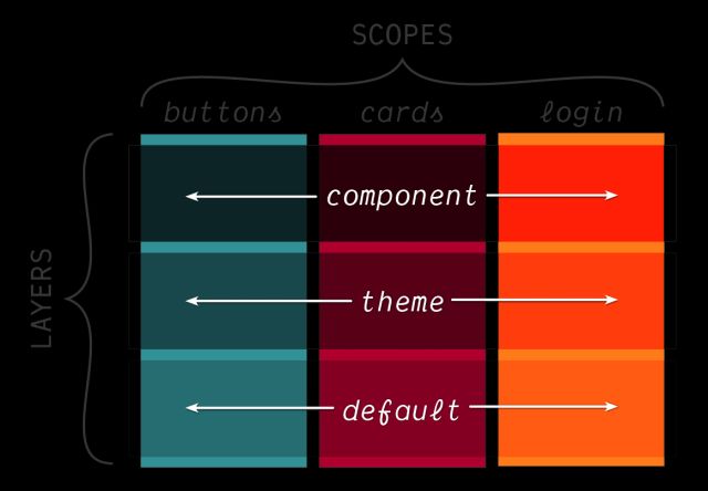
1. Avoid Naming Conflicts
(across large teams & projects)
2. By Expressing Membership
(through lower boundaries & proximity)
Scope Proximity
css…
.light-theme a { color: purple; }
.dark-theme a { color: plum; }
@scope (<root>) { … }
css…
@scope (.light-theme) {
  a { /* similar to simple nesting… */ }
}
@scope (.dark-theme) {
  a { /* but the _closer_ scope root wins… */ }
}Scope Boundaries
css…
.title { /* global */ }
.post .title { /* nested */ }

.post__title { /* BEM */ }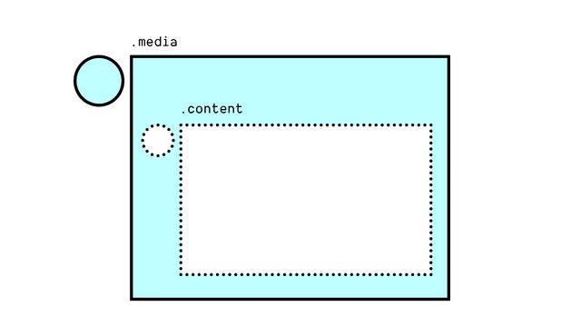
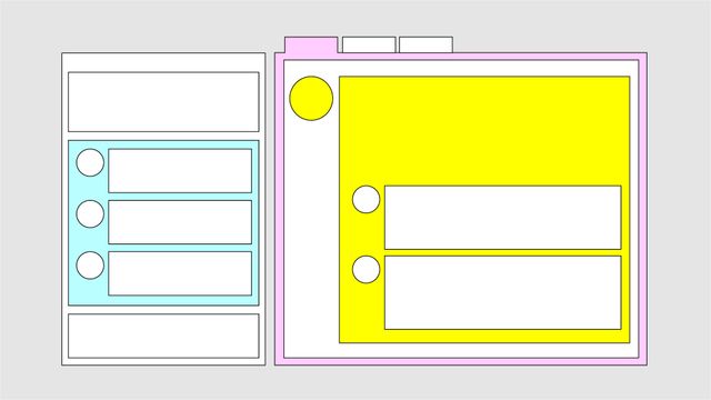
Build-tools Provide Scoped Styles
BEM, CSS Modules, Vue, JSX, Stylable, etc
css…
.post__title { /* BEM */ }
.title[data-JKGHJ] { /* Vue */ }@scope (<root>) to (<boundary>) {…}
css…
@scope (.media) to (.content) {
  img { /* only images that are "in scope" */ }
}Nested <style> Scopes
html…
<article>
  <style scoped>
    p { color: green; }
  </style>
  <p>This paragraph will be green.</p>
</article>

<p>This paragraph won't!</p>html…
<article>
  <style>
    @scope { p { color: green; } }
  </style>
  <p>This paragraph will be green.</p>
</article>

<p>This paragraph won't!</p>Different from CSS Nesting
Scope has… Defined Relationship
Always child or descendant
Scope… Doesn’t Add Specificity
Scope has… Lower Boundaries
css…
@scope (.block-name) to (.block-content) {
  .title { /* only inside the block! */ }
}css…
button {
  &:hover { background: hotPink; }
  &[aria-pressed=true] { border: thick solid teal; }
  @media (width > 30em) { padding-inline: 1em; }
  & + & { border-inline-start: 1ch; }
}Different from Shadow-DOM Encapsulation
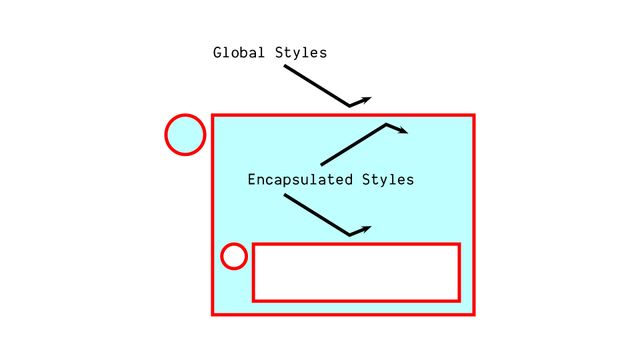
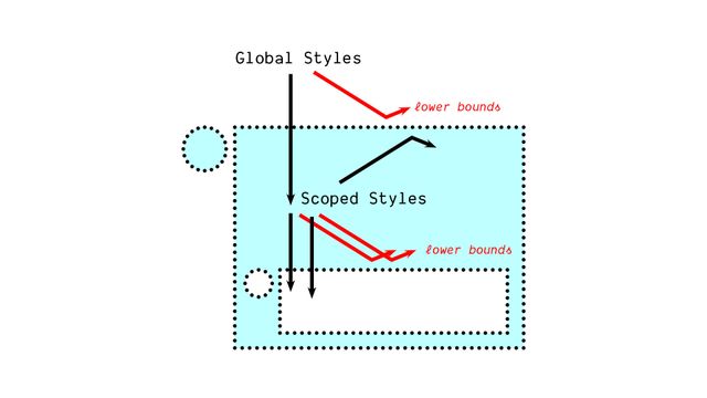
- Scoped styles win
- Shadow styles lose
- The final step in the cascade
Order of Appearance
- Order of appearance
- Guarantees a single answer
css…
button {
  background: red;
  background: oklch(0.5 0.2 0);
}- That will come in handy when we talk about resilience
- Old browsers will discard the new syntax
- at parse time, part of the filtering step before we cascade
- That will allow the well-supported value to win
- But browsers that understand
oklch()color syntax - Will keep that second value around, and it will override the first
And that’s the cascade, in 7 steps…
- Who requested it, and how much do they care?
- Does it come from the shadow DOM?
- Is it an inline style?
- What layer is it in?
- How specific is the selector?
- How close is the scope root?
- And which style was requested ‘last’?
Cascade output…
Single
(possibly empty)
Cascaded Value
for each property of each element
- The input to the cascade
- Was a list of declared values
- (for each property on each element)
- The output now
- Is a single (possibly empty) cascaded value
There are Still Missing Values
- Since some values are potentially empty
- We need a process to fill them in!
- We’ll talk about that tomorrow, along with…
And also… Custom Properties
- Custom Properties (CSS variables)
- Which can play a unique role in that process
- That will start to move us out of theoretical physics
- Into more applied use-cases and demos
The Cascade is Our Most Powerful Feature
- Hopefully (today) a better understanding of cascade…
- What it is, how it works

- Why it exists (to bring balance)
- Where we fit into the larger process

- And ways we can use it
- To write more expressive style rules

- As part of our style collaboration
- With browsers, users,
- and (hopefully) aliens
- The cascade is what makes all of this possible.
Bring this workshop to your company.
