Flow Is ‘Normal’
- Flow is so ‘default’ we don’t see it as ‘layout’
- This is just ‘how text works’
- And the underlying boxes tend to disappear
- Creating a unified ‘document’
Flex and Grid Designed For Layout
- We think of flexbox and grid as being for layout
- helping us move content around a page,
- And providing visual structure
- But they have very different approaches to that,
- And both rely on another concept…
Box Alignment
distributing extra space
- Box alignment
- Proposed/implemented along side flexbox, also works in grid
- Often considered ‘part of’ these layout methods
- But that was never the intent
- The spec also describes how it should work in
- ‘block’ and ‘absolute positioned’ layouts
- And now browsers are starting to add that support!
- Absolute position maybe the simplest to see
- Just moving one element around in the positioning context
- Alignment helps us place an element in relation to extra space
Place Self
Block axis comes first
- Place self is the shorthand
- An item setting it’s own alignment
- Block axis comes first (always for logical props)
Shorthand for… Align-Self & Justify-Self
Which axis are we manipulating?
- We can target each axis individually
justify-*props apply to the ‘inline’ axis- (Think about justifying paragraphs)
align-*props apply to the ‘block’ axis- (Think about aligning text and icons)
- (This assignment changes based on flex-direction)
Fill space
With stretch
Set position
start | center | end
- We can position boxes on either axis
- To the start, center, or end
- Based on the writing mode of the container
- That way they always match, even if…
Set position
self-* | flex-*
- Rarely, we might have nested writing modes
- (Different on container and items)
- We can change which one we’re aligning based on
- With self-start & self-end (for items own writing mode)
- Or flex-start & flex-end (for the flex direction)
- Sometimes alignment can move overflow to scroll start
- Dangerous, because we can’t scroll before the start
safe‘clamps’ alignment at the start- Don’t want to lose content
Details differ Across Layout Contexts
- From here, details differ a bit
- Depending on the layout mode
- Which we’ll see as we dig in,
- Starting with flexbox…
display: flex Content Sharing Space
- Similar to ‘normal flow’ layout
- Flexbox is highly content-driven approach
- But with more options for alignment
- And more… flexible boxes?
- Allowing us to not just move things around in extra space
- But also have items shrink & grow in different ways
- Not just based on content or parent size, but siblings!
- Items flow along a primary axis, forming ‘flex lines’
- Optional line-wrapping at the edge
- Control
-directionand-wrap(or-flow) - Add gutters with
gapon container - Intrinsic sizing, shrink, don’t grow
- Align-self within the line (stretch by default)
- Align-items for container-defined default
- Can’t justify individually (justify to what?)
- Place (align/justify) content!
- Distribution values (between, around, evenly)
On containers… Align-Items as Default
(each item can still align-self to override)
Content distribution
space-between | -around | -evenly
.defaults {
  flex-basis: auto; /* starting width */
  flex-shrink: 1; /* distribution factor */
  flex-grow: 0; /* distribution factor */
}- We also control how the item boxes flex
- When there is extra space,
- or not enough space
- There are three underlying controls: basis, shrink, and grow
- By default, starting from their
autocontent size - All items shrink equally (factor of 1)
- Don’t grow at all (factor of 0)
Four flex
Shorthand Values
initial | auto | none | <grow>
- Often don’t need that level of detail
- Four shorthands to cover most common cases
Initial
Shrink, If Necessary
Same as 0 1 auto
- Initial, the default
- Same as basis auto, no growth, shrink as needed
- Great for distribution around/between elements
Auto
Shrink or Grow
Same as 1 1 auto
- Auto, to distribute space into elements
- Adds the ability for them to grow into extra space
None
Don’t Flex
Same as 0 0 auto
- None, still auto-sizing
- But no flexibility
<number>
Share Space Equally
Same as <number> 1 0
- A single number, setting growth
- Fully flexible, with no content basis
Use the Firefox Flex Inspector
- initial
- auto
- none
<grow>

- Flex values can add up to less than one!
Generally… I Avoid Flex-Basis
Not a strict rule, just a hint!
- Generally I avoid explicit flex-basis
- Not because it’s bad to use, go for it!
- (there are always exceptions!)
- But if I want more control over sizing…
You probably Want Grid Instead
- I probably want grid instead
Poll… Do You Use CSS Grid?
- ✅ regularly
- ⚠️ sometimes
- ❌ rarely
IM(H)O… The Best of CSS 🏆
- Flexbox and grid are both excellent
- I use them all the time, for different things
- But grid may be my favorite tool in CSS
display: grid
Container Defined Layout
- And if you want to create a specific layout
- Instead of letting the content figure it out
- Grid usually the tool for the job
- Can still use intrinsic sizing from items
- But coordinated by rules on the container
- Block-like default
- Container controls the
gap - Auto-repeating gallery
- Add a layout template, grid-areas
- Implicit grid (turn on inspector)
- The ‘grid’ is not the container
- The ‘cell’ is not the item
- Align self (in cells), or content (in container)
- grid-column and grid-row for positioning
- Control implicit tracks with auto
- Positioning w/ start, end, and span
Implicit grids
Generate columns & rows as needed
Sizing implicit tracks…
grid-auto-columns
grid-auto-rows
Explicit item placement… grid-column & grid-row
grid-<axis>-start & grid-<axis>-end- grid-template often the right shorthand
Defining Templates
grid-template: <rows> / <columns>;
Fluid & Fixed 20em 25% 200px
Fluid Until Fixed
minmax(min-content, 1fr)
Fitted…
fit-content(<limit>)
clamp(auto, max-content, <limit>)Names ↔ Areas
with matching *-start & *-end names
Subgrid
as column or row template
So Much More Grid!
- Layout Land videos by Jen Simmons
- Grid by Example from Rachel Andrew
- Winging It LIVE with Stephanie Eckles
- An Interactive Guide to CSS Grid by Josh Comeau
- There’s a lot more to cover
- We would need another full workshop

Jen Simmons… Intrinsic Web Design
- Truly Two-Dimensional Layouts
- Nested Contexts
- Combine Fluid & Fixed
- Various Stages of Squishiness
- Content Expands & Contracts
- Media Queries*, As Needed
- We’re in a new era of web layout
- (read the slide)
🤔 Nested Contexts ??
Content Expands & Contracts ??

Container queries will never be possible on the web. They would cause infinite layout loops.
— Browsers, a paraphrase (circa 2020)
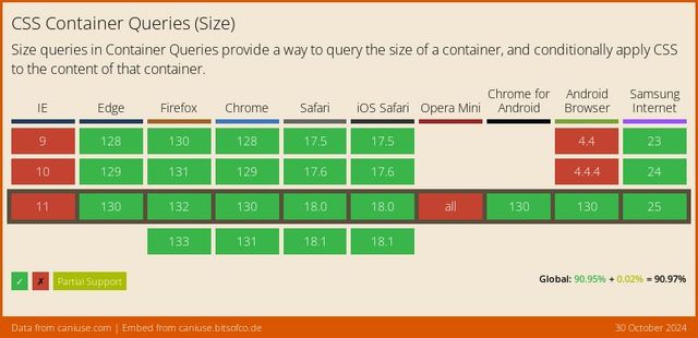

*Some Restrictions Apply
We can’t affect The Container That We Query
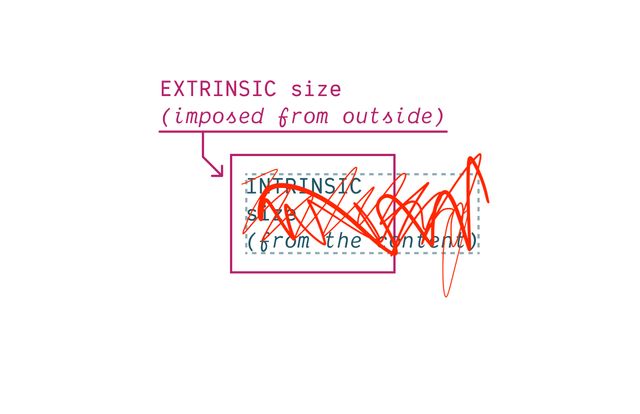
We Need to Turn Off Intrinsic Sizing
CSS Containment
contain: size | layout | style | paint;
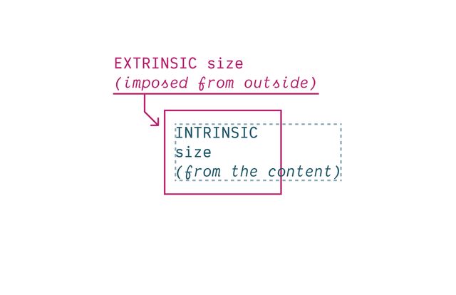
Block boxes get their
inline-sizefrom Context (extrinsic).
— me
Block boxes get their
block-sizefrom Content (intrinsic).
— me
👍🏼 Inline-Only Containment
👎🏼 Block-Only Containment
We can only Measure The Axis We Contain
Contain inline-size
For Most Containers
Contain size
For Scroll Containers
Also need to Contain Layout* & Style
- Containers should no longer apply layout containment!
- Still create ‘formatting context’
- Still contain counters
Since… Containment is Invasive
We create Explicit Containers
container-type: inline-size;contain: inline-size layout style;Recommended… Name Your Containers
main {
  container: layout main / inline-size;
}
container-name [/ container-type]?@container layout (min-width: 40em) {
.conditional { /* … */ }
}
@container main (min-width: 40em) {
.conditional { /* … */ }
}Finding Containers
- For each matched element…
- Find the nearest ancestor that has…
- Any required container name
- Any required container types
Containers Can’t Self-Query
(That would introduce loops!)
Always Measuring an Ancestor
(can’t change what you measure!)
Always Measuring an Element
Bonus! Container Queries Measure Actual Styles
Grid Tracks & Flex Sizing?
No element to measure…

For legacy reasons… No Default Containers
body > :is(header, main, footer, aside) {
  container: layout / inline-size;
}also… Container Query Units
cqw | cqh | cqi | cqb | cqmin | cqmax
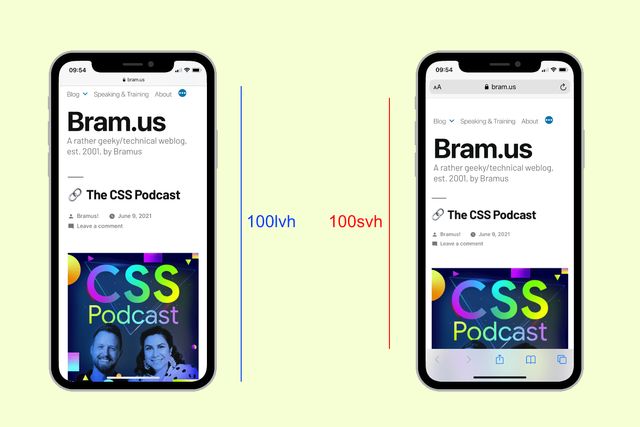
Default unit container The Small Viewport

@container style(--colors: invert) { … }Always Queries Direct Parent
Unless you query a specific container-name
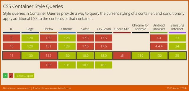
Style Queries… Only Custom Properties*
* for now **
** but maybe forever?
State Queries (???)
@container state(stuck) { … }
@container state(snapped) { … }
@container state(overflowing) { … }