- We’ve talked about our code being suggestions
- Which the browser can ignore
- CSS is like HTML in that way, resilient
- We’ll talk about that more on Thursday
/* a 'declaration' */
width: 500px;- But we also referred to declarations
- As style hints
width: 500px;
- Sometimes they carry
- Seemingly simple concepts
- width of a box
text-wrap: pretty;
- More abstract concepts
- wrapping text so it looks ‘pretty’
- (whatever that means)
width: 500px;
- But even ‘simple’ declarations contain subtext
- What do we mean by a pixel?
- Should this box get smaller on a screen with higher resolution?
- How should it respond to zooming in and out?
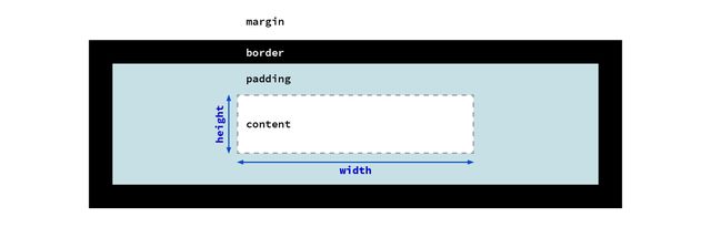
content-box model- Are we setting the width of the content box?
- (so padding and border are added to our width)
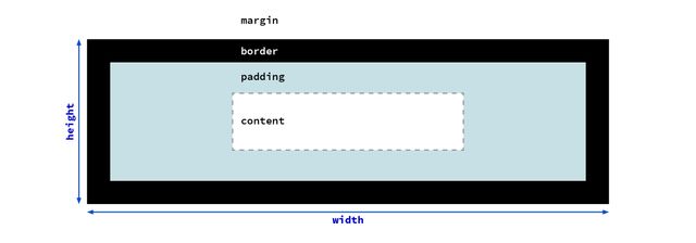
border-box model- Or the width of the entire box,
- so padding and border are subtracted to get the content size?
inline-size: 500px;
- Maybe it’s not the
widthwe care about exactly, - that’s just the direction text flows.
- Are we trying to set the length of a line of text?
inline-size: 45em;
- Should it be based on the size of the font?
width: min-content;
width: max-content;
- Or maybe the box should re-size based on the contents inside?
- Their minimum or maximum size?
width: 100%;
width: 90vw;
width: 80cqi;
- Or based on context
- a parent element, viewport, or container
width: min(45em, 100%);
- Or some combination
- Like the minimum, of two values
Graphic design of unknown content with unknown collaborators, on an infinite and unknowable canvas, across operating systems, interfaces, languages, and writing modes…
— me
There are too many variables to consider. The point of CSS is to make it so you don’t have to worry about them all.
— Keith J Grant, Resilient, Declarative, Contextual
- Too many variables for us to consider one-by-one
- But the browser has all the context
- If we want things to be responsive
- We have to explain ourselves to the browser
- Provide hints about our intent
- That go beyond the specifics
width: auto;
- This is the strength of a declarative language
- Where we specify the behavior we want
- Rather than the steps to achieve that behavior
- We don’t have to plan for all the outcomes, step by step
- most useful tools in CSS
- express somewhat abstract concepts
- let the browser work out details
The fact we can control a paper page is really a limitation of that medium.
— John Allsopp, A Dao of Web Design
- it’s powerful because we’re giving up control
- the browser knows more than we do
It takes craft to set up the circumstances that are simple and yet contain the ambiguities and the incongruity of human experience.
— Anne Bogart
- To quote a book on directing for the theater…
- [quote]
- That’s our job, as UX designers & engineers
- we’re building for human experience
CSS is expressive Like Language
- like language, CSS relies on subtext
- To not just stating the outcome (a box that is
500pxwide) - But also hint at the purpose of that style
- Showing our work, providing an algorithm that results in a style
Like poetry Say More with Less
- And like poetry, those hints
- Will often take us farther
- The more selective we are in our choice of words
- We want to try and say more with fewer constraints
Subtext…
16px != 1em
- Sometimes two words can have the same surface meaning
- But they carry different implications
- In CSS, units are great at this
- (It’s why we have so many)
1emsometimes gives the same result as16px- But they have different meaning
- So they will adapt differently to context
In CSS…
flex != grid
- Similar with layout methods
- We can sometimes get the same result
- using either flexbox or grid (for example)
- but they adapt differently to changes
- We want to consider not just which can achieve a layout,
- But which one carries the right implications
CSS properties Are Not Pure Functions
- As a result, CSS properties tend to be intertwined
- Their behavior isn’t isolated and consistent
- Behave differently depending on other properties
CSS is Modal
Mostly based on formatting contexts
- In most cases, CSS properties are modal
- Some properties behave differently in different modes,
- And some properties only apply in specific modes
- Most obvious with
displayproperties…
demo:
- create
spanwith text & outline - add
width - add
height - add
display: block - not just
displayof the element… - add
body { display: flex; } - remove
display: block - change
widthto be large - add
float - remove
bodydisplayvalue
Layout modes create Formatting Context Flows
- Normal Flow (block/inline)
- Multi-Column (block/inline)
- Grid
- Flex
- Table
- Most of the layout modes in CSS
- Define a sort of ‘flow’
- A way of stacking html elements together,
- So that each element takes the space it needs,
- And pushes the other elements aside
- To avoid overlap
- In CSS, we’re basically always in one of these modes, unless
Pulling elements Out-Of-Flow
- Absolute Positioning (
position: fixed | absolute) - Floats (only in ‘normal flow’)
- An element is explicitly pulled out of the flow
- This is always done element-by-element
- Usually with ‘absolute’ positioning
- (fixed position is considered part of this)
- Or (in normal flow) we can use ‘floats’
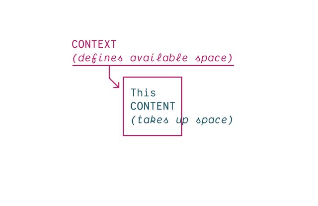
- This push and pull of context and content
- is the fundamental tension of the web
- How do we fit (nested boxes)
- inside an unpredictable container
- starting from the viewport, and working in
- each box defining a new context for descendants
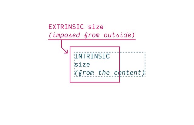
- The container always pushing in, providing limits
- Extrinsic constraints
- The content always pushing out, taking up space
- An intrinsic size determined by whatever’s in there
CSS takes a source document organized as a tree of elements… and text nodes… and renders it onto a canvas such as your screen.
- This is true at every level of the document
- Which is organized into a nested ‘tree’
- of Elements & Text Nodes
- Rendered onto…
The document canvas is the infinite surface over which the document is rendered.
- An infinite canvas!

- But we interact with that canvas…
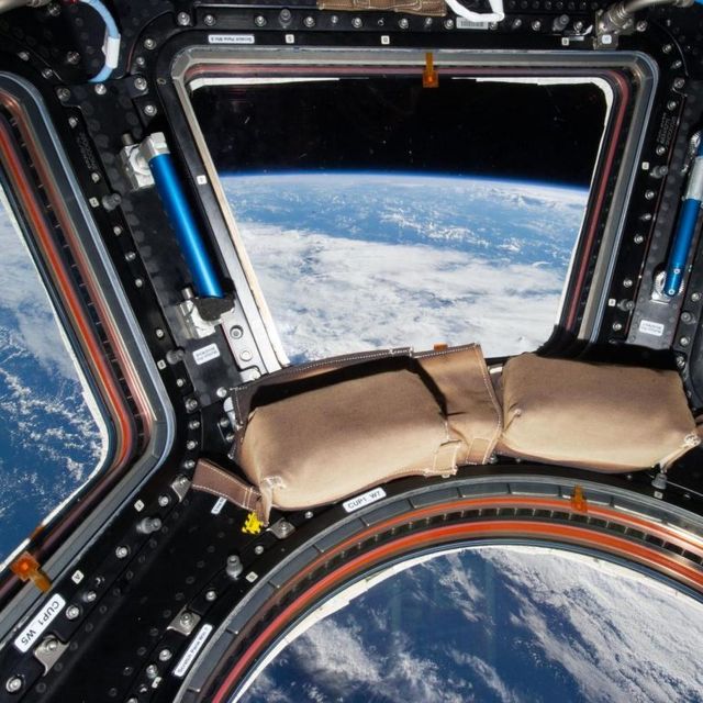
- Through a finite viewport
- Our ‘window’ for viewing a website
- The parent of the root element
- We can’t style (directly)
- Has a finite
width/height

- Provides the initial containing block
- The initial context that we place content into

- It has an extrinsic size, pushing in
- Our content provides expanding boxes
- intrinsic size, pushing out
Historically… Extrinsic Size Units
Including % and other ‘relative’ units
Intrinsic Size Keywords
min-content |max-content | fit-content
- Have access to intrinsic sizing keywords
- Min-content, max-content, and fit-content
box-sizing property…
Selects Box Edge for Sizing
- We can also now select
- The box-edge to size from
* { box-sizing: border-box; }

/* ::before, ::after {
  box-sizing: border-box;
} */- The default is
content-box - (useful for defining containers by the size of content)
- But it’s common to change that default
- With
box-sizing: border-boxon all elements - You can include before & after pseudos if you want
- But I find they don’t usually need it (depends)
- Box tree of elements and text nodes
- Each box has four areas: content, padding, border, & margin
- Four edges: content-box, padding-box, border-box, margin-box
- Each box provides a context for nested content to flow
- HTML box is contained by Viewport
Display:none;(head/style) removes box & subtreeDisplay:contents;(figure?) removes boxDisplay:list-item;(li) generates a second::markerboxList-style-positionmoves::markerin or out of primary box
Elements Generate Boxes
- Every element generates a box by default
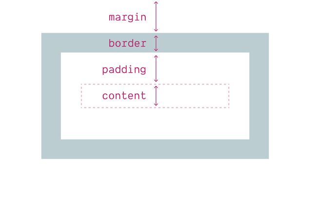
- With four box areas
- (content, border, padding, and margin)
- (B/P/M have their own properties)
- But each of them…
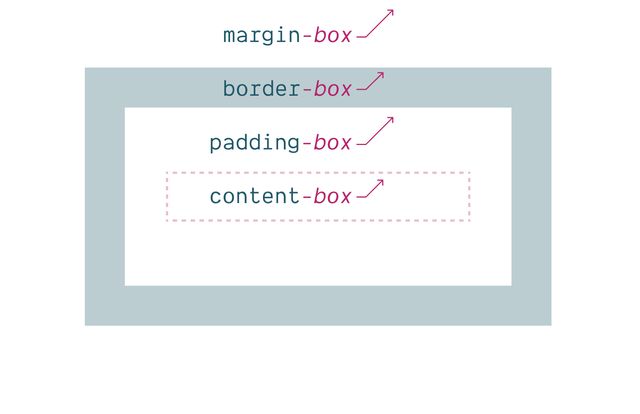
- Has an outer box edge that we can reference
- Using keywords
- In addition to the box properties & keywords…
display property
Box Generation Values
- We can use the
displayproperty - To manipulate box generation…
display: none
Removes Box Tree
- Display-none will remove the box
- (and its entire subtree)
- So neither the box or anything inside is rendered.
display: contents
Removes Box
- Display-contents will remove the box
- But leave the contents in place
- We’ll use this in flex/grid later,
- But there have been some browser bugs…
Historically… ⚠️ Severe A11y Issues
- Originally causing major accessibility issues
- On a range of elements
- Some of that has been fixed in recent releases, but…
Currently avoid… ⚠️ On Buttons & Tables
- Most browsers still have issues on buttons or tables
- So don’t use there
- And always test on semantic elements
- I find this most useful for adding/removing
- ‘wrapper’
divs when doing layout
display: list-item
Adds Marker Box
- In addition to removing element boxes
- We can add them!
- The
list-itemkeyword - Generates an additional
::markerbox - Which we can move in or out of the principle box
Two Outer Display Roles
inline or block
- If we do want a box
- We can also use the
displayprop - To select one of two outer display roles
Inlineorblock- Describe how our box behaves in a
flowlayout - First, inline-boxes and text nodes behave similarly…
- Inline boxes flow & stack together in lines
- We call the direction of that flow
- The ‘inline axis’
- It depends on…
writing mode
[demo link]- …The writing mode of the language
- So the
inlineaxis is not always thewidth - Some languages are written in vertical lines
- So the inline-axis will be the height instead
- But flow doesn’t only have an axis…
direction
[demo link]- …It has a direction,
- Which can also change based on the language
- A right-to-left language (like Arabic)
- will have horizontal lines of text
- But the direction of flow is reversed
- Inline boxes have an intrinsic size
- Determined by the content inside
- Boxes expand (and stack together) ‘in lines’
- When a box reaches a container edge, it will fragment
- Creating a new ‘line’
- Can set
line-height(initialnormalfrom font metrics) - But explicit boxes sizes are ignored
- Contribute border/padding/margins on the inline axis only
participate In Inline Layout
- Inline boxes participate in an
inline layout - And only interact with other inline boxes
- If we mix block and inline boxes together
- we get a block flow with ‘anonymous boxes’ around
- ‘Anonymous’ meaning we have no way to select or style them
- As lines fragment, they stack together on the block axis
- Forming block boxes
- Again the axis and direction of block flow
- Depends on the language and writing mode
- For English, it’s a vertical axis, top to bottom
- But in Korean, Chinese, and Japanese languages
- Where the lines of text can flow vertically
- The resulting blocks would stack horizontally (right to left)
- Take their inline-size from context (extrinsic)
- Always stretch by default
- Take their block-size from content (intrinsic)
- Blocks expand and stack flow on the block axis
- Contribute padding/margins on both axis
- Adjacent margins collapse
- Can be explicitly sized (intrinsic or extrinsic)
Block boxes…
Get block-size
from Content
look down to children…
- Take their block-size from content
- (Intrinsic, look down the tree, child boxes)
Block boxes…
Get inline-size
from Context
look up to parents…
- By default, blocks…
- Take their inline-size from context
- (Extrinsic, look up the tree, parent box)
Participate In Block Layout
- Block boxes always participate in block layout,
- And as we saw earlier
- Will force a block layout when they show up,
- even if that requires extra boxes
- In addition to the physical dimensions
- Block and inline layout help us define two logical dimension
- Based on the flow of text
- English flows in lines from left to right
- And stacks in blocks from top to bottom
- While the physical dimensions are fixed,
- the logical dimensions are based on writing mode
- That also gives us four logical sides
- Top, right, bottom, and left are fixed in place
- But block-start, block-end,
- Inline-start, and inline-end
- Orient us based on writing axis and direction
flow-relative Logical Properties
- There are a few physical situations (eg shadows)
- Most design is relative to flow
- As always, CSS is expressive
- Best to say what you mean
width->inline-sizeheight->block-sizetop->block-startbottom->block-endleft->inline-startright->inline-end
margin-right -> margin-inline-end- For English and other latin writing modes
- We can start to replace our habits & old code
- Reaching for the logical equivalents instead
- A prop like margin-right, margin-inline-end
- It will help if you ever provide page translations
- But also as browsers auto-translate
- Design interfaces that re-orient efficiently
- Without making other changes in CSS
- While some of the long-hands are a bit longer
- We don’t only save time doing multi-lingual sites
- We also get handy block and inline shorthands
- e.g.
margin-block,padding-inline,border-block - I use these all the time!
input {
  margin-inline-end: 1em;
  margin-left: 0;
}- Note that they cascade separately
- We don’t know until layout time if they will conflict
- Because the writing mode has to cascade as well
- If they do conflict, we compare cascade priority again
- Determine which should apply
Outer display (inline or block)…
Often Ignored
(especially display: inline)
- The outer display values are only meaningful in ‘normal flow’
- If we move an element into a
gridflow - …it becomes a ‘grid item’
- In a flex context, it becomes a ‘flex item’ (and so on)
- Both are block-like, but have their own rules
- Floated and positioned elements are also special
- block-like, but out-of-flow, and ‘shrink-wrapped’ to the content
- The outer display values of
inlineorblockare ignored
Inner display…
Flex, Grid, Table-*, Flow
- But display also defines ‘inner’ behavior
- What formatting context or layout mode
- Is established for laying out children inside the element
- The default is a normal flow layout
- Unless we explicitly set another layout type
- Flex, or grid, or some form of table display
Grid and flex Create Formatting Contexts
- Grid and flex create layout containers
- Establish grid and flex formatting contexts
By default… Outer Display Block
- When define set these inner display values
- Without defining an outer box role
- The default outer display is
block
display: flex
display: block flex;
grid » block grid- A display of flex or grid
- Implicitly sets outer value to block
- Block flex, and block grid
Normal Flow Mimics Text Documents
- While normal flow is designed around
- The flow of a text document
- And a long history of word processing
Flex and Grid Designed For Layout
- Flexbox and grid are designed for layout
- Distributing content to different parts of a page,
- And providing visual structure
- But they have different approaches to that
Like inline layout Flexbox is Content-Driven
- Like inline layout
- Designed around intrinsic sizing of content
- Allowing different-sized boxes
- To distribute themselves in a container
Like inline layout Flexbox Wraps in Lines
- Like inline layout
- Flex items flow along a primary axis
- Forming one or more ‘flex lines’
- With optional line-wrapping
- At the edge of the container
Flex Container… display: flex
- Creating a flex container
- Gaps are controlled by the container
- Establishing the ‘flow’ (axis and wrapping)
- Default flexing: auto basis, shrink, don’t grow
Flexbox Controlled by Items
- Most of the control comes from the flex items themselves
- The items negotiation how to share space
- The entire layout is determined items-out
- Rather than being imposed by the container
Four Flex Shorthand Values
initial | auto | none | <grow>
Initial
Shrink, If Necessary
Same as 0 1 auto
Auto
Shrink or Grow
Same as 1 1 auto
None
Don’t Flex
Same as 0 0 auto
<grow>
Share Space Equally
Same as <grow> 1 0
Use the Firefox Flex Inspector
Generally… Avoid Flex-Basis
- Generally I avoid explicit flex-basis
- Not because it’s bad to use, go for it!
- But if I want explicit sizes
You probably Want Grid Instead - I probably want grid instead
Poll… Do You Use CSS Grid?
- ✅ regularly
- ⚠️ sometimes
- ❌ rarely
IM(H)O… The Best of CSS 🏆
- In my opinion
- both are great
- But grids are maybe my favorite tool
- In all of CSS
Grid Controlled by Container
- And if you want to create a specific layout
- Almost always the tool for the job
- Items still contribute intrinsic sizes
- Most of the control comes from the container
- The layout is imposed from outside
- Then auto values are still negotiated by intrinsic content size
Like block layout Grid is Context-Driven
- Like inline layout
- Designed around extrinsic container size
- Asking boxes to conform in lines and rows
- A block-like default flow (stacked)
- Implicit grid (turn on inspector)
- Add a gap
- grid-column and grid-row for positioning
- Add a template
So Much More Grid!
- Layout Land videos by Jen Simmons
- Grid by Example from Rachel Andrew
- Winging It LIVE with Stephanie Eckles
- An Interactive Guide to CSS Grid by Josh Comeau
- There’s a lot more to cover
- We would need another full workshop

Jen Simmons… Intrinsic Web Design
- Truly Two-Dimensional Layouts
- Nested Contexts
- Combine Fluid & Fixed
- Various Stages of Squishiness
- Content Expands & Contracts
- Media Queries*, As Needed
- Taken all together
- We’re in a new era of web design
Inner display…
Flex, Grid, Table-*, Flow
- We looked at two inner display values
- We’re not going to look at table layouts
- But there’s one more worth noting
By default… Inner Display Flow
Flowis our default inner display value- Wasn’t available as a keyword until recently
display: block
display: block flow;
inline » inline flow- When we set display to ‘block’ or ‘inline’ outer display
- Implicitly setting inner value to flow
- If we don’t set an inner value (flex, grid, table)
- We get an inner value of flow
Flow Is ‘Normal’
- Flow is so ‘default’ we don’t see it as ‘layout’
- This is just ‘how text works’
- And the underlying boxes tend to disappear
- Margins collapse to give us reasonable spacing
- And floats ‘flow’ through neighboring boxes
- Pushing inline-content to one side, continuing to wrap
- But sometimes we want to break up our flow
- Historically, solved floats with a ‘clearfix’
- Or
overflow: hidden;
Inner display…
Flow & Flow-Root
- But we can be more explicit now
- Setting
floworflow-root
Display: Flow-Root
“A mini layout in your layout”…
- Flow-root not just creating a flow context
- But isolating it from the outer
- “a mini layout in your layout”
Flow-Root Block Formatting Context
- Generates a new Block Formatting Context
- This is also what happens with
overflow: hidden - And some other ‘clearfix’ techniques
- Rachel Andrew has an excellent article
- With various demos to show what a BFC does
- Keeping floats contained
- Keeping external floats out
- The same with margins
- Don’t interact or collapse across the boundary
Flow-Root boxes… Can have Explicit Size
- While inline boxes are always sized to content
- Block and inline-block (or block flow-root) boxes
- Can have explicit sizes
- And contribute to the layout of both dimensions
- Allows nesting other layouts inside a line box…
Inline & block Flows Separate
- Which is otherwise not possible
- Since inline & block flow on a different axis
- The two don’t normally mix
- They separate (oil and water)
- If we put a block box inside an inline box
- Browsers add ‘anonymous’ blocks to separate
- Make it
inline-block - It joins the inline flow
- While still acting like a block box internally
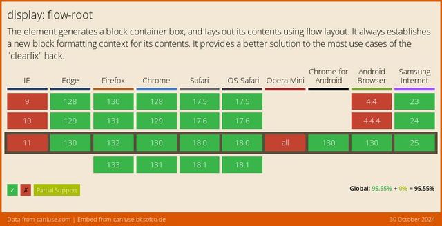
- Well supported since 2019
Inline Layout Variants
inline-flex, inline-grid, inline-block
- Why we have inline-flex, inline-grid, inline-block
- Create more complex layouts, that participate…
Display-outside Inline…
- As inline-level boxes
- In a parent flow of inline content
- The outer display is ‘inline’
Display-inside Flex, Grid, or Flow-Root
- But their inside display value
- The layout context they create for children
- Is flex or grid or flow-root
block»block flowflow-root»block flow-rootinline»inline flowflex»block flexgrid»block gridlist-item»block flow list-iteminline-block»inline flow-rootinline-flex»inline flexinline-grid»inline grid
- So these can get added to our list
- Single display values that represent
- Longer multi-value display behavior
display: list-item
display: block flow list-item;
- Along with
list-item - Which we can define, implying both
- Inner (flow) and outer (block) display defaults
- A ‘block flow list-item’
Marker display…
List-Item
::markerto style markerslist-style-positionto move marker box
- List items are special
- Because they generate an extra box for the marker
- By default that marker is positioned outside the primary box
- But we can move it inside with
- The element behaves as a block in the outer context
- We get both a marker box and primary box
- And inside the primary box,
- Nested content continues to flow
Can I use… Multi-Value Display
- We call this new syntax multi-value display
- It is new, but becoming widely supported
Fine to Use Single-Values
- Don’t need to use new syntax
- Helpful to understand display
- Provide more clarity
- Flexibility to mix and match (if needed)
Bonus… Boxes Overflow
Box Overflow
overflow-x/-y | overflow-inline/-block
Default Visible
Acts like auto when single-axis
Overflow Hidden
- no scroll bar
- clipped at
padding-boxedge - programmatic scrolling is allowed
Overflow Clip
- no scroll bar
- clipped at
padding-box+ overflow-clip-marginedge - programmatic scrolling not allowed
Can I use… Overflow Clip
Overflow Scroll / Auto
(usually auto…)
Text-Overflow
clip | ellipsis
Ellipsis Not a Content St…
Overflow-Wrap
break-word | anywhere
Bonus… Box Alignment
distributing extra space
- Box alignment
- Proposed/implemented along side flexbox
- Not just for flexbox, also works in grid
- And (in beta) for block and absolute positioning!
- Helps us distribute leftover space
- Between and around items
- (Or move items around in space, same idea)
Position Values
start | center | end
- We can position boxes
- On either axis
- Using the position values
- Start, center, or end
Distribution Values
stretch | space-between | space-around | space-evenly
- Or distribute them with space between,
- Space around, or ‘evenly spaced’
- Which takes their size into account
- We can also tell them to stretch
- Filling what space is available
Two Overlapping Concepts
First…
Placing Content
vs.
Placing Items
What boxes are we positioning?
- First, placing content vs placing items
- Easiest to understand in grid…
- Content: the entire grid moves
- Using flow-relative values
- Both axis, or main then cross-axis
- Items: grid stays put, items move in cells
- Controlled by the container
- Self: Overrides the default from ‘items’
Second… Align-* vs Justify-*
Which axis are we manipulating?
- Second, we can target each axis individually
- But people often forget, it’s not obvious
justify-*props apply to the ‘main’ axisalign-*props apply to the ‘cross’ axis- ‘Main’ is usually ‘inline’ axis
- In flexbox, depends on flex-direction
- For block layout…
Details differ Across Layout Contexts
- But the details are slightly different
- Depending on the layout context
Grid supports… All Variations
Content, items, & self – on either axis
- Browsers now supporting
align-contentonly - (Maybe most useful for centering?)
- Treats the entire contents as a unit
- And doesn’t support distribution, only placement
- With abspos: no container
- Only supports ‘self’ properties
- On either axis, or both
- Must have an inset (or tlbr)
- (Opts out of static position)
- With flexbox
- Can’t
justifyan individual item, - Because it doesn’t have it’s own container
- Nothing to justify it in relation to
- Need to justify the whole line
Overflow Keywords
safe | unsafe
- Demo: safe and unsafe alignment
- Center or end aligned
Baseline Values
baseline | first baseline | last baseline
Design For Change
- All these tools help us express
- The intent of a layout
- The choices that we’re making
- And what to prioritize
- This meme perfectly captures what is actually awesome about CSS – and how we can go wrong by taking too much control without considering the consequences. So how can we lighten our grip here?
[demo] change to use intrinsic sizes