Thanks to… The OddBird Team
(especially Stacy & David)
- The team at OddBird helped put this together
- Building the site & tooling
- Stacy Kvernmo & David Herron built demos
- And have been around helping out
- There’s nothing like being on a team
- (say hi?)
Quick poll (in chat)… Who’s Using Custom Properties?
- ✅ all the time
- 🤔 on occasion
- ❌ not at all
Variables Store Values
- Variables are common in programming
- Capture, store, and access values
Design Tokens
brand colors, sizes, fonts, etc…
- In CSS that has often meant
- Global ‘design tokens’
- brand colors, sizes, fonts, etc
Design Tokens
button-background, primary-grid…
- Don’t have to be global
- Don’t have to be simple
Re-use to Avoid Repetition
- Broadly any CSS value we want to re-use
Provide Meaningful Names
hsl(331deg 42% 30%)
color-mix(in oklab, darkRed 73.29%, mediumBlue)- What is this color?
- A mix of darkRed and mediumBlue?
- With variables we can give it
- A meaningful name, based on…
‘deep-raspberry’
- What it looks like
- (deep raspberry)
‘best-color’
- Why we chose it
- (the best color)
‘action’
- What it signifies
- (action, maybe)
‘link-text’
‘button-background’
- Where we’ll use it
- (link text and button backgrounds?)
--deep-raspberry: hsl(322, 92%, 24%);
--best-color: var(--deep-raspberry);
--action: var(--best-color);
--link-text: var(--action);
--button-background: var(--action);- Or all of the above?
- We can use one variable to name the next
- Creating different layers of meaning

- Like audio patch bays
- Connecting an input to an output
- With a physical cable
- Like audio in cables…
Don’t Do Anything
Until we apply them
- You don’t hear any sound
- Until you plug it into a speaker of some kind
- An amplifier,
- Something that turns signal into noise
button {
  background-color: var(--button-background);
}- In CSS
- Normal properties are the amplifier
- Variables carry silent tokens
- Until we plug them in
- And the normal property makes it a style

- That’s when things get interesting
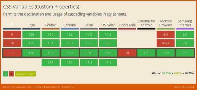
- Widely supported since 2016…
- Two names
- Useful as CSS variables
- But they are also… properties
- Custom properties, that we define
Properties Of Elements
(in the cascade)
- Like any other property in CSS
- Cascade, inherit, and resolve
- Expose the inner workings of value resolution!
- (Force us to learn it)
.warning {
  --state-color: maroon;
}
--name: value;
- Using a normal declaration syntax,
- (property and value)
- But we come up with the property name
- Requirement: start with a double-dash
Called
--dashed-idents
For mixing custom & built-in identifiers
<dashed-ident>s are <custom-ident>s, but not vice versa- in CSS, called ‘dashed idents’
- Not only used for custom props
- But anywhere a ‘custom ident’
- (something we name)
- Shares space with other CSS keywords
built-in-property: value;
--custom-property: value;- In rule blocks, mixing declarations
- Some built-in, some custom properties
- Need to tell the difference
- Avoid conflicts in the future
-webkit-property
-moz-property
-ms-property
--property
webkitmozms-<empty>-property- The syntax comes from browser prefixes
- Which have (mostly) been phased out
- Remove the browser name
- Now it’s ours
.warning {
  --state-color: maroon;
}- Apply to any elements
- But they won’t do anything…
- (except cascade and inherit)
.alert {
  border: medium solid var(--state-color);
}- Until we access them
- Apply them to a normal property…
var( --property )
- Using the
varfunction - Var, parenthesis, dashed-ident
- The name of the custom property to access
.ಠ_ಠ {
  --(╯°□°)╯: ︵┻━┻;
}- Beyond the double-dash,
- Extremely permissive syntax
- This table-flipping emoji is valid CSS
- Just not very useful
- Unless maybe…
- (We’ll dig into that one next week)
- Scott Kellum takes advantage of this
- In CJSS
- Allowing you to write JS and HTML
- Directly in CSS!
- (I promise, some useful demos)
No… Non-important `!`
- A few limitations…
No… Un-Matched Closing Bracket ), ], }
Unlike other CSS properties, custom property names are not ASCII case-insensitive.
<custom-ident>sProperties Of Elements
- Otherwise normal properties
- Of elements
- (don’t exist or have a value outside)
Follow Normal Cascade
- Follow normal cascade
- But highlight some strange edge-cases…
But Not Filtering…
For each HTML Element,
Find All Relevant Declarations
- In the filtering step, before cascading…
Must be Syntactically Valid
(otherwise discarded at parse-time)
- Declarations must be syntactically valid
- But what’s that mean?
.ಠ_ಠ {
  --(╯°□°)╯: ︵┻━┻;
}- According to CSS syntax rules
- Valid to define
.ಠ_ಠ {
  --(╯°□°)╯: ︵┻━┻;
  color: var(--(╯°□°)╯);
}- Valid to access on (say) color prop
.ಠ_ಠ {
  color: ︵┻━┻;
}- Only becomes invalid
- After we replace the variable
- Color property requires color syntax
var() output…
Not Validated
Until Applied
- Parse-time validation early, before cascade
- We don’t know cascaded value
Variable substitution After Cascade is Complete
- Var substitution has to wait
- Go by syntax alone
.ಠ_ಠ {
  --(╯°□°)╯: ︵┻━┻;
  color: var(--(╯°□°)╯);
}- Valid, but will fail later
- Will fail after the cascade
- Which is a problem…
button {
  --fancy-color: oklch(0.8 0.1 0);

  color: pink;
  color: var(--fancy-color);
}- If we have a fancy color in the var
- And try to provide a fallback
- By repeating the property…
button {
  --fancy-color: oklch(0.8 0.1 0);

  /* color: pink; DISCARDED by cascade */
  color: var(--fancy-color);
}- Fallback will be removed by the cascade
- Before we know if the fancy color is supported
button {
  --fancy-color: oklch(0.8 0.1 0);

  /* color: pink; DISCARDED by cascade */
  /* color: var(--fancy-color); INVALID */
}- In a browser without OKLCH
- The variable will fail when subbed
- We end up without any color!
Properties using var() become…
Invalid At Computed Value Time
- It doesn’t have a value
- Solution:
- Use
@supportswhen setting variables
Cascading Removes Extra Values
result: 0-1 cascaded values
- The cascade filtered us down
- Ensure we don’t have more than one value
- But we might still have no value!
We need… Single Value Per Element
Defaulting Inserts Missing Values
result: one specified value
Defaulting process Depends on the Property
Some Properties Inherit
value from direct parent
- Values may be specified much higher up
- Still only have to look at direct parent
- Styles resolve in document order, outside-in
- Each level, until a cascaded value
- Because the cascade happened first
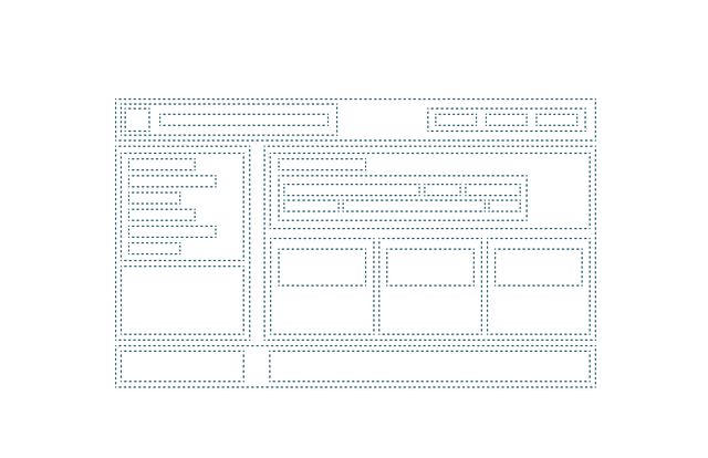
- Start with all these nested boxes
- Assume they are un-styled boxed
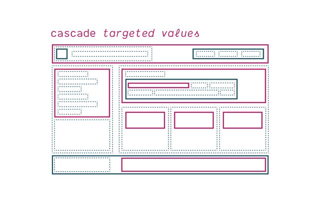
- Cascade goes first
- Explicit selectors & declarations
- Styles attached to individual elements
- Not everything gets style…
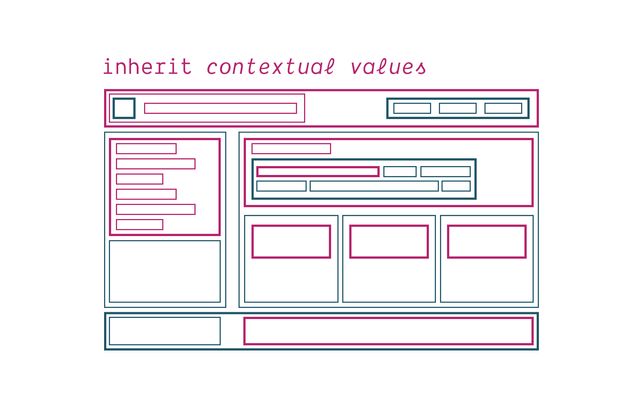
- So after the cascade is complete,
- And only when values are missing,
- Then we apply inheritance
- Each (un-styled) box looking at it’s parent
- Cascade has priority (by going first)
Cascaded values Based on Selector Mapping
Inherited values Based on DOM Context
Custom properties Inherit (By Default)
main { --action: maroon; }
aside { --action: teal; }
footer { --action: rebeccaPurple; }

button { background: var(--action); }We can Reduce Nesting
button { background: blue; }
main button { background: maroon; }
aside button { background: teal; }
main aside button { background: hotPink; }Inheritance Rewards Proximity
Allow us to Control Inheritance
We can Capture a Value
anywhere in the DOM
We can Access a Value
from any ancestor
[demo]:
- cascaded declarations first
- (our element is the subject)
- (sorted by cascade priority)
- inherited declarations
- (our element is a descendant)
- (sorted by inheritance proximity)
- together: all the relevant declarations
- and which one applies!
- computed… still missing values for most props
Most properties Don’t Inherit
If I added a
spanin the middle of this paragraph, what styles would I expect to apply automatically inside thespan?
— Internal Monologue
Generally…
Un-styled Inline Boxes (spans)
Should Not Impact Layout
Generally… Layouts Do Not Inherit
(including anything box-related)
Generally… Typography Inherits
(including text colors)
No inheritance? Use Initial Value
- Spec here is brief
- We’ll read it!
- (copied here)
Each property has an initial value, defined in the property’s definition table.
— Cascade & Inheritance, § 7.1. Initial Values
[Demo]:
- pick a property (display?)
- Look it up on MDN
- Check ‘formal definition’
- (shows inherited, and initial)
- Link to spec
- (same)
If the property is not an inherited property, and the cascade does not result in a value, then the specified value of the property is its initial value.
— Cascade & Inheritance, § 7.1. Initial Values
We’ve Done It!* 🥳 Exactly One Specified Value
Either from…
- The Cascade (declarations)
- Inheritance (parent)
- Initial Value (spec)
We’ve Done It!* (* Almost)
explicit defaulting… “Global Keywords”
available on every CSS property
Global Keywords…
initialinheritunset(inheritorinitial)revert(previous cascade origin)revert-layer(previous cascade layer)
initial & inherit
choose your default, explicitly
- Only use these, if you know what you want
unset
whichever default is appropriate
- Pretend no one set any value
- Prefer this over initial/inherit
body { margin: unset; }- This is a great value for CSS resets
revert & revert-layer
defer to previous origin or layer
- Often what you really want
- Pretend I didn’t set anything
- initial value is not browser default
- be wary of globally inheriting box properties
- usually use
unsetor one of therevertvalues
Global keywords… Resolve on Custom Properties
- Global keywords on all properties
- Including custom properties
html {
  --color: teal;
  --color: initial;
  background: black;
  background: var(--color, red);
}- No way to pass keywords along as values
Initial Value Of A Custom Property?
html {
  font-size: var(--i-never-specified-a-value);
}Guaranteed Invalid Value
like Undefined in JS
- We call it ‘the guaranteed invalid value’
- No syntax for it
- Only used for custom properties
- And this will surprise you…
- it’s guaranteed not to be valid
Properties using var() become…
Invalid At Computed Value Time
result: the property is un-set
- If it ends up on a property, IACVT
- Since it’s guaranteed, we know earlier in the process
- Not early enough for the cascade
- But early enough for substitution…
var(--undefined, fallback)- Allows us to provide fallbacks
var(--my-color, teal)/* fallback: 'Georgia, Palatino, serif' */
var(--my-font, Georgia, Palatino, serif)var(--btn-color, var(--action, teal))Warning Not for Property Invalid
- Before validation on the property
- So it only works with GIV
Warning Not for Legacy Support
- Still can’t use it for legacy support fallbacks
html { --my-color: red; }

@supports (color: oklch(0% 0% 0)) {
  html { --my-color: oklch(65% 0.2625 350.47); }
}html {
--guaranteed-invalid: initial;
}initial value(ok, now) We’ve Done It! 🥳 Exactly One Specified Value
- The Cascade (declarations)
- Inheritance (parent)
- Initial Value (spec)
- Explicit Default (keyword)
Next step… Computed Value
making relative values absolute
p {
  color: currentColor; /* rgb(0, 0, 0) ? */
  font-size: 1.2em; /* 19.2px ? */
  border-color: hotPink; /* rgb(255, 105, 180) */
  width: 80%; /* 80% (requires layout) */
  height: auto; /* auto (requires layout) */
}Computed Values Inherit
currentColor!)
currentColor
Inherits as Keyword
It should re-calculate when the color changes!
Custom Properties… Mostly As Specified
p {
  --my-size: 1.5lh; /* 1.5em */
  --my-color: hotPink; /* hotPink */
}- Value hasn’t been parsed/validated
- Not clear yet what type this is
- Can’t make it absolute without a type
Custom Properties…
var() Substitution
p {
  --my-size: 1.5lh; /* 1.5em */
  --alias: var(--my-size); /* 1.5em */
  --calc: calc(var(--alias) * 2); /* calc(1.5lh * 2) */
}
Properties…
Validated & Compute var()
p {
  --calc: calc(var(--alias) * 2); /* calc(1.5lh * 2) */
  color: var(--calc); /* unset */
  min-height: var(--calc); /* 3lh */
}demo:
- see ‘computed’ panel
- custom properties aren’t resolving?
- only one! let’s look into that…
Custom Property Definition?
- We’ve talked about defaults
- We can register custom properties
- And define more about them
@property --brand-color {
  syntax: "<color>";
  inherits: true;
  initial-value: hotPink;
}Can I use… @property
All three Descriptors Required
syntax, inherits, and (usually) initial
inherits
true or false
/* replace 'initial' with any default value */
* { --this-property: initial; }- Doesn’t actually stop inheritance
- Just ensures we never get to it
- Always a declared value
- Reset on every element
syntax…
Supported Names
Or "*" for ‘universal syntax’
Does Not Fix Invalid At Computed Value Time
- Definitions are still not
- … available at parse time
- … stable enough to rely on
Does Change Computed Values
(depending on syntax)
demo:
- remove and re-add registration
- inspect computed values
- change to universal syntax (doesn’t compute)
- change to color syntax (invalid)
Also… Allows Transitions & Animations
Currently… No Changing Types
Numbers, Lengths, & Strings
.number-to-length {
  --number: 1;
  --length: calc( var(--number) * 1em);
  /* not `var(--number)em` */
}calc().number-to-length {
--length: 1em;
--number: calc( var(--length) / 1em );
}
initial-value…
Must be Absolute
(when the syntax is not *)
Initial ~= Spec
Root/* ~= Browser
initialvalues equivalent to spec initial- Not right for every situation,
- But a good fallback
- Declarations on root/* better for dynamic tokens
Final Steps Used & Actual Values
- All properties that apply
- But some props might not apply
- (e.g.
flex: 1on a non-flex item) - Usually the same as ‘computed’
html {
  color-scheme: dark light;
  /* ~ used: dark; */
}div {
width: 80%;
/* ~ used: 1049.6px; */
/* ~ actual: 1050px; */
}🥳 Values Resolved
- That’s it,
- the entire ‘value resolution’ process
- Any questions on that,
- before we get into
- more variable use-cases?
Custom properties can Store Global Tokens
:root { --btn-color: maroon; }html/:root, then inherit)- These tokens will inherit everywhere
- Inheritance will prioritize proximity
- Change value for nested contexts
:root { --btn-color: maroon; }
/* html { --btn-color: maroon; } */html or :root- Either root or html is fine
- In any html document, select the same thing
- Maybe you find it more clear?
- Mostly just increases specificity
- (Element type to Pseudo-Class)
Any Document Root
Like <svg> or <xml> or <html>
- It’s true!
- But is it actually what you want?
demo:
- just an svg on it’s own
- root styles apply to the svg element
demo:
- same svg in a page
- (styles commented out)
- html styles targeting the root & svg…
- what happens when we uncomment?
I dunno… Proceed With Caution?
- It’s not bad to put vars on root
- But careful about using root
- In nested contexts
- Not every root, only the (outermost) root
* { --btn-color: hotPink; }- Another global approach
- Select everything
- Rely on cascade, not inheritance
But not all Tokens Are Global
- Not all design tokens need to be global
button { --btn-color: maroon; }- Can also define locally
- Specific to a component
button[type='submit'] { --btn-color: seaGreen; }
[aria-pressed=true] { --btn-color: rebeccaPurple; }- Even variations of a component
[data-grid] > * { --grid-area: main; }- We can combine these approaches
- Define on everything in a certain context
Define Nowhere???
- You don’t need to define anywhere to start
- Sometimes useful to have ‘open’ (undefined) vars…
button {
  background: var(--btn-context, maroon);
}- Creating a button component
- We can put the default value in a fallback
- And leave the variable open for inheritance
- Then later, we can fill it in…
main { --btn-context: mediumVioletRed; }

[type='submit'] { --btn-context: steelBlue; }
button:focus { --btn-context: seaGreen; }- Override based on specific locations
- Or based on different variations
- In the component or interaction state
Custom properties Manage Dynamic Changes
- Great for dynamic changes, like…
<button style="--btn-color: red;">
  You're not the boss of me
</button>/* --btn-color is not being used */
button {
background: seaGreen;
color: white;
}Combine with… Attribute Selectors
[attr]➡ Presence (even if empty)[attr="..."]➡ Exact match[attr*="..."]➡ Any match[attr~="..."]➡ Space-delimited (like classes)[attr|="..."]➡ Hyphen-delimited[attr^="..."]➡ Starts with…[attr$="..."]➡ Ends with…[attr="..."i|s]➡ Case sensitivity
<!-- Element-attached/inline -->
<div style="--ease: var(--in-out-back);">[style*='--ease'] {
--in-quad: cubic-bezier(0.55, 0.085, 0.68, 0.53);
--out-quad: cubic-bezier(0.25, 0.46, 0.45, 0.94);
--in-out-back: cubic-bezier(0.68, -0.55, 0.265, 1.55);
}JavaScript Interactions
html {
  @media (prefers-color-scheme: dark) {
    --os-mode: -1;
  }

  @media (prefers-color-scheme: light) {
    --os-mode: 1;
  }
}[data-colors='light'] {
--html-mode: 1;
}
[data-colors='dark'] {
--html-mode: -1;
}[data-colors] {
--mode: var(
--html-mode, var(
--user-mode, var(
--os-mode, 1
)
)
);
}--user-mode set via JSCSS Animation
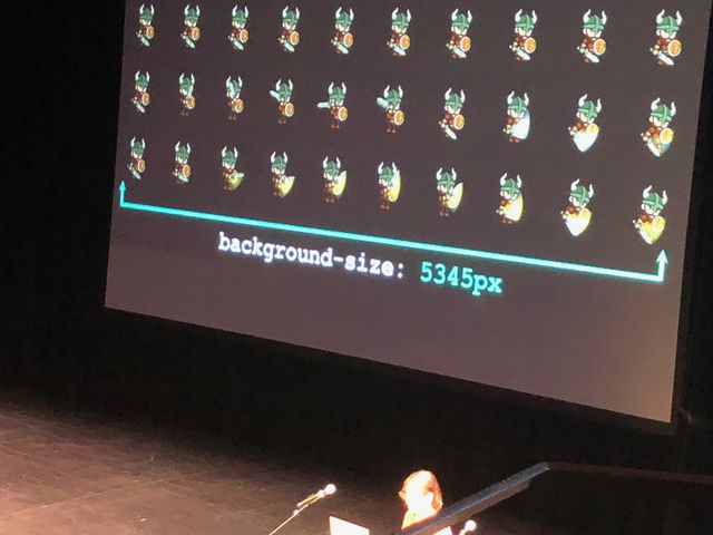
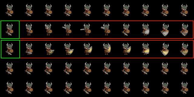
<section
  class="sprite-demo"
  :style="{
    '--src': show.sprite.src,
    '--columns': show.sprite.columns,
    '--rows': show.sprite.rows,
}">...</section><div
v-for="action in show.actions"
:key="action.name"
:data-action="action.name"
:style="{
'--row': action.row,
}"
/>Custom Properties Are Not Just Variables
(as we’ve known them)