- intros: name & (brief) relation to CSS
- (experience, daily interaction, feeling, etc)
- (there’s a lot of us)
- each person call on someone else
Week by week… Where We’re Going
- How the Language works – cascade, inheritance, and variables
- Approaches to Layout – normal flow & alignment, flexbox, grid, etc.
- Organizing Philosophies – BEM, progressive enhancement, the cascade, etc.
We’ll get
Into The Weeds Specs
- You don’t need to memorize everything
- Or read all the specs straight through (I wouldn’t)
- I look things up constantly (no shame)
- Learn where to look, what terms mean
Takeaway How CSS Moves
- How we interact with it
- (different from most programming languages)
- (talking about today and tomorrow)
For The Journey
- Slides & Resources: workshops.oddbird.net
- Shared Notes: smashed.by/css-2024
- Mastodon: @mia@front-end.social
- Follow along with the slides
- ctrl-k/cmd-k to change views, arrows to navigate
- Resources: anything we link to, articles, specs, codepen demos
- Shared doc for notes or questions
- Questions at end
- Stop me if you’re getting lost
Ready… Set…
- Any questions before we start?
- here to talk about CSS
- (fix the demo)
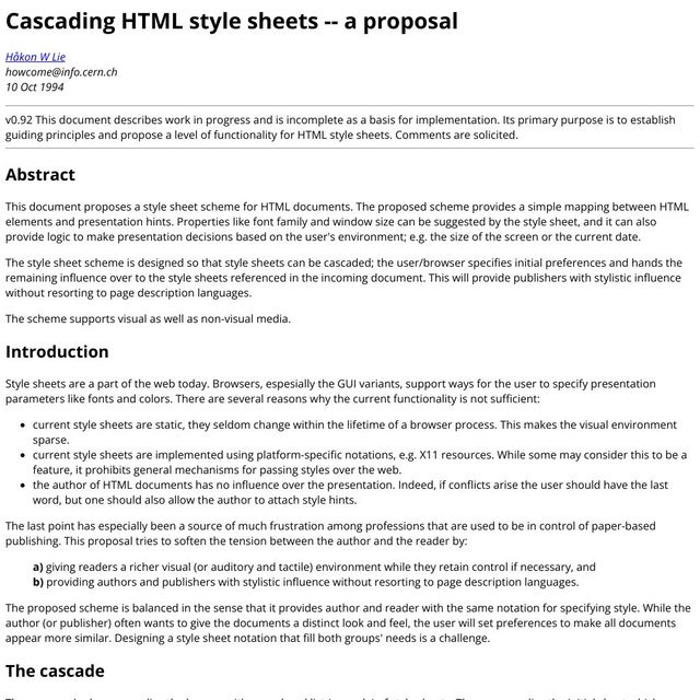
- CHSS
- Håkon Lie, 1994
- email, still archived online
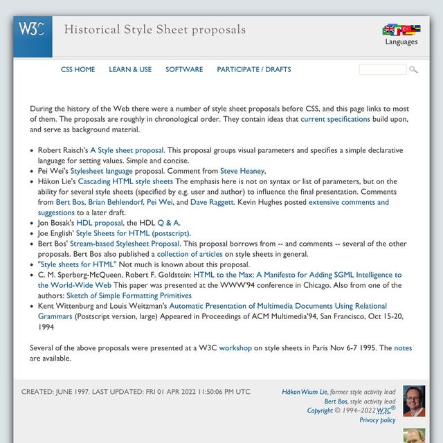
- along with several others
- not the only
- not the first
- solves a major problem for the new platform
Technology Is Political
- not technical
- but philosophical
- political,
- like all decisions we make
- designing a new platform
- or interface
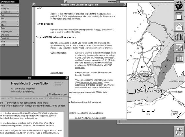
- first web browser
- Hypermedia WWW Browser and Editor
- CERN
- NeXt machine
- graphic interface

You can’t make a web that’s world-wide, by saying it works on my machine, and everyone else is an edge-case.
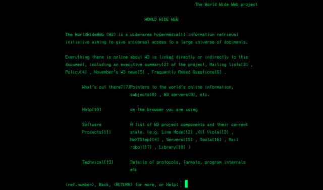
- Nicola Pellow
- Line Mode browser
- text-only
- no install
- any device with an internet connection
Web for all. Web on everything.
— W3C Mission Statement
- Mission statement of W3C
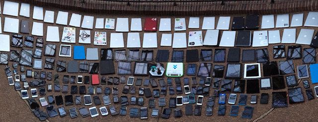
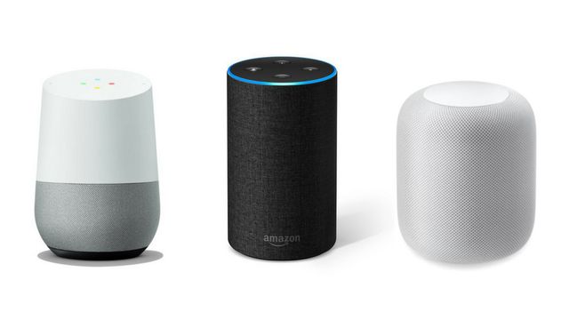
- includes devices without screen
- or screen readers
- read the screen (a combination)
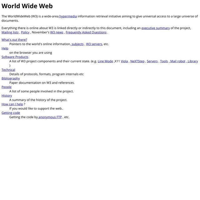
- leads to difficult constraints
- documented on the original website
- also still available
- browsers ignore code they don’t understand
[DEMO]
- individual attributes
- entire HTML tags
Protect the Content
across devices, and over time
- the code is optional
- the content is essential
- whatever else happens
- browsers should protect the content
- that’s why…

- we can still see
- first website on modern browsers
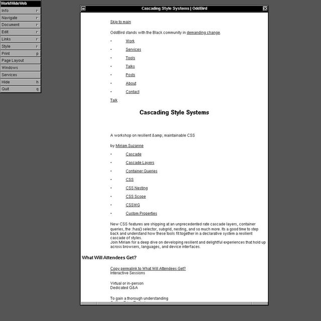
- modern website, on the first browser
- (this is an emulator you can play with)
- site for workshop, on oddbird.net
- No css
- No images
- all the text is there
It is required that HTML be a common language between all platforms…
- more dramatic limitation
- to be a common language anywhere…
…This implies no device-specific markup, or anything which requires control over fonts or colors.
- we can’t use device-specific markup,
- anything which requires control
Web Design Will Never Happen
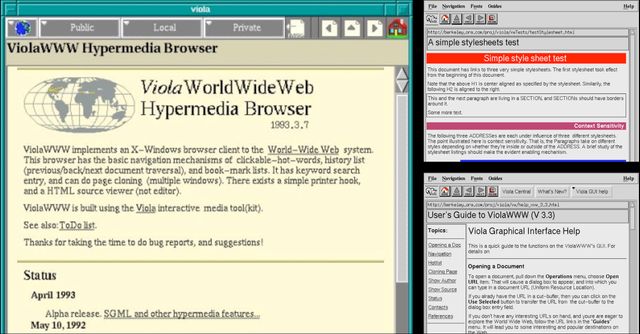
- problem isn’t styles
- early browsers internal stylesheets

- Even text-only browser
- headings, paragraphs, etc
- But the styles are different per browser
- not per website
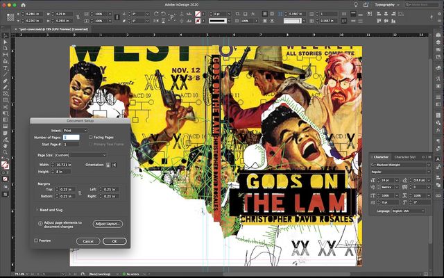
- not the way print works
- define everything…
- page size (static, forever)
- export to PDF, jpg,
- send it to the printer


- It just sits there
- The same was true for other digital formats at the time…
PostScript, 1982 Page Description Language
- PostScript around almost a decade
- page description language
- Like print
- describes a static page
- how big is it? where does each thing go?
- We set fonts, colors, etc.
- We have complete control, but…
The fact we can control a paper page is really a limitation of that medium.
— John Allsopp, A Dao of Web Design
- That control comes at a cost
- The page, print or PDF, is a static medium
- can’t adapt to context or preferences
- a limitation of the medium
Web Styles Must Be Responsive
- web is different
- for everyone, on everything
- sites aren’t static pages
- what we ship is not always what our audience sees
- styles must adapt to situations…
@media
min-width
- Not just the width of the viewport
@media
prefers-reduced-motion
- user needs & preferences
@media
hover
- device interfaces
@supports
container-type: inline-size
- changing capabilities over time
- we want to ship new features
- without breaking the web every time
- compatible forwards, backwards, and sideways
- too many variables for anyone to control,
- but also…

- We’re not alone here
- our decisions impact other people
- So we can’t control everything
- Because other people have a say
- We’re part of that group too…
- If conflicts arise,
- (between authors and users of a site)
- user should have last word
- Again…
If a trade-off needs to be made, always put user needs above all.
— W3C, Platform Design Principles
- That’s a core W3C principle
- If a tradeoff needs to be made
- (in the design of the platform)
- Always put user needs above all
- And there’s more…

- We’re collaborating with browsers
- (instructed to ignore us)

- people might override us
- their chosen devices (various capabilities)
- wearing handy little tool belts

- aliens 👽
- Maybe, who knows?
- We should collaborate with them…

- just trying to get home.
Web Design Seems Impossible
- Under those constraints,
- web design seemed impossible, but…
HTML totally eliminates any visual creativity that a document’s designer might have.
— Roy Smith, www-talk “Re: Adobe’s PDF”
- No one was happy with that outcome
- Every site looks the same
- That’s boring for everyone
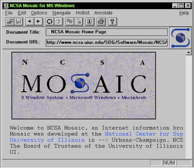
- Turning point, 1993
- Mosaic added image tag to HTML
- Before web standards
- web styles suddenly possible

- lose what makes HTML special
- Can’t protect the content in an image…
- If it doesn’t load, it’s lost
The web would have become a giant fax machine where pictures of text would be passed along.
— Håkon Lie, 2014 interview
- A real risk to the platform

- 1993-1994
- a rush of different proposals
- author style hints
Styles are suggestions or hints about behavior, not rules…
— Robert Raisch, Request for comments: STYLESHEETS
- Not rules, but hints and suggestions.
- (phrase shows up over and over)
A set of HINTS or SUGGESTIONS to the renderer which might be used…
— Robert Raisch, Request for comments: STYLESHEETS
- Sometimes all-caps
- [slide]

Provide authors and publishers with stylistic influence without resorting to page description languages.
— Håkon Lie, CSS proposal
- In Håkon’s proposal…
- authors and publishers have
- stylistic influence
- without resorting to page description languages
- without giving us full control
- Use the same resilient logic as HTML…
- browsers ignore css
- always protect the content!
- reason default
overflowisvisible - if we get cocky
- make a box too small for our text
Content should be viewable and accessible by default.
— W3C, Platform Design Principles
- Browser will try to bail us out
- Not because it’s the best-looking solution
- but because the web is unpredictable
- so browsers protect content
- another design principle of the w3c
- content should be viewable and accessible by default
![InDesign is [+]](/img/rhqYG1iQfc-640.jpeg)
- InDesign doesn’t worry about
- accidental overflow can be found and fixed
- before we hit publish
- and then it stays the way we designed it
Graphic design of unknown content with unknown collaborators, on an infinite and unknowable canvas, across operating systems, interfaces, languages, and writing modes…
— me
- It’s absurd.
There are too many variables to consider. The point of CSS is to make it so you don’t have to worry about them all.
— Keith J Grant, Resilient, Declarative, Contextual
Define some constraints. Let the language work out the details.
— Keith J Grant, Resilient, Declarative, Contextual
CSS is A Declarative Language
/* a 'declaration' */
property: value;- write our hints as declarations,
- a property and a value
width: 500px;
- Seemingly simple concepts
- width of a box
text-wrap: pretty;
- More abstract concepts
- wrapping text so it looks ‘pretty’
- (whatever that means)
width: 500px;
- Even the concepts that seem ‘simple’, hide deeper complexity
- Should this be smaller on a screen with higher resolution?
- How does it respond to zooming in and out?
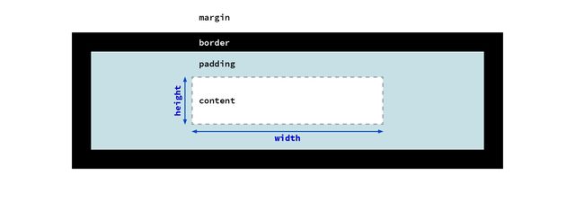
content-box model- width of the content box?
- padding and border are added
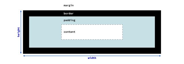
border-box model- Or the width of the whole box,
- with padding and borders?
- The answer depends on what we’re doing
inline-size: 500px;
- or maybe we want the inline-size
- the size of the inline dimension
- (whichever way the text flows)
width: min-content;
width: max-content;
- We might want a size based on contents
width: 45ch;
- Or the size of characters
- in our font
width: 100%;
width: 90vw;
width: 80cqi;
- Or based on context
- a parent element, viewport, or container
width: min(34ch, 100%);
- Or some combination
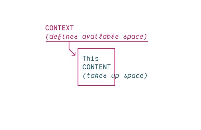
- Everything in CSS based on
- constant back-and-forth
- context pushing in,
- (defining available space)
- content pushing out
- (taking up space)

- How do we ensure
- Our content will fit
- any container we put it in
width: auto;
- most useful tools in CSS
- express a (somewhat abstract) behavior
- let the browser work out details
- if we can avoid touching it, we should
- the browser knows more than we do
Expressive Like Language
- not describing the page in step-by-step detail
- but expressing high-level concepts
- Our job is poetic, providing subtext
- Not just the result, but the reason…
Subtext…
padding: 16px != padding: 1em
- Units are great at this
- why CSS has so many
1emsometimes same as16px- But they adapt differently
Design For Change
- Our job is not
- make it look good on my device
- But make sure it adapts
- to change
In CSS…
flex != grid
- can get same static result using flexbox/grid
- different movement and behavior
- express different intent
Express…
More Meaning
Fewer Constraints
- Writing CSS is about
- expressing our intent clearly
- using hints and suggestions
- avoid unnecessary control
- more meaning with fewer constraints
To me, this meme perfectly captures what is actually awesome about CSS – and how we can go wrong by taking too much control without considering the consequences. So how can we lighten our grip here?
[demo] change to use intrinsic sizes
To Avoid Harm… Express Clear Intent
- To avoid harm
- Not a static design
- Expressive suggestions
- Help the browser understand constraints
to Avoid Harm Design For Change
- so that when things change, the design adapts
- not just describing what we see
- (on our devices)
- how to behave in different situations
To Avoid Harm… Use a Light Touch
define the edges, not the details
- Use a light tough
- Define the outer boundaries…
Web for all. Web on everything.
— W3C Mission Statement
- We provide hints
- Help the browser understand our goals,
- Let the browser take care of details
First Do No Harm
- This is our job as designers (engineers)
- everything else we do in this workshop
- everything else in CSS
- built around this political vision
- protect the content, protect the user
- First, Do no harm
- Any questions on that before
- we dive into the cascade
- and how this all works…?