Cmd/Ctr-K for Controls
Flex follow-up… CodePen & Layers


😎 Fing Cool Feature
(but makes CQs impossible)
Container queries will never be possible on the web. They would cause infinite layout loops.
— Browsers, a paraphrase (circa 2020)
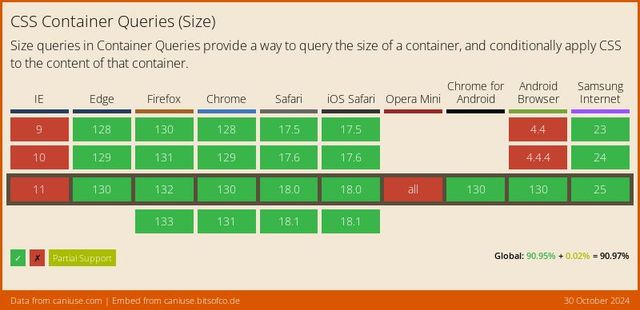

*Some Restrictions Apply
We can’t impact The Container That We Query
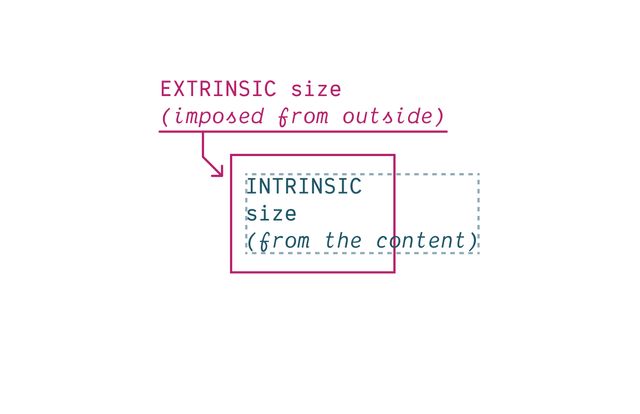
We Need to Turn Off Intrinsic Sizing
CSS Containment
contain: size | layout | style | paint;
Block boxes get their
inline-sizefrom Context (extrinsic).
— me
Block boxes get their
block-sizefrom Content (intrinsic).
— me
👍🏼 Inline-Only Containment
👎🏼 Block-Only Containment
We can only Measure The Axis We Contain
Contain inline-size
For Most Containers
Contain size
For Scroll Containers
Also need to Contain Layout & Style
Since… Containment is Invasive
We create Explicit Containers
css…
container-type: inline-size;contain: inline-size layout style;Recommended… Name Your Containers
css…
main {
  container: layout main / inline-size;
}
container-name [/ container-type]?css…
@container layout (min-width: 40em) {
  .conditional { /* … */ }
}

@container main (min-width: 40em) {
  .conditional { /* … */ }
}Finding Containers
- For each matched element…
- Find the nearest ancestor that has…
- Any required container name
- Any required container types
Containers Can’t Self-Query
(That would introduce loops!)
Always Measuring an Ancestor
(can’t change what you measure!)
Always Measuring an Element
Bonus! Container Queries Measure Actual Styles
Grid Tracks & Flex Sizing?
No element to measure…

For legacy reasons… No Default Containers
css…
body > :is(header, main, footer, aside) {
  container: layout / inline-size;
}also… Container Query Units
cqw | cqh | cqi | cqb | cqmin | cqmax
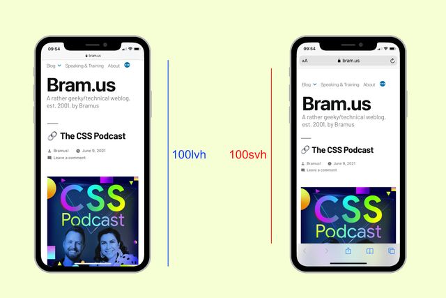
Default unit container The Small Viewport

css…
@container style(--colors: invert) { … }Always Queries Direct Parent
Unless you query a specific container-name
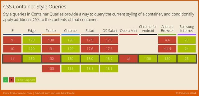
Style Queries… Only Custom Properties*
* for now **
** but maybe forever?
State Queries (???)
css…
@container state(stuck) { … }
@container state(snapped) { … }
@container state(overflowing) { … }css…
/* explicit fallbacks, rarely needed */
@supports not (container: name) { /* … */ }There’s a Polyfill
Poll… Do You Use CSS Grid?
- ✅ regularly
- ⚠️ sometimes
- ❌ rarely
Goal… Go Grid First
- I have an agenda
- When you do layout
- You should reach for grids first
- So let’s skip this background stuff…
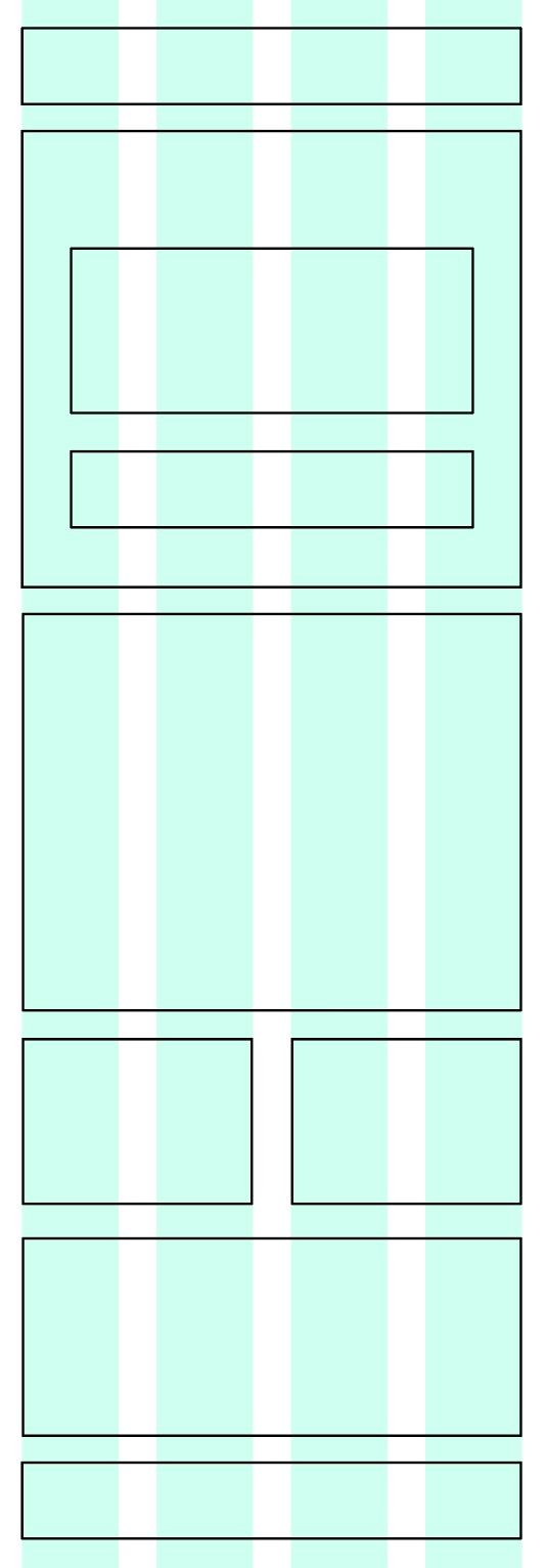
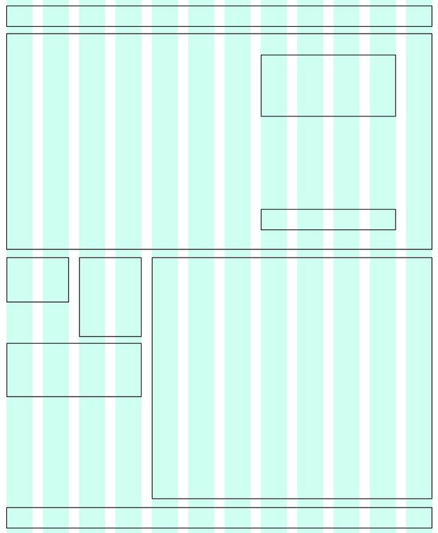
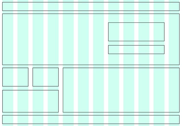
2010… Responsive Web Design**™**
skip…
scss…
.grid-span {
  width: percentage( /* 23.7288136% */
    ((3 * 4em) + (2 * 1em)) / ((12 * 4em) + (11 * 1em))
  );
  margin-right: percentage( /* 01.6949153% */
    1em / ((12 * 4em) + (11 * 1em))
  );
  padding-left: percentage( /* 08.4745763% */
    ((1 * 4em) + (1 * 1em)) / ((12 * 4em) + (11 * 1em))
  );
}skip…
skip…
skip…
skip…
Problems… Single Axis
skip…
Problems… Complex Math
skip…
Problems… No Intrinsic Sizing
skip…
2012… Flexible Boxes
skip…
Great for Distributing space
skip…
Not great for Explicit Layout
skip…
Designed to Pair With CSS Grid
skip…
2017… CSS Grid
skip…

Jen Simmons… Intrinsic Web Design
- Truly Two-Dimensional Layouts
- Nested Contexts
- Combine Fluid & Fixed
- Various Stages of Squishiness
- Content Expands & Contracts
- Media Queries*, As Needed
- … And get right to the good stuff
- We’re in a new era of web layout
- (read the slide)

- Can we still make static grids,
- With 12 equal-width columns? Yes.
- Is that the best we can do?
- No
Container… display: grid
Implicit grids
Generate columns & rows as needed
Auto item placement… grid-auto-flow
column | column [+ dense]
Sizing implicit tracks…
grid-auto-columns
grid-auto-rows
Explicit item placement… grid-column & grid-row
grid-<axis>-start & grid-<axis>-end
Explicit span…
grid-column: span <tracks>
Defining Templates
grid-template-columns
grid-template-rows
Fluid & Fixed 20em 25% 200px
Fluid Until Fixed
minmax(min-content, 1fr)
Fitted…
fit-content(<limit>)
clamp(auto, max-content, <limit>)Names ↔ Areas
with matching *-start & *-end names
Media/container Queries, As Needed
Repeating Grids
repeat( <count>, <tracks> )
Subgrid
as column or row template
Bring this workshop to your company.