/* a 'declaration' */
property: value;- write our hints as declarations,
- a property and a value
/* a 'block' */
{
  background: white;
  color: mediumVioletRed;
}- group them into blocks
<!-- 'inline' (or 'element attached') styles -->
<p style="
  background: white;
  color: mediumVioletRed;
">…</p>- attach directly to elements in HTML.
<p style="color: mediumVioletRed;">…</p>
<p style="color: mediumVioletRed;">…</p>
<p style="color: mediumVioletRed;">…</p>
<p style="color: mediumVioletRed;">…</p>
<p style="color: mediumVioletRed;">…</p>- but that can get repetitive
- if we want to re-use the same styles on multiple elements
- ideally, create design systems
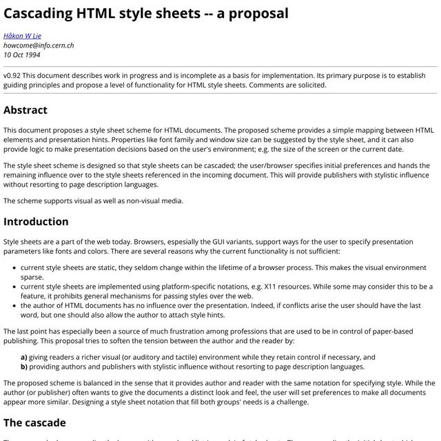
- CSS helps by providing “a simple mapping…”
Selectors…
p { /* … */ }
- Selectors…
/* a 'style rule' (or 'rule set') */
p {
  background: white;
  color: mediumVioletRed;
}- Which we can attach to declaration blocks,
- forming rule-sets.
- The selector maps our rule set…
<p>This is a short paragraph</p>p { … }- … to elements in the document.
- (this is the majority of the CSS we write)
- Then we can…
<!-- a 'style sheet' -->
<link rel="stylesheet" href="styles.css">/* another 'style sheet' */
@import url('styles.css');- Combine our rule sets into style sheets,
- and import them from our document,
- or other style sheets.
- Not just us as document authors…

- Anyone involved can contribute style sheets
- The users interacting with our document,
- and the user agent (or browser) they use.
- This is the initial vision of the web.
- It’s personalized. Users are in control.
- So all these style sheets get merged…
- Into an ordered list (or ‘cascade’) of styles
- that should be applied to the same document.
- Of course, this leads to conflicts!…
<button type="submit" id="send" class="action">button { background: gray; }
.action { background: darkBlue; }
[type=“submit”] { background: darkGreen;
background: var(--submit, black); }
#send { background: maroon; }- We have any number of declarations
- from a range of different sources
- with selectors that might overlap, applying
- potentially different values
- to the same elements, and the same properties!
For Browsers…
Every CSS Property
On Every HTML Element,
Must Have a Single Value
- Browsers need to resolve conflicts.
- Every CSS property
- on every HTML element
- must have a single value
Every <button> Needs
One Background-Color
& One Text Color
& One Padding-Left
& One Margin-Inline-End
& …
- Every button needs
- one text
color, - one
padding-left, - one
margin-inline-end, etc.
The Cascade (Process) Resolves Conflicts
- what we call ‘the cascade’ now
- is a browser process
- merging all the stylesheets, rules, and declarations
- (‘cascading’ them together)
- and resolving conflicts
Inheritance… Fills in Missing Values
- That process ensures
- we don’t have extra values
- And then inheritance helps clean up
- By filling in some of the missing values
- There are over 700 CSS properties,
- and we don’t declare all of them.
-
Filtering
-
Cascading (includes specificity)
-
Defaulting (includes inheritance)
-
Resolving
-
Formatting
-
Constraining
- Both ‘cascading’ and ‘inheritance’
- part of a longer process
- value resolution or processing
- A series of steps
- converting declarations into styles
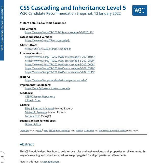
- They’re important parts of the process
- The spec that defines all of this is called
- ‘Cascading & Inheritance’
-
Filtering
-
Cascading
-
Defaulting
-
Resolving
-
Formatting
-
Constraining
- We won’t get through all the steps today
- Just filtering and cascading
- Tomorrow we’ll cover defaulting
- (and the rest)
Input… A “Cascade” of Style Sheets
- We start the process with
- a cascade of style sheets
- (input from authors, users, and browsers)
Output… The Actual Value
exactly one per property, per element
- And at the end of the process
- we need to get back
- exactly one actual value
- (per property, per element)
- Today we’ll get…
- Filtering (declared values)
- Cascading (cascaded value)
- Defaulting (specified value)
- Resolving (computed value)
- Formatting (used value)
- Constraining (actual value)
- the ‘cascaded’ value
- After defaulting we’ll have a single ‘specified’ value
- And eventually (at the end) an ‘actual’ value
- Rendered on the screen
Cascade & Inheritance Internal Browser Algorithms
- On the one hand,
- This is all internal logic, right?
- Just an algorithm…
- That the browser uses
- to determine a winner, thunder-dome style
- Two styles enter, one style leaves…

- Almost like the laws of physics…
- A way of describing the universe around us,
- The way the world works.
- That’s all true, but also…

- tools provided to us, intentionally
- part of the language,
- designed for us to communicate…

- all of us,
- not just as authors,
- but also as users…
Express… Purpose & Priority
- Allowing us to…
- Provide more detail
- About the purpose and importance
- Of our hints and suggestions.
- Express our intent
- Makes the collaboration possible
-
Filtering
- Cascading
- Defaulting
- Resolving
- Formatting
- Constraining
- Let’s start from the top
- Filtering…
1. Filtering…
For each HTML Element,
Find All Relevant Declarations
- First thing a browser does
- after parsing our style sheets.
- Go through the HTML
- find all the relevant style declarations
- that map to each DOM element
A Relevant Declaration…
(Read it from the specification)
- In a stylesheet that applies to this document
- (proper media attr)
- Not in a false conditional rule
- (proper at-rules - media, supports, preferences, etc)
- In a selector that matches the HTML Element
- Is syntactically valid
- Invalid CSS (like HTML) is discarded/ignored
- Called ‘parse time’ validation
- Not everything can be validated at this point
- Useful, because we catch issues early
- Before we discard other declarations
.short { border: thin double; }
.long {
  border-top: thin double;
  border-left: thin double;
  border-bottom: thin double;
  border-right: thin double;
  border-image: none;
}- Also need to expand shorthand properties
- Elements don’t have a border property
- Els have four border properties, and a
border-image Borderis shorthand for setting all of them
.short { border: thin double; }
.long {
  /* declared */
  border-top-width: thin;
  border-top-style: double;

  /* reset to 'initial' value */
  border-top-color: currentColor;
  border-image: none;
}- Not just the four sides, but
- The
width,style, andcolorof each - Any missing values get filled in
- Initial value of border-color is
currentColor - (We’ve set that implicitly)
- Also
border-imagewhich is reset-only
To start over Use Shorthand Properties
- Shorthands are great for starting over
- Reset everything
- Build from the ground up
- But they’re risky if…
To adjust details Use Longhand Properties
- You just want to make small adjustments
- Long-hand properties are more precise
- And leave everything else intact
For Each Property A List of Declared Values
(zero or more)
- The result of filtering,
- A list of declared values
- For each property on each element
- Might be empty, might be multiple
- Now we know what conflicts exists
- And we’re ready to resolve those conflicts
demo (debug mode):
- inspect the first section
- filter properties
Filtering(list of declared values)-
Cascading
- Defaulting
- Resolving
- Formatting
- Constraining
- Now that we have a list
- declared values that are relevant
- We move onto the cascade
- Still narrowing down the list…
2. Cascading…
Resolve any Conflicts
between Declared Values
- Merging the declared values
- Resolving any conflicts
- Find a single winner

- Sort of like a coin sorter
- See which coins (declarations) go farthest
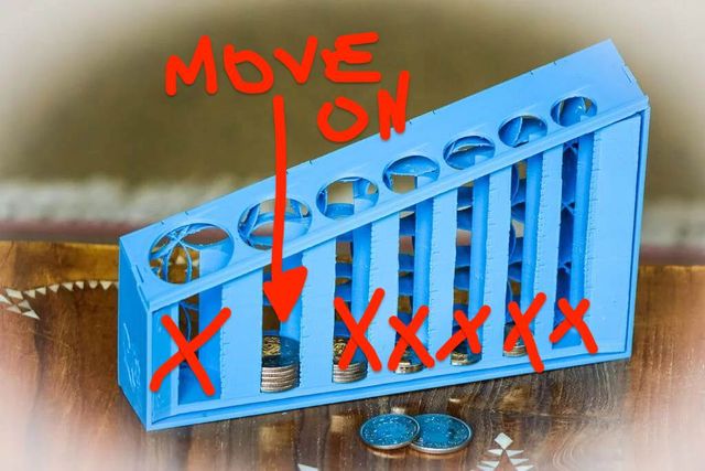
- We can ignore any empty columns
- The coins that made it the farthest move on
- Everything else is discarded…

- We do this over and over
- Until we have a single coin
- Each time, comparing different aspects
- Not just size, but shape, width, metal, etc
- Or to recover from this metaphor,
- and talk about CSS declarations…
- Who requested the style? (origin)
- How much do they care? (importance)
- Does it come from the shadow DOM? (context)
- Is it an inline style? (element attached)
- What cascade layer is it in? (fairly new)
- How specific is the selector? (specificity!)
- How close is the scope root? (proximity, new)
- Which value was declared last? (order, single)
🗺️ Origins… Who Requested The Style?
- In detail, from the top
- What’s the origin of the declaration?
- Who requested it?

- It could be…
- Us as authors
- Or users
- Or their agent, the browser
- Combined with that…
❗Importance… How Much Do They Care?
- How much do they care?
- Did they mark this style as important?
- These are directly related
- In general…
- The user and browser
- Specify initial preferences
- Tend to be global, not site-specific
- Apply to every website you visit
First… 🖥 User Agent Styles
- User agent (browser) goes first
- Providing legible defaults…
demo:
- inspect styles
- none from document, only from browser
- remove:
* { all: initial; } - Without browser styles,
- Unreadable wall of content…
/* initial values */
display: inline;
background: transparent;
color: CanvasText;
font-style: normal;
flex-basis: auto;
/* etc. */- We’re seeing initial values
- What comes before browser defaults
- Specified for each property, not each element
- Always
display:inline, even ondivs…
body { margin: 8px; }
a:link {
  color: blue;
  text-decoration: underline; }
h1, h2, h3, h4 /* etc */ {
  font-weight: bold;
font-size: something big I dunno; }- Browser adds everything else
8pxmargin on thebody- Link colors and underlines
- Heading styles, large bold text
- Space around paragraphs and lists, etc
- This old rule isn’t entirely true
- Elements not ignored, we see them
- But inline & un-styled (initial values)
- To maintain compatibility, CSS ensures…
- un-styled inline boxes should not impact layout
User Agent Styles
- Firefox/Gecko
resource://gre-resources/ - Safari/WebKit
- Chrome/Blink
- That’s true for all inline boxes
- Until the browser gets involved
- Providing default styles
- For links, and other inline elements
- In firefox, load in the browser
- Otherwise, find in public source code
Second… 👥 User Styles
Establish desired preferences
- After browser defaults
- Users apply their preferences
- Originally using the same CSS syntax
- To put us all on equal footing
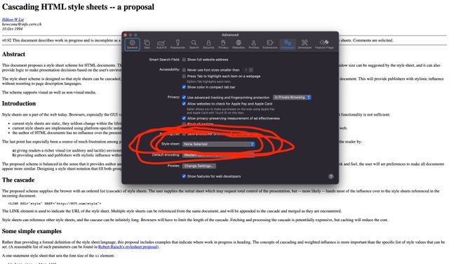
- Safari still supports this option
- In the settings panel
- Upload a stylesheet
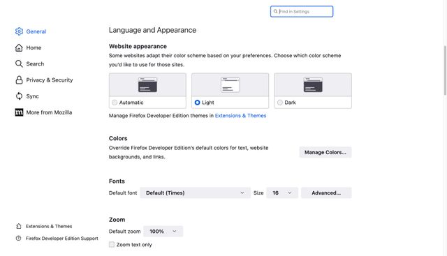
- Most other browsers have switched
- To providing limited preferences
- A form where you can set values
- Without learning CSS
User Styles
- Safari/WebKit:
Settings / Advanced / Style sheet… - Firefox/Gecko:
about:preferences - Chrome/Blink:
chrome://settings/appearance
- Details are a bit different
- All browsers provide something
You, too
Are Allowed
To Have
Your Own Preferences
- You (yes you) can have preferences too
- I set a few, better fonts and larger text
- Worried as dev “but I’ll see something different”
- That’s the point!
- Remember to check with different settings
Finally… 🎨 Author Styles
- Finally, ‘document’ or ‘author’ styles
- (that’s us)

- We come last
- And kinda just do whatever
- Smear our brands all over everything
- Design
🗺 Cascade Origins
- 🖥 User Agent Defaults (applied first)
- 👥 User Preferences (override defaults)
- 🎨 Author Styles (so powerful)
- Those are the normal origins
- First the user agent (browser), providing defaults
- Then the user, setting preferences
- (they override the browser)
- Then we come along at the end…

- And we override everyone
- We have way too much power
- And tend to stomp all over people
- But that doesn’t make sense, right?
- What about lack of control,
- hints and suggestions and all that?
- The proposal is clear,
- If conflicts arise
- The user should have the last word

- So we need a way for the other origins
- To take back control when it matters,
- Something that will bring balance to the cascade…
Why we have… ❗Importance
- That’s why we have importance
- A safety valve for the other origins
- Anyone can add
!importantto a declaration…
- 🖥 User Agent Defaults
- 👥 User Preferences
- 🎨 Author Styles
- ❗🎨 Author Important
- ❗👥 User Important
- ❗🖥 User Agent Important
- That declaration moves to a new origin
- One of three important origins
- Higher priority than the normal origins
- With the order reversed…

!important mirror universe- It’s a mirror universe
- We all have evil twins with goatees
- ❗🎨 Author Important (goes first)
- ❗👥 User Important (override authors)
- ❗🖥 User Agent Important (most power)
- In the important origins
- We go first (lowest priority)
- Users override us
- Browsers have final say
- Set the boundaries of what’s allowed
- 🖥 User Agent Defaults
- 👥 User Preferences
- 🎨 Author Styles
- ❗🎨 Author Important
- ❗👥 User Important
- ❗🖥 User Agent Important
- Important origins always override normal origins
- So we’re really in the middle
- Our normal and important styles, together
User Agent Styles
- Firefox/Gecko
resource://gre-resources/ - Safari/WebKit
- Chrome/Blink
- Browsers do use importance
- (demo: find in page)
demo:
- Specificity is contained
- Importance is reversed
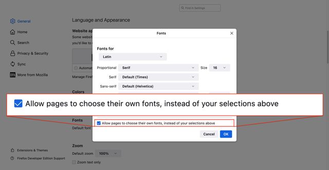
!important behavior- Importance works in Safari user styles
- Firefox provides a checkbox
- Chrome provides a ‘minimum font size’
The purpose of… ❗Importance
- Importance doesn’t change specificity
- It changes the origins
- And the priority of origins
- The purpose…
Authors 👎🏼 Specificity Wars
With our own colleagues and libraries
- Is not for fighting each other
- In big teams who can’t agree
- Or angrily trying to override
- Styles we wrote last year
Browsers/Users 👍🏼 Protect Styles
From higher origins breaking important things
- The purpose is for users and browsers
- To protect style from future origins
- Someone that might come along later…

- And stomp all over their preferences
- We’re the baddies here
- We need to do better at collaborating…
Often Isolated
- …
- …
- 🎨 Author Styles
- ❗🎨 Author Important
- ❗…
- ❗…
- But the fact that our origins
- (Normal and important)
- Are isolated together
- Means we don’t always interact with
- What’s happening around us

- We start to think
- We’re the center of the universe
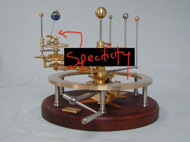
- On our own
- Dealing with specificity…
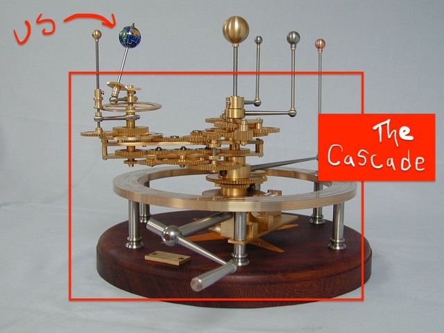
- When we’re really just one
- ‘Pale Blue Dot’
- In the solar system of the cascade
- Fair, it’s what we deal with every day
- But good to have perspective
2 Bonus Origins… For Intermediate Styles
in transitions and animations
- Technically two additional origins
- For ‘transitional’ styles,
- Generated by animations & transitions
- Somewhere between two declared values
hotPink
»
teal
- Going from HotPink to Teal,
- Have to go through other colors…
hotPink
rgb(93 138 220)
?!
teal
- (Depending on the color space we use)
- Maybe
rgb(93 138 220)
button {
  background: plum;
  transition: background 1s;
}
button:hover { background: pink; }- In a transition, start & end values cascade
- Already have origins, can have importance
- The
transitionproperty also cascades - So everyone has agreed to the transition before it starts
- Override any of the props to change it
- 🖥 User Agent Defaults
- 👥 User Preferences
- 🎨 Author Styles
- ❗🎨 Author Important
- ❗👥 User Important
- ❗🖥 User Agent Important
- ➡️ Transitions
- But the transitional values
- Need to override the start & end, wherever they are
- Transition needs to override everything
- From all other origins
- Transitions get the very top origin
:target { animation: bg-change 3s ease-in both; }
@keyframes bg-change {
  from { background: pink; }
  to { background: cyan; }
}- Animations are different
- Only the
animationproperty itself cascades - Keyframe declarations are outside the cascade
- Importance isn’t allowed in keyframes
!important keyframes [present, debug]demo:
!importantkeyframe declarations are ignored- the whole declaration is discarded
- External
!importantwill win
- 🖥 User Agent Defaults
- 👥 User Preferences
- 🎨 Author Styles
- 🏇🏽 Animations
- ❗🎨 Author Important
- ❗👥 User Important
- ❗🖥 User Agent Important
- ➡️ Transitions
- Keyframe styles do not cascade
- Important styles override
- Important styles always win
- Importance splits us into a different path
- Not just for origins, as we’ll see
- The next step in the cascade funnel…
🌒 (Shadow) Context
styling web components
- Context
- Currently ‘shadow DOM’, but might be expanded
- (How many people here are using shadow DOM?)
Web Components* Can Use Shadow DOM
- Shadow DOM is part of ‘Web Components’
- But also used by some browsers
- To explain complex HTML components, like…
- …Form inputs
demo:
- Dev tools setting: show UA shadow DOM
- Inspect file input
demo:
- Light DOM v Shadow DOM
- Most selectors are limited in scope
- Host, slots, and parts get combined cascade
Shadow Styles Are Custom Defaults
similar to user agent origin
- Web components are thought of like HTML components
- The styles they provide are defaults
- Only expose the parts they want for more styling
- So they work almost like Browser defaults
Shadow styles Have Low Priority
- With a lower priority than other document styles
- This is the opposite of framework components
Normal styles
light > shadow
- By default the page (light DOM)
- Overrides Shadow DOM styles
- (where allowed)
Again… Importance is Defensive
and reverses priority
- Again, importance is defensive
- Component authors can protect styles
- The priority is reversed
Important styles
light < shadow
- When comparing important styles
- Shadow DOM wins over light DOM
(demo)
- Again with context
- Priorities are different
- For normal and important styles
- If we still have a tie at this point
- Move on to compare…
<!-- Element-attached/inline -->
<button style='color: blue'>…</button>/* Selector-Mapped Styles */
button { color: violet; }- Element attachment
- Some styles are directly attached (inline)
- And some are mapped with selectors
Inline Styles Win When Importance is Equal
they don’t reverse!
- Here things are different,
- There’s no reversal based on importance…
- Important styles always win over normal styles
- (already enforced by origins/importance)
- But in both normal & important origins
- Attached styles win over selectors.
- The only way for selector styles to win
- Is by using importance, move into a higher origin
- Skip over layers, we’ll come back…
Jumping ahead… Selectors & Specificity
- (time check - take a break?)
- Selectors & Specificity
- This is where we spend most of our time
p { /* … */ }
a { /* … */ }
.summary { /* … */ }
:hover { /* … */ }
#call-to-action { /* … */ }- Selectors come in a variety of forms
- Starting with what we call ‘simple selectors’
- The Lego parts other selectors are built from
Grouped into Four Categories
- Simple selectors are grouped
- Into four categories…
* { /* 'universal' */ }- The universal (star) selector
- Alone in its category
- Selects all HTML elements
- (but not pseudo-elements like before or after)
button, div, span {
  /* 'type' (element) */ }
::before, ::after, ::part() {
/* 'pseudo-element' */ }- Element & pseudo-element ‘type’ selectors
- Select specific elements/pseudos
.action, .summary {
  /* 'class' */ }
:hover, :user-invalid {
  /* 'pseudo-class' */ }
[type=“submit”] {
/* 'attribute' */ }- Attribute selectors
- Include classes and pseudo-classes
- Select elements based on any attributes or states
- Classes are just a special attribute shorthand
#send { /* 'id' */ }- Finally ID selectors
- Valid ID’s are required to be unique on a page
- This should only ever select one element
Each category Increasing Priority
- Each of these categories
- Has increasing priority in cascade…
Specificity is a “Heuristic”
- Based on the assumption (or heuristic) that…
More Explicit Selectors
are Likely
More Important
- More explicit selector
- are likely
- More important
- Working up from…
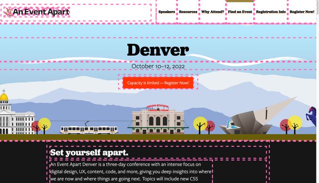
* { outline: …; }- The universal selector
- Which selects basically everything
- (Useful for only a few resets)
type » Global Defaults
- Type selectors
- Help us establish broad defaults
attrs/classes » Common Patterns
- Attribute selectors
- Where we have the most control & flexibility
- Become the backbone of our design systems
- Defining common patterns

#logo { outline: …; }- And finally IDs
- For extremely targeted styles
- One-offs
Four layers Of Specificity
- Universal
*(go first) - Element
types (p,ul,body, etc) - Reusable
.classes &[attributes] - Unique
#IDs (most power)
- And these form the four basic layers
- Specificity
- Universal first, then type, attributes, and IDs at the top
- But we don’t just use simple selectors
p.summary:focus-within { /* … */ }
a:hover { /* … */ }- We can combine them into compound selectors
- Directly, without combinators
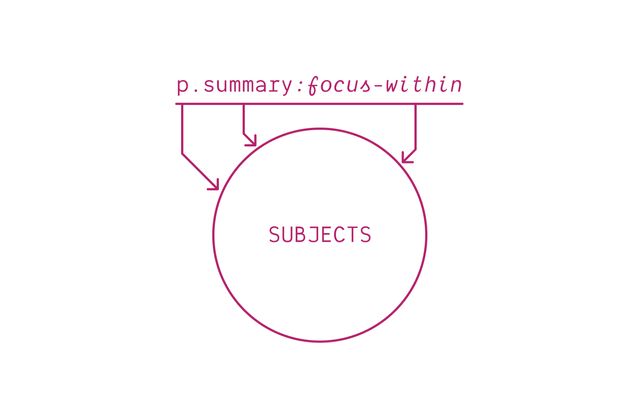
- So all parts describe the selector subjects
- Target any element
- Which matches all simple parts
- Or we can add combinators…
Combinators…
> +(space)~
- Direct child (greater than)
- Next sibling (plus)
- Descendant (white space)
- Subsequent (future)-sibling (tilde)
p.summary a:hover { /* descendant */ }
p.summary > a:hover { /* child */ }
p.summary + a:hover { /* next */ }
p.summary ~ a:hover { /* future */ }- Giving us complex selectors
- May contain multiple compound parts
- But now those parts refer to different elements…
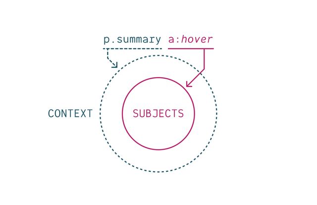
- There’s still only one subject
- Always the last compound selector, on the right
- That’s the element we end up styling
- The rest provide context, filtering results
- Target el still matches all simple parts of the subject
- Also has to have matching context
p.summary a:hover,
p.summary > a:hover {
  /* … */
}- To target multiple subjects,
- We have to combine selectors into lists
h2:has(> button[aria-expanded="false"]) + div {
  display: none;
}- Like units, selectors are expressive
- Browsers read them right to left
- (and so can we)
- A div that follows an h2
- (which has a button child, not expanded)
- Grammar class all over! Diagramming sentences!
Each declaration
Has a Weight
Based on How Specific
The Selector Is
Adding up all the simple selectors
- Every selector-mapped declaration in CSS
- Has a specificity determined
- By adding up the simple selectors used
- In each selector category
/* 1 IDs, 2 attributes, 2 element type */
form#contact button[type='submit']:active {
  border-color: seaGreen;
}- Universal selectors and combinators don’t count
- Here the
border-colordeclaration comes from a selector - With 1 ID
- 2 Attributes
- 2 Element types
Often written with commas…
Specificity of [1,2,2]
- A specificity of
1, 2, 2 - This is often written with commas
- (and in brackets, but you do you)
Like Versioning…
v3.10.1 > v3.9.12
- Comparing specificity
- Works a bit like software versions
3.10.1is larger than3.9.12- Probably shouldn’t get into double digits
- But if you do, columns don’t roll over
Compare from the left
[1,0,2] vs [0,3,2] vs [0,2,3]
- We compare from the left
- If one has more IDs than the others…
Compare from the left
[1,0,2] vs [0,3,2] vs [0,2,3]
vs [0,3,2] vs [0,2,3]- We have a winner, without going farther
Move on when tied
[0,3,2] vs [0,2,3]
- We only have to look at the next column (attributes)
- If there’s a tie in the first
Move on when tied
[0,3,2] vs [0,2,3]
vs [0,2,3]- And we’re still only comparing
- One column at a time
Heuristics Are Assumptions
- It’s a good heuristic
- Most of the time
- But heuristics are assumptions, and…
Assumptions Often Fail
Especially “At Scale”
- Assumptions always fail at some point
- So the more code we write,
- (The larger our code base)
- The more likely we are to find those exceptions…
/* …default table styles… */
table[rules=cols i] > tfoot > tr > td,
table[rules=cols i] > tfoot > tr > th,
table[rules=all i] > tfoot > tr > td,
table[rules=all i] > tfoot > tr > th {
  border-color: black;
}- Even browsers have some very specific defaults
- Would be an issue, without origins
- It’s good for this declaration to be specific
- But it’s still just a specific default
- (essential the specificity is contained)
- On the other end…
[hidden] { display: none; }- There are some broadly-defined defaults
- Like
display:noneon thehiddenattribute - Are really important!
- Don’t want to override setting display to grid.
- It’s a simple selector with broad reach
- But shouldn’t be low priority
One Flexible Layer
Universal*Elementtypes- Reusable
.classes &[attributes] Unique#IDs
- This becomes especially problematic
- Because we only fully control
- One of Four specificity categories
- (Class and attribute selectors)
- All the rest are limited in some way
.block .element.modifier { /* 3 */ }
.block__element--modifier { /* 1 */ }- So we spend our time
- Arguing over how many classes or attributes to use
- Forcing lower and lower specificity
- Through intricate naming conventions…
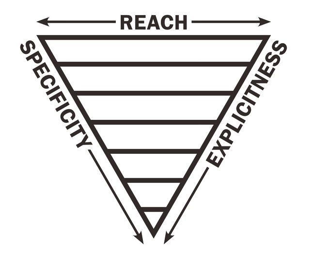
- Or carefully organizing our code-base
- (This is Harry Robert’s Inverted Triangle)
- Useful for thinking about the ideal relationship
- Between a selector’s reach and specificity
- From the top, most styles low specificity, broad reach
- Get more explicit, increase specificity, less code
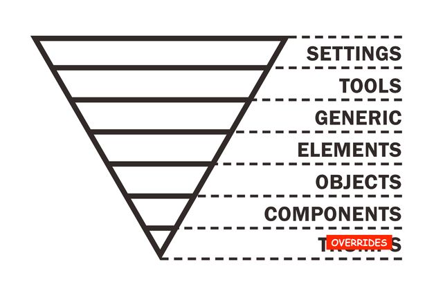
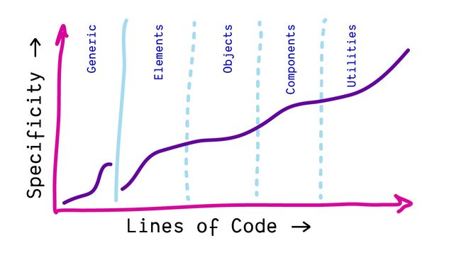
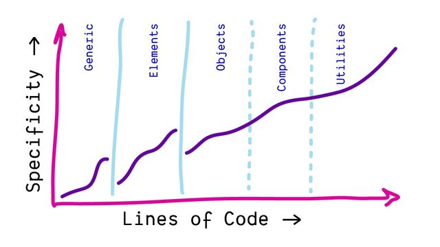
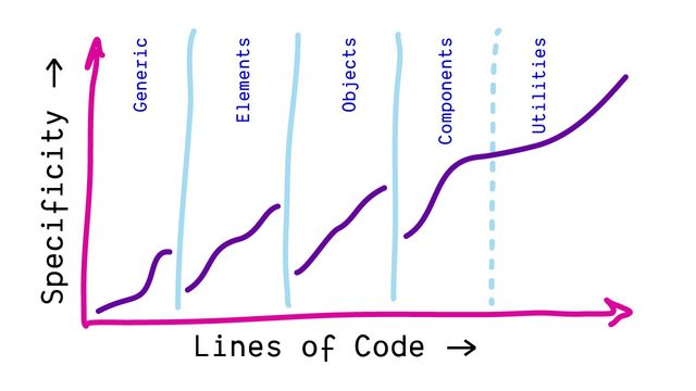
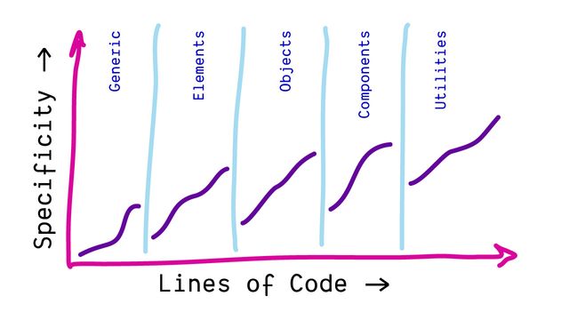
- Useful to think about our styles in layers
- From generic to specific
- Starting with abstract, broad settings and tools
- Through generic elements, objects,
- More specific components
- To very few, narrowly targeted overrides
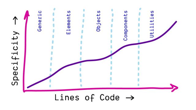
- Organize codebase low-to-high specificity
- It’s a great system (we’ll talk about it more)
- But it requires careful coordination…
❗important 💣
- Which can fall apart
- If someone brings importance
- To a specificity fight…
.🤬-bootstrap {
  font-weight: bold !important;
}- Or a third-party tool
- Doesn’t play by the same rules
😩🤬😩
- This can get frustrating!
🏃♂️💨
- And then people run away
- Looking for alternatives to CSS!
- That’s not good for anyone

Building with accessible semantics from the get-go can give you expressive, meaningful style hooks for free.
— Ben Myers, Stateful, Semantic Selectors
- To quote from Ben Myers excellent article…
- When we build with accessible semantics
- We get meaningful style hooks for free
form:has(:invalid) [type="submit"] { … }
.form__btn--submit--invalid { … }- Converting semantic selectors to single classes is a lossy transform
- Doing the browser’s job, but worse
- Name more things on every project
- Like compressing a photo too far, it’s blurry now
- We’re losing info about intent, and specificity…
- Specificity is useful
demo:
- We want modifiers to override defaults
- Source order is fragile
When specificity falls short We Need an Escape Hatch
(still meaningful and expressive)
- When specificity falls short
- We need an escape hatch
- that’s still meaningful and expressive
Cascade Layers
- That’s why we added Cascade Layers
- Proposed at the end of 2019, and already…
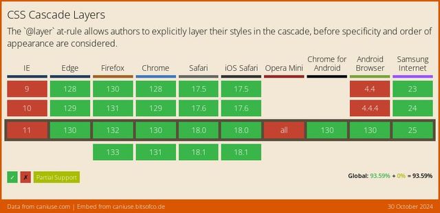
- Well supported across browsers
- For 2 years now
- Added to the cascade before specificity
- Applied first
- More powerful than specificity

- Designed to match this Inverted Triangle idea
- Organizing CSS into layers
- From broad abstractions with lower-priority
- (Resets, defaults, etc)
- To more specific and higher priority details
- (Components and overrides)
@layer settings { … }
@layer tools { … }
@layer generic { … }
@layer elements { … }
@layer objects { … }
@layer components { … }
@layer overrides { … }- We can take those same layers
- And make them explicit in CSS
- With the at-layer rule
- These provide us with…
Layers of Specificity
- Layers of specificity
- First we choose the declaration
- In the highest layer
- And only if there are multiple from that layer
- Then we compare specificity
@layer { … }
- A layer rule starts with at-layer
- And then brackets
- We can put any CSS inside those brackets…
@layer <name> { … }
- And we can optionally give our layers a name
- Any name we want
@layer reset {
  audio[controls] { display: block; }
  [hidden] { display: none !important; }
}
@import url(…) layer;
@import url(…) layer(<name>);
@layersettings{ … }@layertools{ … }@layergeneric{ … }@layerelements{ … }@layerobjects{ … }@layercomponents{ … }@layeroverrides{ … }
@layerUtilities{ … }@layerComponents{ … }@layerThemes{ … }@layerFrameworks{ … }@layerResets{ … }
@layer reset { /* least powerful */ }
@layer default { /* … */ }
@layer theme { /* … */ }
@layer components { /* more powerful */ }
/* unlayered styles: most powerful */
@layer <name>, <name>, <etc>;
Specificity is Contained
Only compared inside a layer
demo:
- Source order is fragile, layers are explicit
- Specificity only matters inside a layer
- Un-layered styles win by default
- Layers stack in order
- Define the order up front
/* establish layer order */
@layer one, two, three;

/* add code to layers as needed */
@import url(two.css) layer(two);
@layer three { … }
@layer one { … }
@layer two { … }- Generally, imports have to come first
- Layer lists are allowed before imports
- Order matters!
@layer components {
  @layer state { … }
}

/* access nested layers */
@layer components.state { … }/* system.css */
@layer theme { … }
@layer components { … }@import url(system.css) layer(system);
@layer system.theme { … }
@layer system.components { … }@import url(system.css) layer(system);
@layer system.theme { … }
@layer system.components { … }
@layer system.custom { … }- Add your own sub-layer to an imported layer!
@import url(bootstrap.css) layer(bootstrap.theirs);

@layer bootstrap.ours {
  /* anything here will override bootstrap */
}@layer components {
@layer defaults, themes, state;
}Not Escalating ❗️importance
Managing Priorities
More Cascade Control
Fewer Specificity Hacks
Like Origins, ❗️important Layers Reverse
- Resets
- Themes
- Components
!important
- Resets
- Themes
- Components
- ❗important Components
- ❗important Themes
- ❗important Resets

- The goal is balance
Protect Styles From Future Layers
Prioritize -> Layers
Protect -> Importance
- If we just want to override
- Or manage priorities
- That’s what layers are for
- Importance only when essential
@layer reset {
  [hidden] { display: none !important; }
}- Reasonable thing to put in a reset
- Reasonable for reset to have low priority
- But we don’t want future layers to override this one declaration
Getting Started
my recommendations
Define a A Layer Order
/* add as the first styles */
@layer reset, framework, components, utilities;<style>/* keep this before linked styles */
@layer reset, framework, components, utilities;
</style>
<link rel="stylesheet" href="…">
<link rel="stylesheet" href="…">If Possible Layer Overall Architecture
<style>
@layer reset, framework, components, utilities;
@import url(…) layer(reset);
@import url(…) layer(framework);
</style>Prioritize Dependencies
*Including inter-org dependencies
- Like resets, design systems, component libraries
- Anything not project-specific
Clearly define… Each Tool’s Priority
Clearly define… Tool-Specific Overrides
@import url(bootstrap.css) layer(bootstrap.vendor);

@layer bootstrap.overrides {
  /* anything here will override bootstrap */
}As you go, Update Layer Order
Working from Lowest to Highest

<template>…</template>
<style>
@layer components {
  /* … */
}
</style>Don’t (Usually) Need Layers Per-Component
As useful, Layer Inside Components
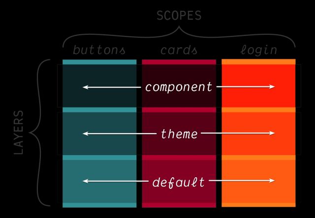
Use layers To Provide Clarity
Use layers To Convey Architecture
Use layers To Describe Intent
Not Just…
‘This is !important’
(layers lower importance by default)
X Overrides Y…
Because ‘Components’
Override ‘Defaults’
Once We Start Layering
*the styles will be hidden from older browsers
There’s No Harm Layering More
Encourages Nuanced & Explicit Priorities
For flexibility… Layer Everything
Use un-layered for Prototyping & DeBugging
Third-party tools… Consider Providing Layers
Also Not The Only Tool
Some Selectors Help Manage Specificity
#example {
  /* ID specificity */ }
[id="example"] {
/* attribute specificity */ }- ID’s are often used in forms, aria-roles, etc
- We can also use them in CSS, without the specificity
.example {
  /* [0,1,0] */ }
.example.example.example {
/* [0,3,0] - same elements */ }- Repeated attrs/IDs increase specificity
- Without changing the subject
:is() and :where()
Select The Same Elements
The union of both inside & outside subjects
/* (a) AND ALSO (nav .active) */
a:where(nav .active) { color: black; }
a:is(nav .active) { color: black; }/* (h1 a) AND ALSO (main > *) */
h1 a:where(main > *) { color: black; }
h1 a:is(main > *) { color: black; }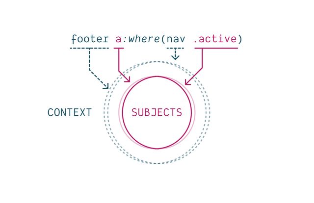
- Both contexts have to be present
- Both subjects have to match
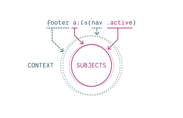
- They select the same elements
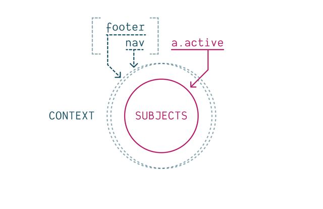
:is() and :where()
Also Group Selectors
h1 a:hover, h1 a:focus,
h2 a:hover, h2 a:focus,
h3 a:hover, h3 a:focus,
h4 a:hover, h4 a:focus,
h5 a:hover, h5 a:focus {
  text-decoration: underline;
}:is(h1, h2, h3, h4, h5) a:where(:hover, :focus) {
text-decoration: underline;
}table[rules=cols i] > tfoot > tr > td,
table[rules=cols i] > tfoot > tr > th,
table[rules=all i] > tfoot > tr > td,
table[rules=all i] > tfoot > tr > th {
/* … */
}table:where(
[rules=cols i], [rules=cols i]
) > tfoot > tr > :is(th, td) { /* … */ }
:is() and :where()
Can Change Specificity
:where()
Removes Internal Specificity
/* nav a.active { 0,1,2 } */
nav a:where(.active) { /* 0,0,2 */ }
a:where(nav .active) { /* 0,0,1 */ }
*:where(nav a.active) { /* 0,0,0 */ }
:is() Keeps
Highest Internal Specificity
:is(a, .b, #c .d) { /* 1,1,0 */ }
a:is(.b, #c .d) { /* 1,1,1 */ }a:where(#logo, .sponsor .logo) {
/* specificity: 0,0,1 */
}
a:is(#logo, .sponsor .logo) {
/* specificity: 1,0,1 */
}It doesn’t matter Which Item Matches!
<a class="sponsor logo">Still 1,0,1</a>a:is(#fakeID, .sponsor .logo) { /* … */ }CSS Nesting
Also relies on :is() selector
header {
  h1 { /* header h1 */ }
  > .title  { /* header > .title */ }
  + p { /* header + p */ }
}header {
h1 { /* header h1 */ }
> .title { /* header > .title */ }
+ p { /* header + p */ }
body & { /* body header */ }
}.card {
@media (width > 20em) {
display: flex;
}
}ol, ul {
> p { /* :is(ol, ul) > p */ }
.sidebar & { /* .sidebar :is(ol, ul) */ }
}:is() under the hood/* :is(button, .btn, #my-btn) */
button, .btn, #my-btn {
&:focus,
&:hover,
&:active { /* 1,1,0 */ }
}
:is() and :where()
Are Forgiving Selector Lists
But Not Nesting
While we’re here…
:not() and :has()
:is() & :not() & :has()
Use Same Specificity
Use :not()
For Excluding Elements
(inside matches are removed from outside matches)
/* (p) UNLESS (.warning)  */
p:not(.warning) { /* … */ }
Use :has()
For Selecting Context
(we can move the subject!)
form:has(:focus) { /* form with focus */ }
button:has(svg) { /* button with icon */ }:has() Selectorform:focus-within { /* form with focus */ }.card:has(> figure:first-child) { /* image card */ }
.card:not(:has(img)) { /* card without image */ }
input:has(+ .error) { /* input followed by error */ }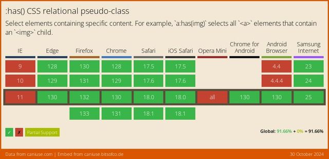
article:has(h1, .title) a {
  color: red;
}

article h1 a {
  color: green;
}Scope Is New
Rolling out this year!
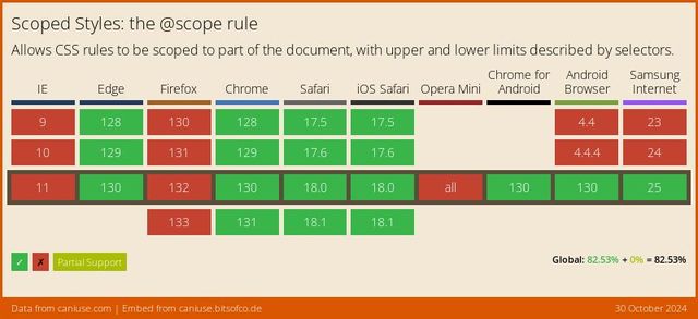

1. Avoid Naming Conflicts
(across large teams & projects)
2. By Expressing Membership
(through lower boundaries & proximity)
Scope Proximity
.light-theme a { color: purple; }
.dark-theme a { color: plum; }
@scope (<root>) { … }
@scope (.light-theme) {
  a { /* similar to simple nesting… */ }
}
@scope (.dark-theme) {
  a { /* but the _closer_ scope root wins… */ }
}Scope Boundaries
.title { /* global */ }
.post .title { /* nested */ }

.post__title { /* BEM */ }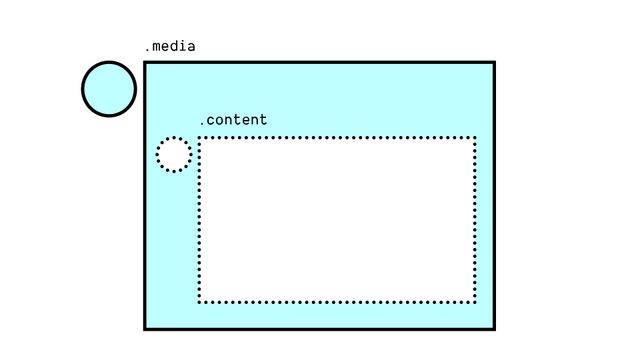
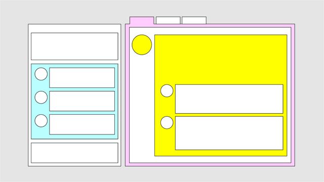
Build-tools Provide Scoped Styles
BEM, CSS Modules, Vue, JSX, Stylable, etc
.post__title { /* BEM */ }
.title[data-JKGHJ] { /* Vue */ }@scope (<root>) to (<boundary>) {…}
@scope (.media) to (.content) {
  img { /* only images that are "in scope" */ }
}Nested <style> Scopes
<article>
  <style scoped>
    p { color: green; }
  </style>
  <p>This paragraph will be green.</p>
</article>

<p>This paragraph won't!</p><article>
<style>
@scope { p { color: green; } }
</style>
<p>This paragraph will be green.</p>
</article>
<p>This paragraph won't!</p>Different from CSS Nesting
Scope has… Defined Relationship
Always child or descendant
Scope has… Lower Specificity
Scope has… Lower Boundaries
Use scope To Narrow Context
Use nesting To Provide Variants
Different from Shadow-DOM Encapsulation
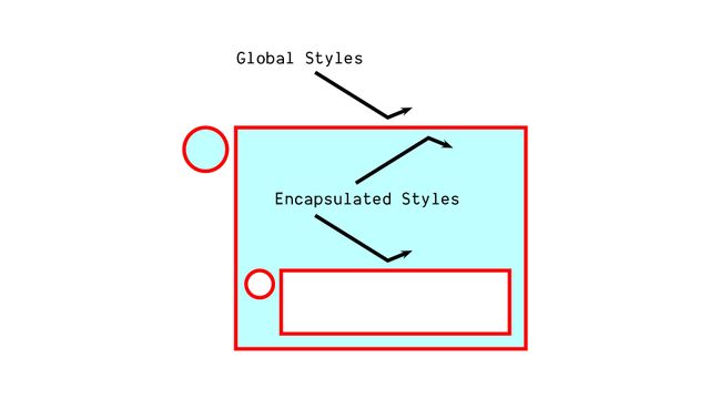
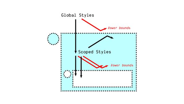
- Scoped styles win
- Shadow styles lose
Order of Appearance
- The final step in the cascade
- Order of appearance
- Guarantees a single answer
button {
  background: red;
  background: blue;
}- If we still have multiple declarations
- Same origin & importance, same context
- Similarly attached or mapped from selectors
- Same layer, specificity, and scope proximity
- Then one has to come last
- No way to get a tie at this point
button {
  background: red;
  background: oklch(0.5 0.2 0);
}- This also becomes useful
- When we want to use new features in CSS
- Legacy browsers will throw out the declaration they don’t understand (oklch color)
- But modern browsers will have to choose one
- Put them in order, so most modern wins
- That’s technically the end of the cascade
- No more official steps
Still Non-CSS… Presentational Hints
- But there are still styles to handle
- And browsers have a choice
- About where to fit them into the cascade
- These are non-CSS ‘presentation hints’
- Provided in HTML…
<img src="…" alt="…" width="1600" height="900">
<div hidden>…</div>- Things like
widthandheighton an image - Or the
hiddenattribute - Part of the markup
- But clearly related to the styling,
- Hinting at styles
Added to Any Lower Origin
details left to the browser…
- Browsers are allowed to add these
- To either the browser origin
- Or a special author-hints origin
- Below our normal author origins
- Either way, CSS always wins over these hints
Cascade output…
Single
(possibly empty)
Cascaded Value
for each property of each element
- The input to the cascade
- Was a list of declared values
- (for each property on each element)
- The output now
- Is a single (possibly empty) cascaded value
There are Still Missing Values
- Since some values are potentially empty
- We need a process to fill them in!
- We’ll talk about that tomorrow, along with…
And also… Custom Properties
- Custom Properties (CSS variables)
- Which can play a unique role in that process
- That will start to move us out of theoretical physics
- Into more applied use-cases and demos
The Cascade is Our Most Powerful Feature
- Hopefully (today) a better understanding of cascade…
- What it is, how it works

- Why it exists (to bring balance)
- here we fit into the larger process

- And ways we can use it
- To write more expressive style rules
The cascade Describes Intent
- Describing the intent of each declaration
- And how it should be merged with other declarations

- As part of our style collaboration
- With browsers, users,
- and (hopefully) aliens
- Most importantly…
A Jedi uses the [Cascade] for knowledge and defense, never for attack.
— Yoda (almost)
